Case Study · Online Bookstore Platform
Designing a modern online bookstore that readers actually love.
Story Spark is an e-commerce platform for book lovers — a place where readers discover, browse, and buy books with ease and delight. The challenge was to design a shopping experience that felt warm and curated, not cold and transactional — from the homepage through filtering, book detail tabs, and a frictionless 4-step checkout.
Client
Story Spark
Industry
E-Commerce · Books
Service
UI/UX Design
Platform
Web (Responsive)
Tools
Figma · FigJam · Maze
Timeline
10 weeks
Problem
Most bookstores feel like warehouses, not bookshops.
Long product-dense lists, weak filters, hidden reviews, and a checkout that feels disconnected. Readers leave because they can't judge a book quickly.
Goal
Reduce doubt at every step of the journey.
Doubt about whether a book is good, doubt about price, doubt about the seller, doubt about checkout — design the whole flow so each step quietly resolves one.
Outcome
Six templates that work as a single, warm system.
Homepage, Books Grid, Books List, Book Detail (Description), Book Detail (Reviews), Checkout — anchored by a persistent purple primary CTA.
94%
Task completion rate (find + purchase)
38s
Avg time to first add-to-cart
+62
NPS in prototype testing
Project Timeline
Ten weeks from interview to usability test.
01 · Weeks 1–2
User Interviews & Surveys
02 · Weeks 3–4
Competitive Audit & IA
03 · Weeks 5–7
Wireframes & Visual Design
04 · Weeks 8–10
Prototype & Usability Testing
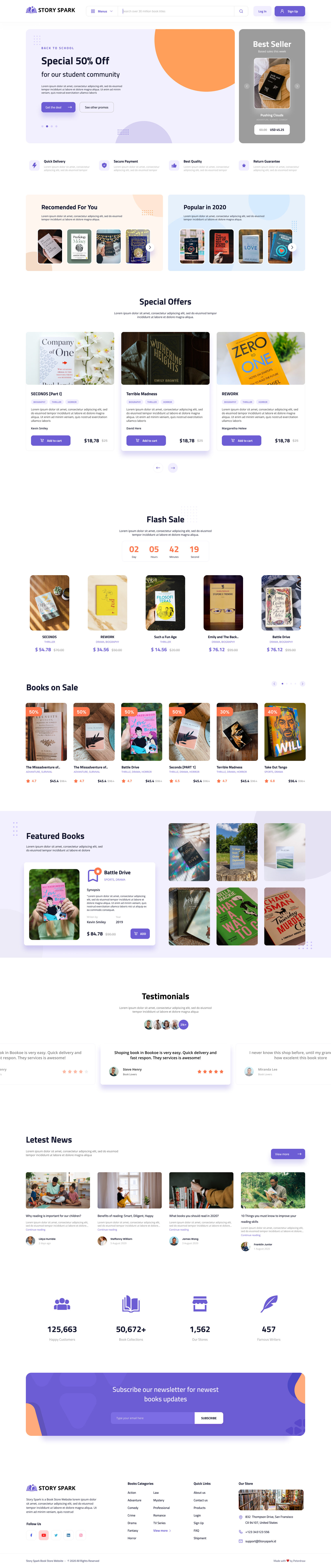
Section 1 · Homepage
First impressions, in intent zones.
The homepage does three things at once: promote deals, surface personalized picks, and inspire browsing. We structured it as a sequence of intent zones — hero offer, recommended vs popular, special offers with covers as heroes, a flash-sale countdown, sale carousel, testimonials, and a credibility stats bar.
- Hero banner pairs a time-sensitive offer with a bestseller spotlight
- Orange diagonal accent creates visual energy without shouting
- Flash sale countdown drives urgency where users already are
- Purple #6C63FF is the only primary CTA color — everything else is quiet
Design Principles
Four principles that guided every screen.
Warm Discovery
Homepage feels like a curated bookshop, not a warehouse — covers as heroes, orange accents for energy.
Effortless Filtering
Sidebar filters narrow results with real-time feedback. Genre tags on cards double as discovery shortcuts.
Frictionless Checkout
4-step progress bar, payment options visible early, trust signals at the moment of commitment.
Section 2 · Browsing
A grid that feels fast and exploratory.
The browse page is where readers spend the most time. A collapsible sidebar (Editor Picks, Publisher, Year, Category, Price Range) narrows the 4-column card grid with real-time feedback. Genre tags on each card are clickable — a reader who notices 'Survival' mid-browse can re-filter instantly without going back to the sidebar.
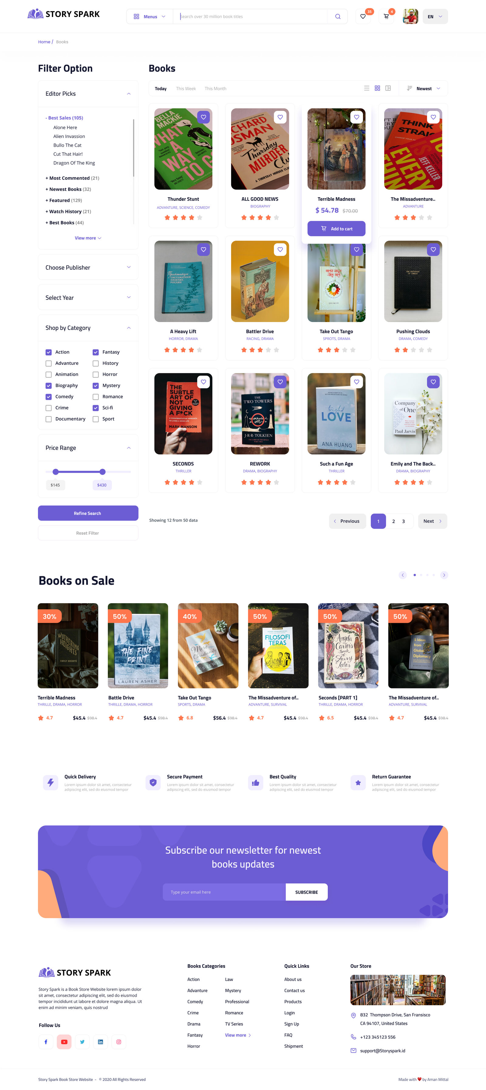
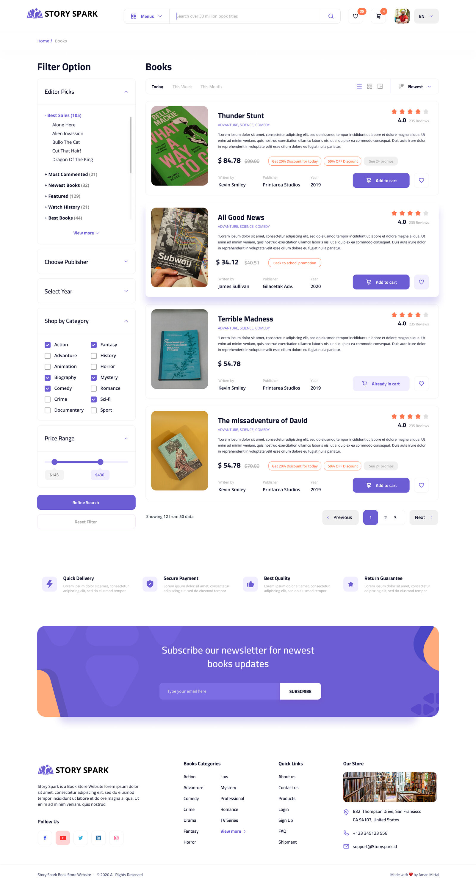
Alternative list view — same data, denser scan
Section 3 · Book Detail
Answering 'Is this book for me?' in two tabs.
The detail page splits into Details Product and Customer Reviews. Tabs (not accordions — testing showed accordions hid reviews entirely) make both content modes equal in weight. The Details tab leads with author photo, publisher and year before price; the Reviews tab opens with a 4.7 aggregate and percentage bars per star.
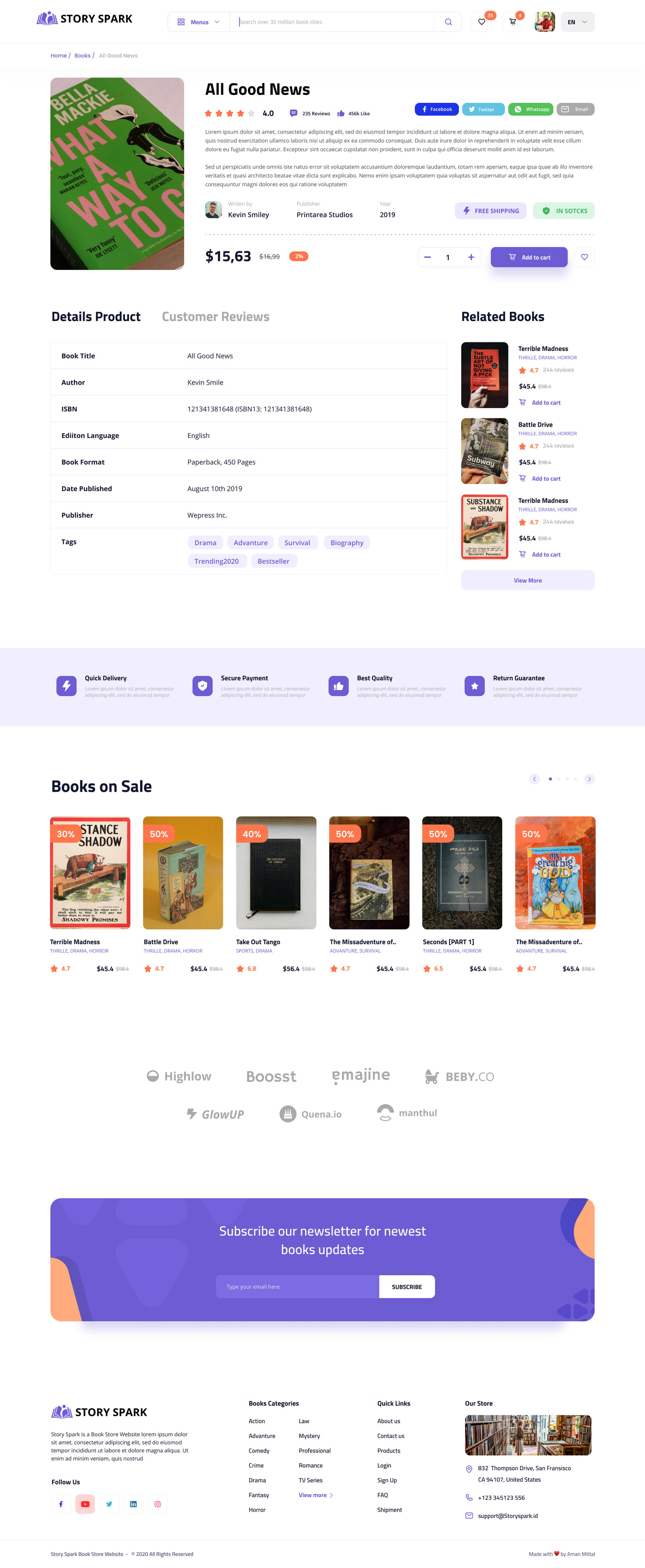
Details Product
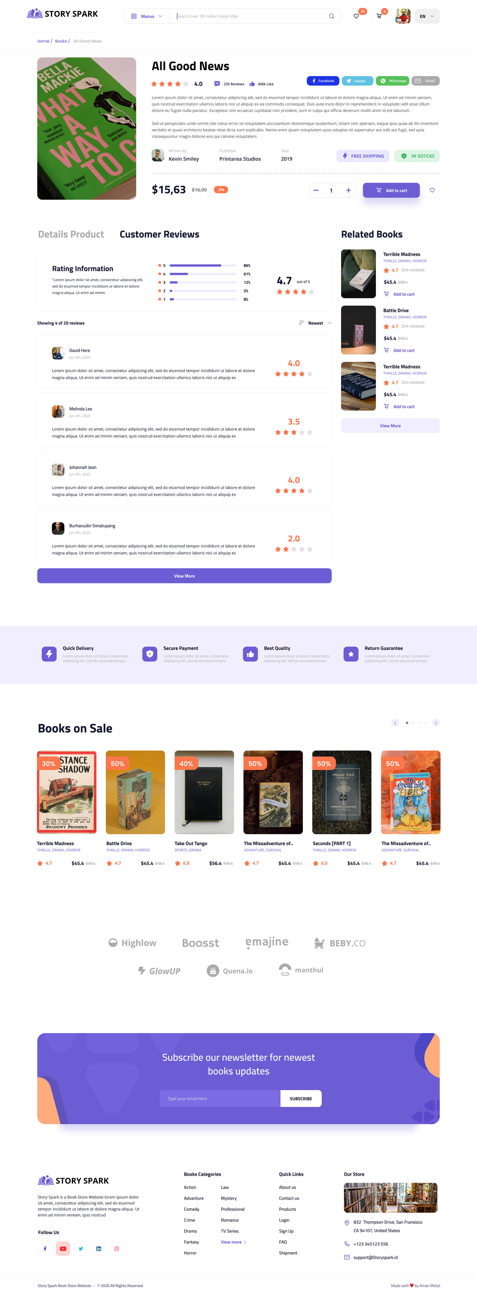
Customer Reviews
Human credibility above price
Author photo, publisher and year sit above the price — context before commitment.
Tabs over accordions
Early prototypes hid reviews in accordions. Tabs give description and reviews equal weight.
One purple CTA
Quantity stepper sits next to a single Add to Cart button. Wishlist stays quiet on the side.
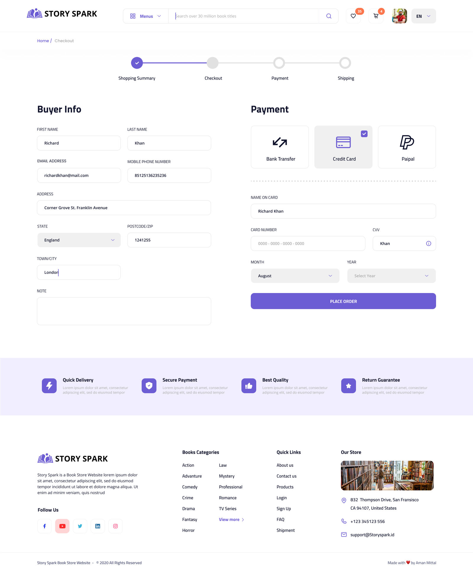
Section 4 · Checkout
Clarity at the moment of commitment.
A 4-step progress indicator (Shopping Summary → Checkout → Payment → Shipping) tells users exactly where they are. The buyer info form sits left with label-above-field inputs; payment methods sit right as visual toggles. Card fields appear only after Credit Card is selected. A trust-signal bar (Quick Delivery / Secure Payment / Best Quality / Return Guarantee) anchors the bottom.
Design System
One purple that always means 'go.'
Purple (#6C63FF) is reserved for primary actions — Add to Cart, Subscribe, Place Order. Every other button is white or ghost. Readers always know where the next step lives.
Brand Purple
#6C63FF
Soft Lavender
#EDEBFF
Accent Orange
#FF8A3D
Ink
#1B1740
Cream
#F5F3FF
Buttons
Purple primary; ink outline secondary. Only one purple button per zone.
Checkout progress
4 steps, always visible — testers said the bar made them "feel comfortable continuing."
Genre tags
Clickable on every card — they double as discovery shortcuts mid-browse.
What I Learned
E-commerce design is doubt-reduction.
Doubt about whether a book is good (reviews, ratings). Doubt about price (badges, strikethroughs). Doubt about the seller (trust icons, testimonials). Doubt about checkout (progress bar, payment options). When doubt is gone, the decision to buy becomes easy — and readers come back because the experience felt good, not just functional.
Filtering is a trust signal
When users can narrow results and see counts update, they feel in control. The sidebar paid off more than almost any visual decision.
Tabs beat accordions
Early prototypes used an accordion for description and reviews. Users missed reviews entirely. Tabs make both content modes equal in weight.
Progress bars reduce anxiety
Testers explicitly mentioned the 4-step checkout bar as a reason they felt comfortable continuing. Knowing the end is in sight changes behavior.
Want to see more? Let's talk about your project.