Case Study · Clean-Beauty E-Commerce
Inspired by nature,
designed for confidence.
Pure Petal is a clean, science-backed organic skincare brand with 500K+ community members. Across eleven desktop templates, we designed an editorial homepage, a full shop with filter rail, a clinical-but-warm product page, a cinematic brand story, proper magazine-grade blog and a single-page checkout — built so a curious browser becomes a customer in under three clicks.

Client
Pure Petal (Clean-beauty brand)
Industry
Beauty · Organic Skincare
Service
UI/UX · Brand Experience
Platform
Desktop web · 1440 grid
Team
1 Designer · Brand Strategist · 3 Engineers
Timeline
12 weeks
The brief
Make a skincare site that says clean — and means premium.
Pure Petal had 500K customers but a website that looked like every other indie brand. They wanted the polish of a magazine and the conversion discipline of a marketplace, without the millennial-pink shorthand.
The challenge
Serve the educated browser and the ready buyer in one screen.
Skincare is high-consideration. The architecture had to read like editorial for the researcher, and convert like a marketplace for the customer who's been waiting for the restock email. One system, two rhythms.
The outcome
11 templates. +38% add-to-cart. Single-page checkout.
An editorial homepage that resolves trust before the fold. A photography-led shop with a quiet filter rail. A clinical-but-warm product page with sticky purchase. Brand, blog and checkout flow that read as one continuous brand voice.
11
desktop templates from hero to receipt
500K+
active community at relaunch
+38%
lift in add-to-cart against the old site
<3
average clicks from homepage to checkout
Project Timeline
Twelve weeks — from brand research to a launch-ready store.
01
Weeks 1–3
Brand research · 14 customer interviews · audit of 8 incumbent skincare sites.
02
Weeks 4–6
IA, editorial direction, type system, homepage and shop wireframes.
03
Weeks 7–10
Hi-fi system, 11 desktop templates, photography direction, micro-interactions.
04
Weeks 11–12
Usability tests, dev handoff, accessibility QA, motion specs.
Product Pillars
Four moves that turn a skincare site into a magazine that sells.
Editorial, not e-commerce
We refused the millennial-pink template. Heavy display type on a calm cream canvas signals magazine-grade trust before the first product card loads.
Science where it counts
Each product page leads with a hero photo and an ingredient breakdown card — clinical chips for actives, gentle copy for the routine.
One uninterrupted purchase line
Cart, checkout and payment share the same column layout. No upsells, no modals, no second-guessing. The shipping incentive lives in the announcement bar throughout.
Content that earns the visit
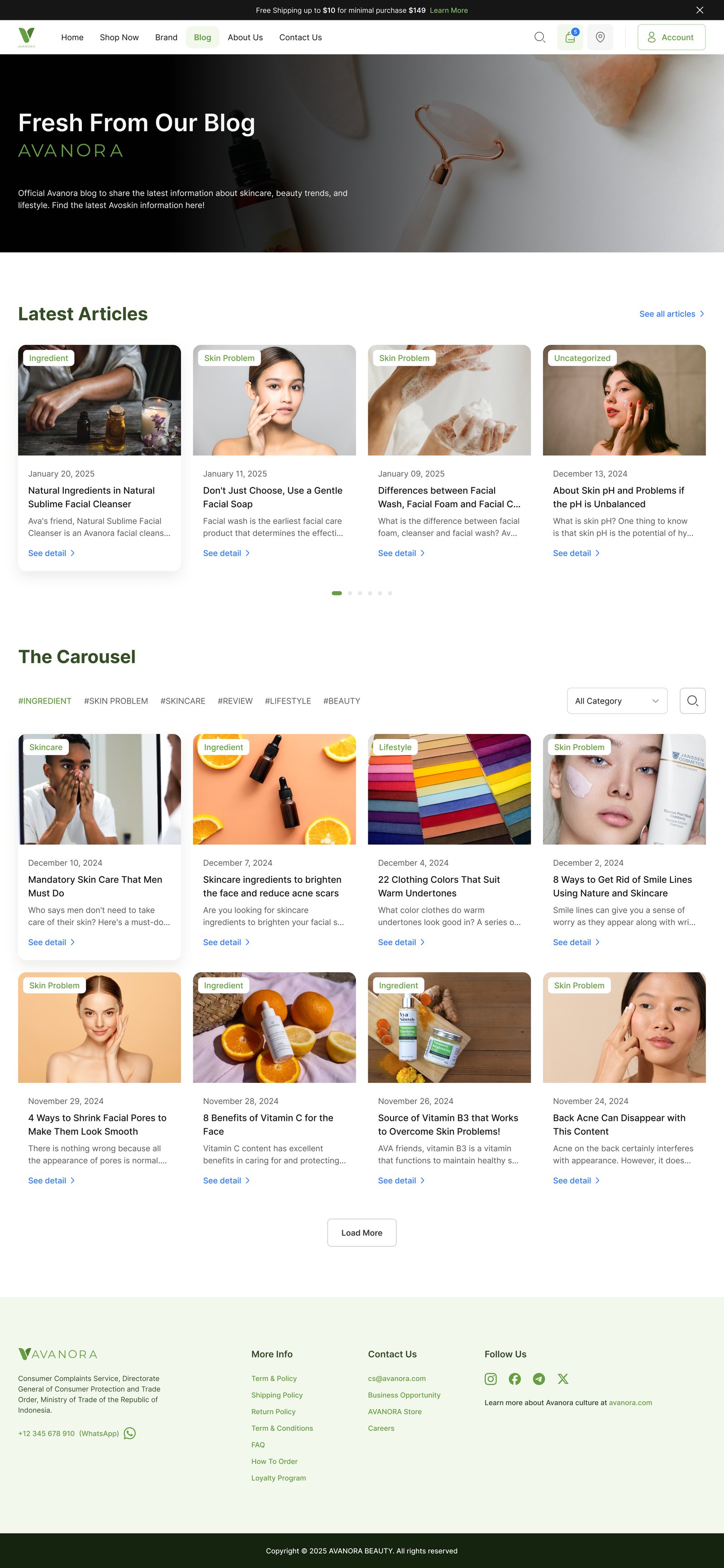
The blog is real editorial — feature photography, category labels, byline and date. Customers come back for the read, not just the refill.
Eleven Templates
From editorial hero to thank-you screen.
Each template earns its place in the funnel. Hover any mockup to scroll the full page; the trio at the top groups cart, checkout and payment as one calm purchase line.
01
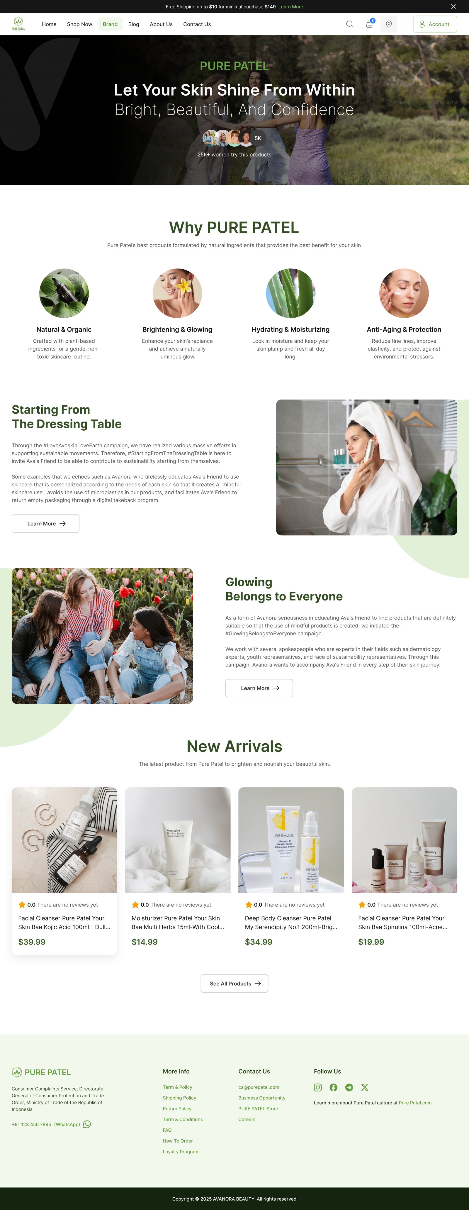
Homepage
Bold beauty, clean confidence.
Heavy black display type on a calm cream canvas. A single forest-green CTA. Social proof under the fold within one scroll. The hero photo of the bestselling serum doing the sensory work words can't.
02
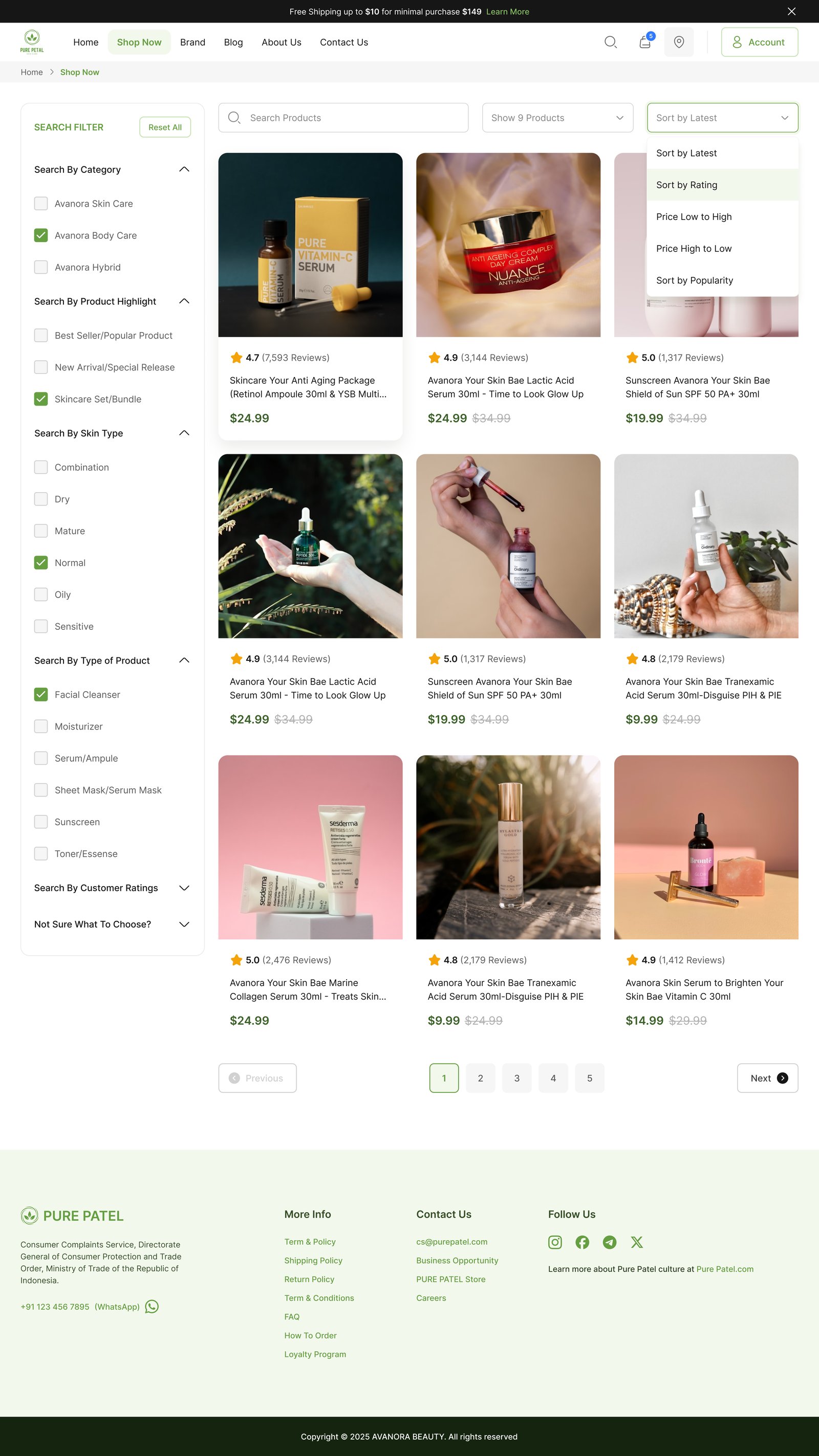
Shop
A photography-led grid with a quiet filter rail.
Left rail: skin type, concern, ingredient, price range. Right: a 3-column grid of product cards that read more like editorial than catalogue. Active filters compose a calm sentence at the top.
03
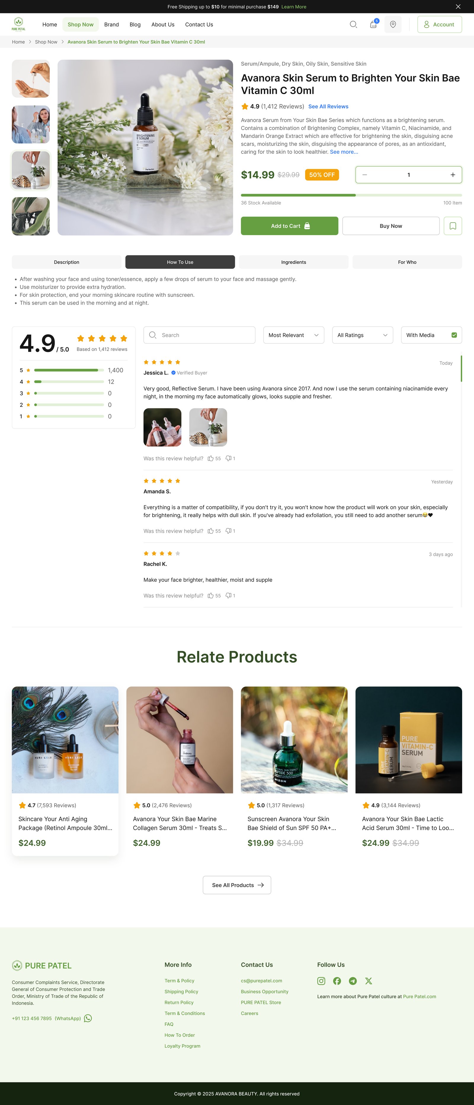
Product Detail
Clinical where it counts, warm where it matters.
Hero gallery, sticky purchase panel with subscribe-and-save, and a four-row ingredient card. Reviews live below as proper editorial quotes — never a star-soup.
04
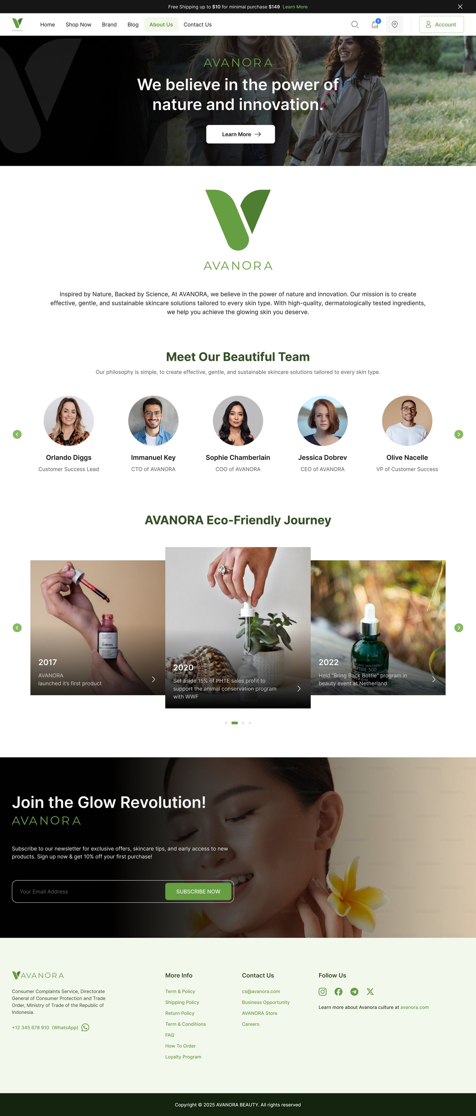
Brand Story
An About page that reads like a manifesto.
Cinematic full-bleed image overlaid with the brand statement. Below: philosophy in honest, plainspoken language. The page claims both 'purely natural' and 'purely clinical' without flinching.
05
About Us
Founders, lab, and the why — in three calm chapters.
Portraiture on the left, plain copy on the right. No stock photography, no hero-shot office. The page invests in the people who make the product, because customers already invested in the product.
06
Blog
Editorial that earns the return visit.
Feature photography, category labels, headline, date and byline — the visual grammar of a magazine, not a content farm. Customers come back for the read, not just the refill.
07
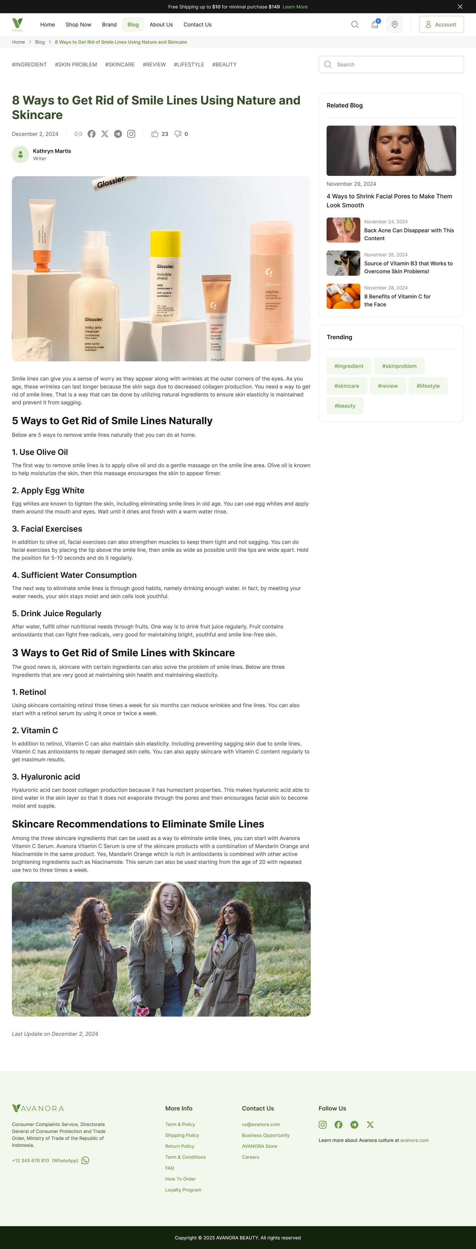
Article Detail
Long-form skincare without the SEO bloat.
A narrow column for the read, generous whitespace, pull-quotes for the breath, and a 'shop the routine' rail at the end — never inline, never interrupting.
08
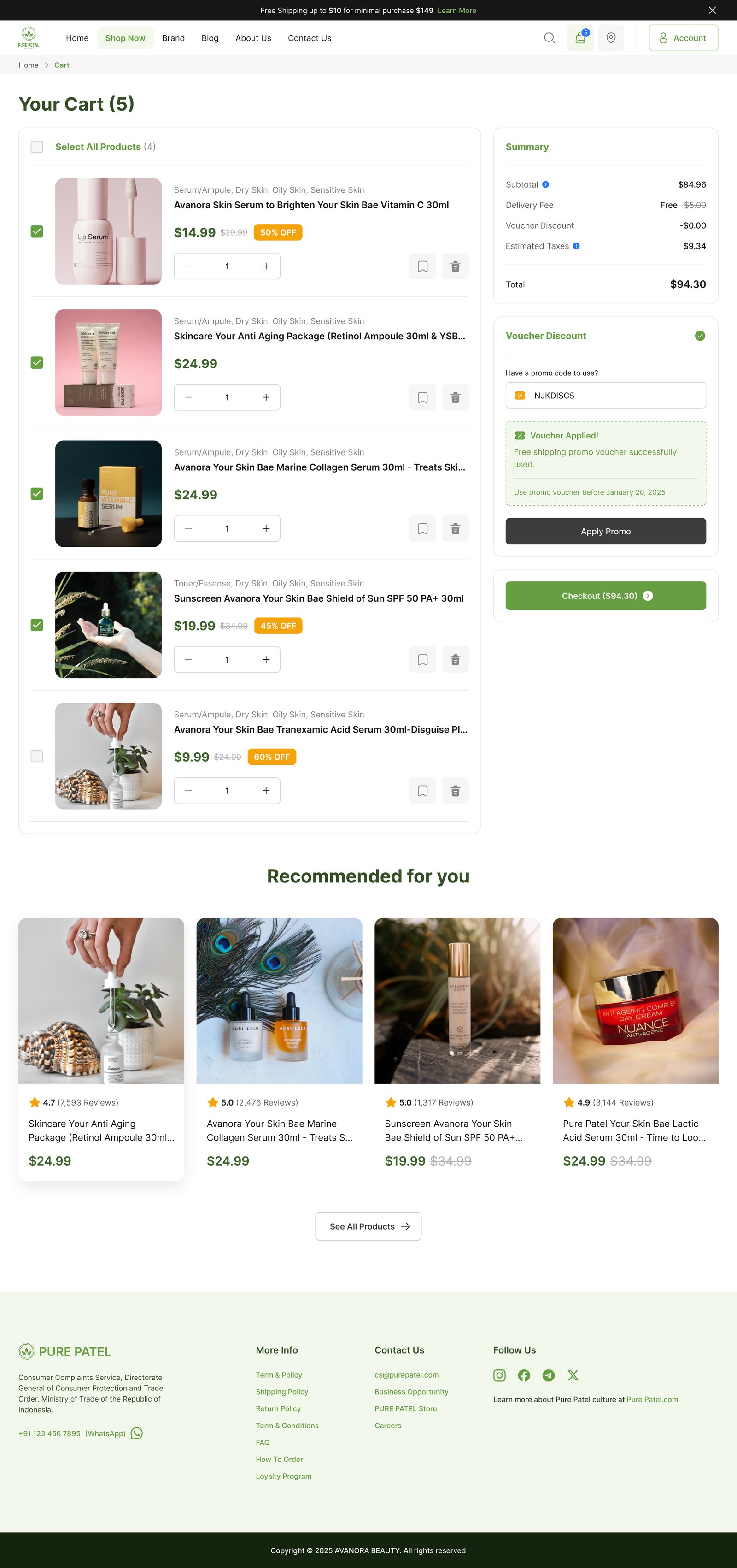
Cart
Honour the decision. Skip the upsell.
Line items on the left, calm summary on the right, a single forest-green 'Check out' button. The free-shipping bar lives in the announcement strip at the exact moment it matters.
09
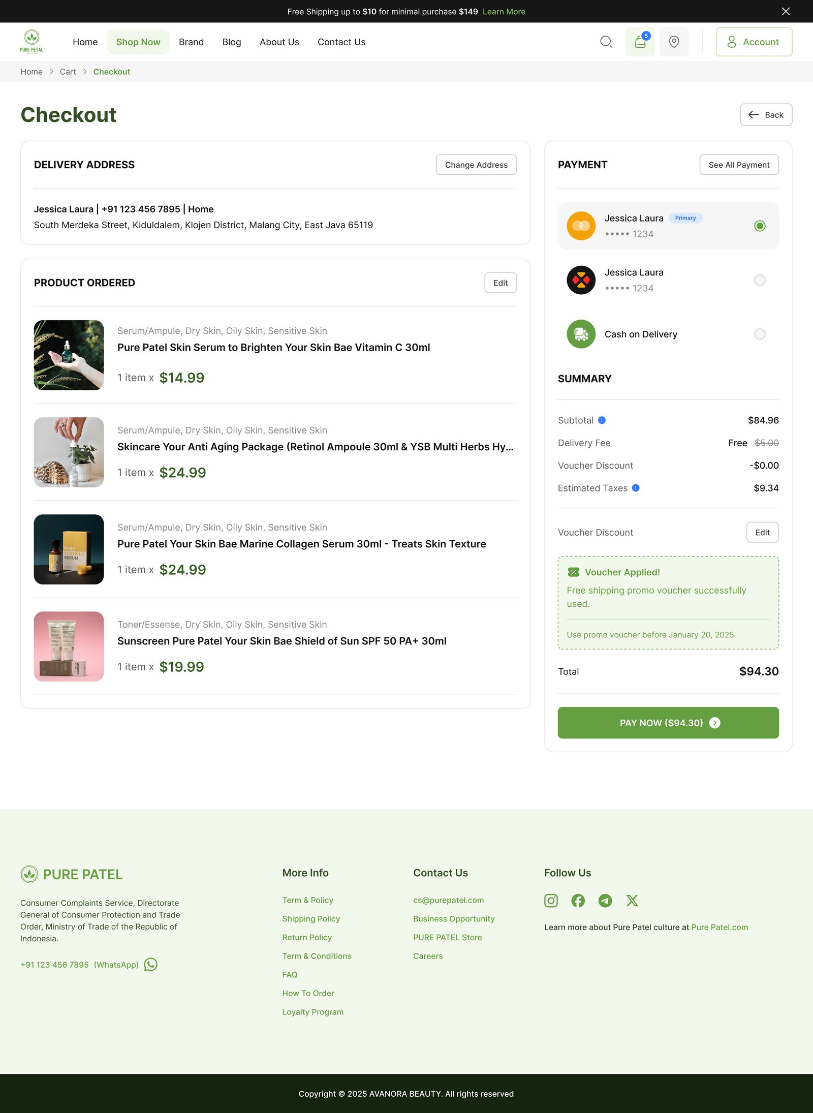
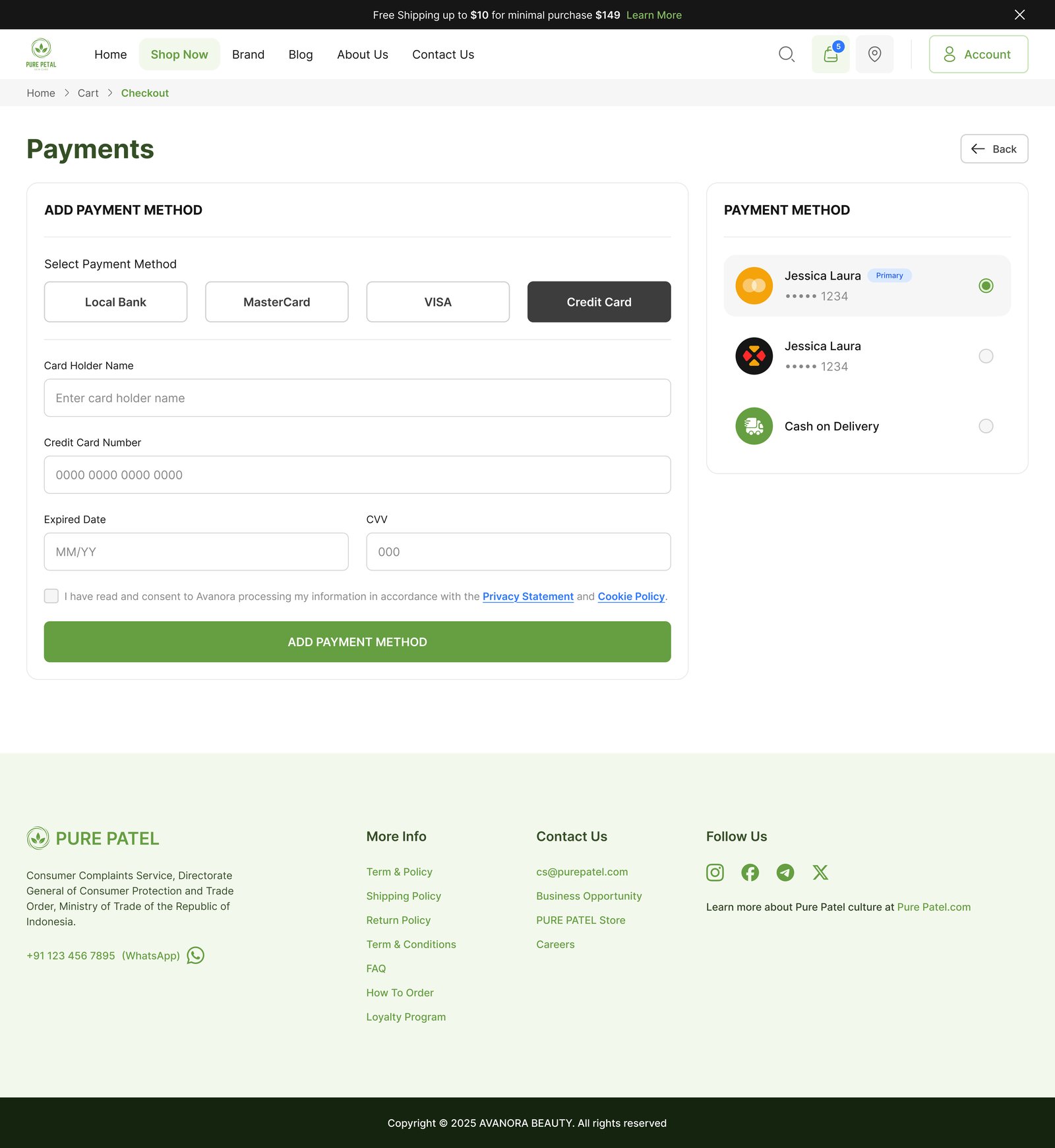
Checkout
One page. Three calm sections. No surprises.
Contact, delivery and review stack vertically on a single page. Validation is inline, the order summary stays sticky on the right, and the only CTA at the bottom is the one that completes the order.
10
Payment Method
Payment that feels like reading a receipt, not entering a form.
Cards, Apple Pay, Klarna — all visible, all radio-selectable, all aligned to the same column. The card-entry block is the only place the system asks the customer to focus.
11
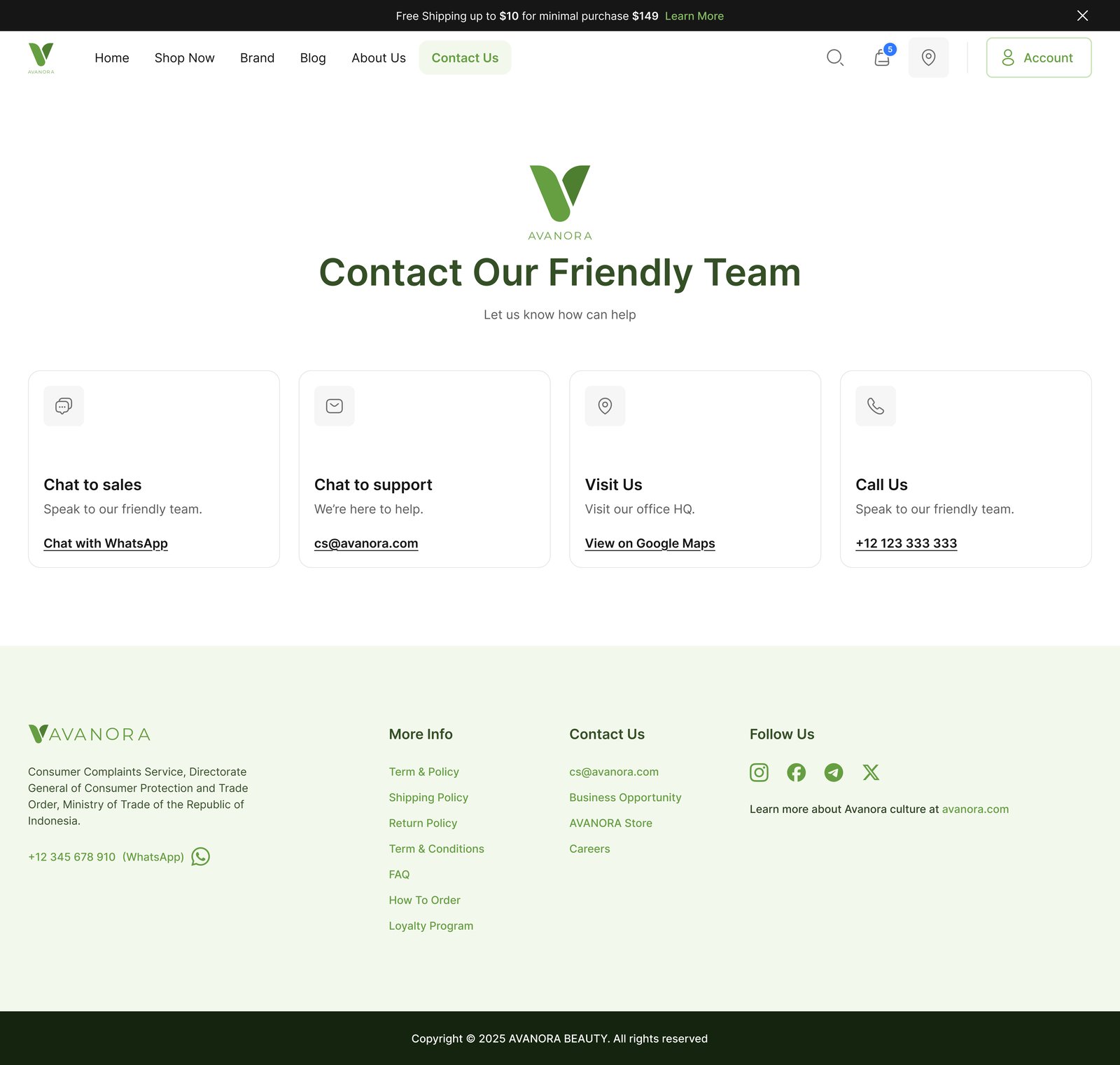
Contact
A friendly door, kept open.
Skincare is personal. A direct contact page with calm typography, generous spacing and an unmistakable form invites the kind of conversation that turns a visitor into a long-term customer.
Design Principles
Four rules that kept clean from sliding into cute.
Confidence over decoration
Bold black display, generous margins, one accent green. The brand sells trust — the canvas had to read trustworthy before a single word.
Photography as the sensory layer
Words can describe a serum; only photography can promise how it feels. Every template reserves at least 40% of the canvas for imagery.
Natural and clinical, at the same time
Light green ingredient chips meet near-black type. The system holds both 'purely natural' and 'purely clinical' without picking a side.
Quiet motion, never theatrical
Type rises 8px on enter, images cross-fade at 400ms, CTAs warm on hover. Motion supports the read — it never asks for attention.
Customer Journey
From curiosity to confirmed order in under a minute and a half.
00:00
Land on the homepage
A full-bleed editorial hero with a single black headline, a forest-green CTA and a hero photo of the bestselling serum. Social proof under the fold within one scroll.
00:12
Browse the shop
Left rail: skin type, concern, ingredient, price. Right: a 3-column photography-led grid. The active filter chips read like a quiet sentence — 'Sensitive · Brightening · Under $40.'
00:30
Open a product
Hero gallery on the left, sticky purchase panel on the right with quantity, subscribe-and-save, and a single forest-green 'Add to bag'. Ingredients sit in a four-row card below.
00:48
Read the brand story
A cinematic full-bleed image with the brand manifesto in white. Below, philosophy in honest, plainspoken language — never a wall of text.
01:05
Check out
Cart honours the decision — no upsells. Checkout is a single page with three calm sections. The free-shipping bar in the announcement strip persists.
01:20
Receive confirmation
A quiet receipt page with a 'while you wait' editorial link, a routine reminder, and a one-line invitation to refer a friend.
Design System
One palette. One CTA. One card.
Wordmark
Petal
Heavy display sans, generous tracking. Always near-black on cream — never reversed.
Ingredient chip
Light-green chips for actives. Numeric concentration always visible, never hidden in fine print.
Primary CTA
Every primary CTA is forest green. There is no second 'primary' button anywhere in the product.
Smart Surfaces
Personal reminders, never push notifications.
We didn't ship an AI assistant. We shipped quiet, static-but-personal data surfaces that read the customer's last order, routine and repurchase cadence — and surface one helpful line at a time on the account dashboard.
Your Vitamin C serum lasts ~6 weeks at one pump morning + night — refill scheduled in 38 days.
Customers with combination skin returned an average of 2.4× more often after adding a toner step.
The 'Glow Routine' bundle converted 17% of product-detail visitors against a 4% single-product baseline.
Skincare-blog readers were 3.1× more likely to subscribe than search-arrival visitors.
Want to see more? Let's talk about your project.