Case Study · Real Estate Marketplace
Home to stay.
Rent with ease.
PropEase is a one-stop real estate marketplace for buying, renting and listing property across Indian cities. Across nine desktop templates, we designed a unified header for four jobs, a rent calculator that doubles as a lead engine, and an in-product rent-agreement generator — so the deal never leaves the platform.
Client
PropEase (PropTech startup)
Industry
Real Estate · Two-sided marketplace
Service
UX/UI · Web Design
Platform
Desktop web · 1440 grid
Team
1 Designer · PM · 6 Engineers
Timeline
12 weeks
The brief
Build a real estate site that doesn't feel like a broker.
The founders had a clear thesis — zero brokerage, free listings, and a closing-the-loop product where the rent agreement is generated in-house. They wanted a marketplace that felt like a calm utility, not a portal hawking 'verified leads'.
The challenge
Four audiences — buyers, renters, owners, builders — in one product.
Buyers want long, photographic project pages. Renters want speed and the calculator. Owners want a free, dignified listing form. Builders want spotlighted projects. One design system had to serve all four without leaking complexity into any single screen.
The outcome
9 templates. 0% brokerage. A calculator that drives signups.
A four-job header that lets every visitor land on their funnel. A shared card across six surfaces. A 12-field rent calculator that became the #1 organic acquisition channel. And a rent-agreement preview that closes deals without anyone leaving the product.
9
core desktop templates from search to signed agreement
4-in-1
buy, rent, list and paperwork — one product
0%
brokerage — listings stay free for owners and tenants
<90s
median time from home to a saved property
Research & Discovery
Three weeks listening before a single pixel.
14 interviews across four audiences, a teardown of five Indian portals, and an information-architecture workshop with the founding team. The findings shaped every screen that followed.
User Interviews · 14 sessions
Tenant · 27 · Mumbai
Calculator anxiety"Every portal shows me ₹40K listings for a 1BHK and I have no idea if the owner is dreaming. I just want a number I can trust before I start calling."
Owner · 54 · Delhi
Verified-lead extortion"I paid ₹3,000 to 'unlock' verified buyers — half the numbers were dead. Listing my own flat shouldn't feel like buying a lottery ticket."
Builder PM · 41 · Pune
Lost in the resale noise"Our new launch sits next to ten 'rent 1BHK' cards on every portal. Buyers looking for a Spotlight project can't see us under the resale clutter."
Renter couple · 32 · Bengaluru
WhatsApp paperwork"We finalised a flat on the portal — then the owner sent us a stamp-paper draft over WhatsApp. The 'deal' just disappeared off the platform."
Competitive Audit · 5 Indian portals
| Portal | Monetisation | Rent calculator | Paperwork | Biggest miss |
|---|---|---|---|---|
| MagicBricks | Owner pays for 'verified' buyer leads | Hidden in footer · 4 fields | Off-platform · partner site | Listings feel like ads, not inventory |
| 99acres | Featured listing + lead packs | EMI only · no rent estimator | None | Buy & rent share one feed — slow filter |
| Housing.com | Premium owner plan | Basic 3-field price index | PDF download, not editable | Builder pages buried under resale |
| NoBroker | Renter relationship pack | Locality average, not parametric | Paid add-on (₹1,499) | Calculator and paperwork sit behind paywall |
| Square Yards | Heavy retargeting + sales calls | Loan, not rent | None | Sales-first UX, not a marketplace |
| PropEase | Free for owners & tenants | 12 fields · in-product | Live A4 preview · free PDF | Closes the loop without leaving the product |
Three patterns held across all five competitors: the rent calculator was either missing or token, the agreement always pushed users off-platform, and 'free' meant 'free until you want a real buyer'. Each became a positioning lever.
IA Workshop · Open card-sort → 4 pillars
A 90-minute open card-sort with the founding team grouped 38 candidate pages into four header-level jobs. This sitemap is what the header bar still reflects today.
Buy
- Residential
- Commercial
- Plots
- New Launch
- Top Properties (Sale)
Rent
- Residential
- Commercial
- Top Properties (Rent)
- Property Detail (Rent)
List free
- List Property
- List a Project (Builder)
- Owner dashboard
- Bidding history
Tools
- Rent Calculator
- Rent Agreement
- EMI Calculator
- Request Services
Project Timeline
Twelve weeks — from blank Figma to a closing-ready marketplace.
01
Weeks 1–3
Owner & tenant interviews · audit of 5 Indian portals · IA workshop.
02
Weeks 4–5
Wireframes for buy, rent, list and the rent calculator flow.
03
Weeks 6–10
Hi-fi system, 9 desktop templates, rent agreement preview.
04
Weeks 11–12
Usability tests with owners + tenants, dev handoff, QA.
Product Pillars
Four moves that turn a portal into a marketplace.
One header. Four jobs.
Buy, Rent, List a Project, List a Property — every primary intent sits in the header, locked to a city picker. Users never hunt for the path they came for; PropEase opens with their job already on screen.
Projects and properties, separate but symmetrical
Builder projects (Spotlight + 'All Projects') and individual listings (Top Properties for Sale / Rent) use the same card atom, the same detail layout — but two distinct funnels, so buyers and renters never have to filter the other side out.
Rent Calculator as a marketing engine
A 12-field rent estimator that doubles as a lead magnet. Owners list to validate the number; tenants land here from Google and stay for the listings. One tool, two sides of the marketplace, fed daily.
Paperwork inside the product
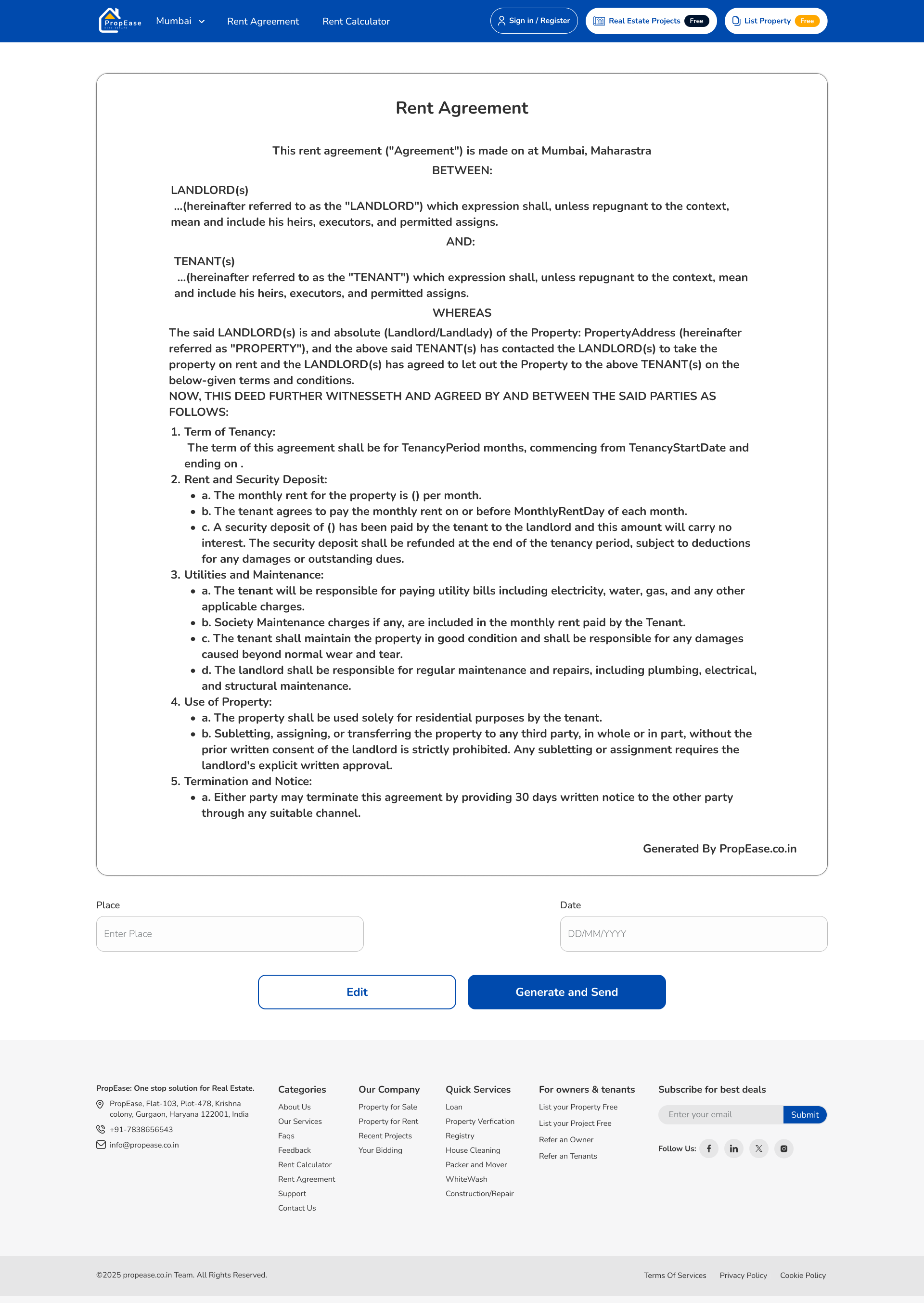
A guided rent agreement builder with a live preview — clauses, deposit, lock-in, notice, all baked into a generated PDF. We refused to send users off-platform; the closing of the deal lives inside PropEase.
Key Design Decisions
Four forks in the road — and the version we left behind.
Every shipped decision had at least one rejected sibling. These are the trade-offs that shaped the product more than any single screen.
Single brand blue — no dual-color system
What we shipped
One confident #1A56DB for every primary action, link and active state. Amber appears only on the 'Free' badge.
What we rejected
Blue + Green (sale = blue, rent = green) and Blue + Orange (CTA + accent). Both tested as 'broker-like' in moodboard reviews — they coded the page as a sales funnel, not a utility.
Why
Trust in real estate compounds when colour stays stable. A second 'primary' would force renters to relearn the system on every page; one blue makes PropEase read as institutional from screen one.
12-field rent calculator instead of a 3-field one
What we shipped
Profession, locality, parking, water supply, floor, super build-up area, cover area, age of construction, furnished, type, residential/commercial — twelve inputs, one number out.
What we rejected
A 3-field version (city + BHK + sqft) we wireframed first. It produced a ₹15K–₹45K range — wide enough to be useless. Owners ignored it; tenants didn't trust it.
Why
The calculator is the lead engine — it only works if the number is defensible. Twelve fields take 40 seconds but produce a single confident figure tenants quote to owners on the call. The friction is the feature.
Live A4 preview for the rent agreement, not a wizard
What we shipped
Form fields on the left, a live A4 PDF preview that re-renders on every keystroke on the right.
What we rejected
A 5-step wizard (Parties → Property → Terms → Clauses → Review) that hid the document until the final step. Early-test users asked 'what does this become?' on every screen.
Why
An agreement is a legal artefact. People need to see the paragraph their name will appear in before they sign it. The live preview removed four 'is this real?' support tickets in the first beta week.
Four Request Services tiles instead of a chatbot
What we shipped
Loan, Verification, Registry, Cleaning, Whitewash, Construction — surfaced at the moment a deal needs them.
What we rejected
An AI chat sidekick on every page. Stakeholders pushed for it; a paper-prototype test showed tenants either ignored it or asked the bot to 'just call the owner'.
Why
Chat sets an expectation we can't honour — a 24/7 broker. Real services from real partners, placed where the transaction actually needs them, do the same job without the broken promise.
Nine Templates
From a city pick to a signed agreement — in nine screens.
Each template earns its place in the funnel. Hover any mockup to scroll the full page; every screen lives in the same blue system.
01
Home
One header. Four jobs. A city always pinned.
Sign in / Real Estate Projects / List Property (Free) sit in the header next to a Mumbai dropdown. Buy/Rent toggle owns the hero. Below: Explore Now chips, Spotlight Project, Top Properties (Sale), Top Properties (Rent), Commercial, Recent Bidding, Why PropEase, Request Services.
02
Project Listing
Builder projects, separated from individual listings.
A dedicated rail for Spotlight Projects (GokulDham, Sundaram Towers, Pankaj Villa) with possession date, total units, total towers and BHK mix. Buyers searching new launches never wade through resale listings.
03
Project Detail
Eco. Location. No fixed maturity. Highlights as honest blocks.
Wide hero photo with project name overlay. Two-column meta — Area, Possession, BHK, Total Units, Total Towers — plus a sticky Owner / Builder contact card. Highlights split into three icon blocks. Flat configurations rendered as 1/2/3 BHK rate cards.
04
Property List (Rent)
A rent grid that respects the renter's tempo.
Same card atom as Top Properties, filtered to rentals with /Month price formatting and a free WhatsApp-style chat affordance. No 'verified lead' modals, no scroll-locked banners — just listings and a sort.
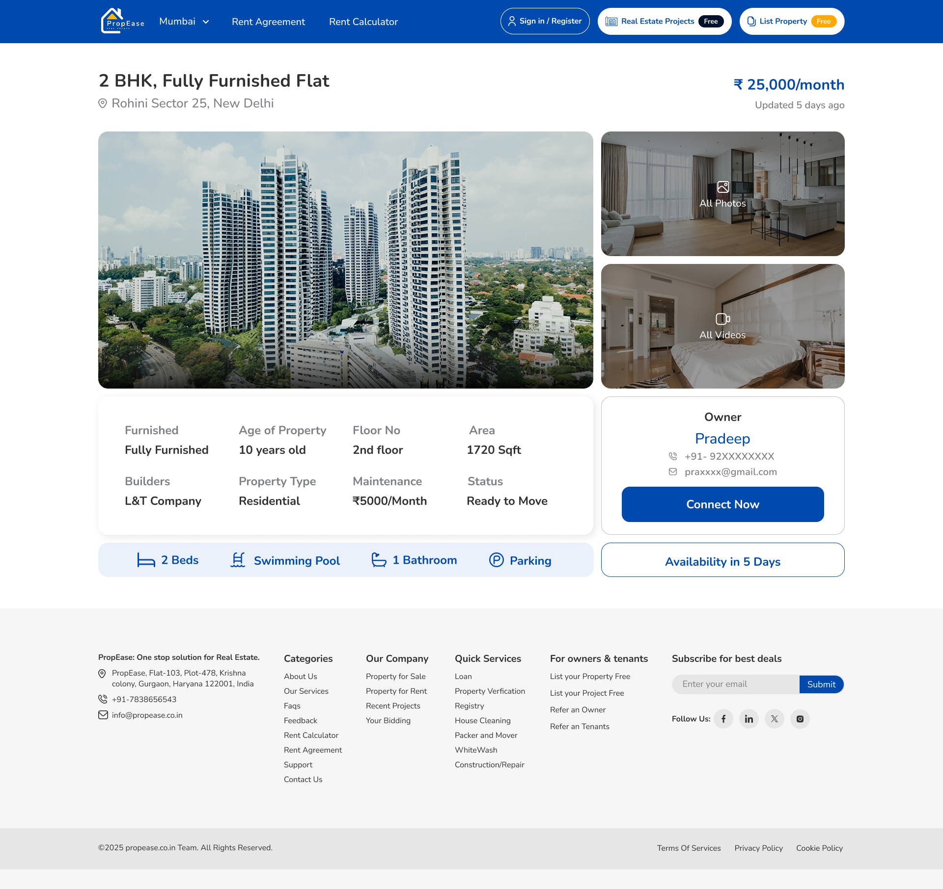
05
Rent Detail
Eight specs at a glance. Owner one tap away.
Wide image + All Photos / All Videos panel on the right. Eight-cell spec strip — Furnished, Age, Floor, Area, Builder, Type, Maintenance, Status. Sticky Owner card with name, masked phone, masked email, Connect Now CTA and an Availability in 5 Days badge.
06
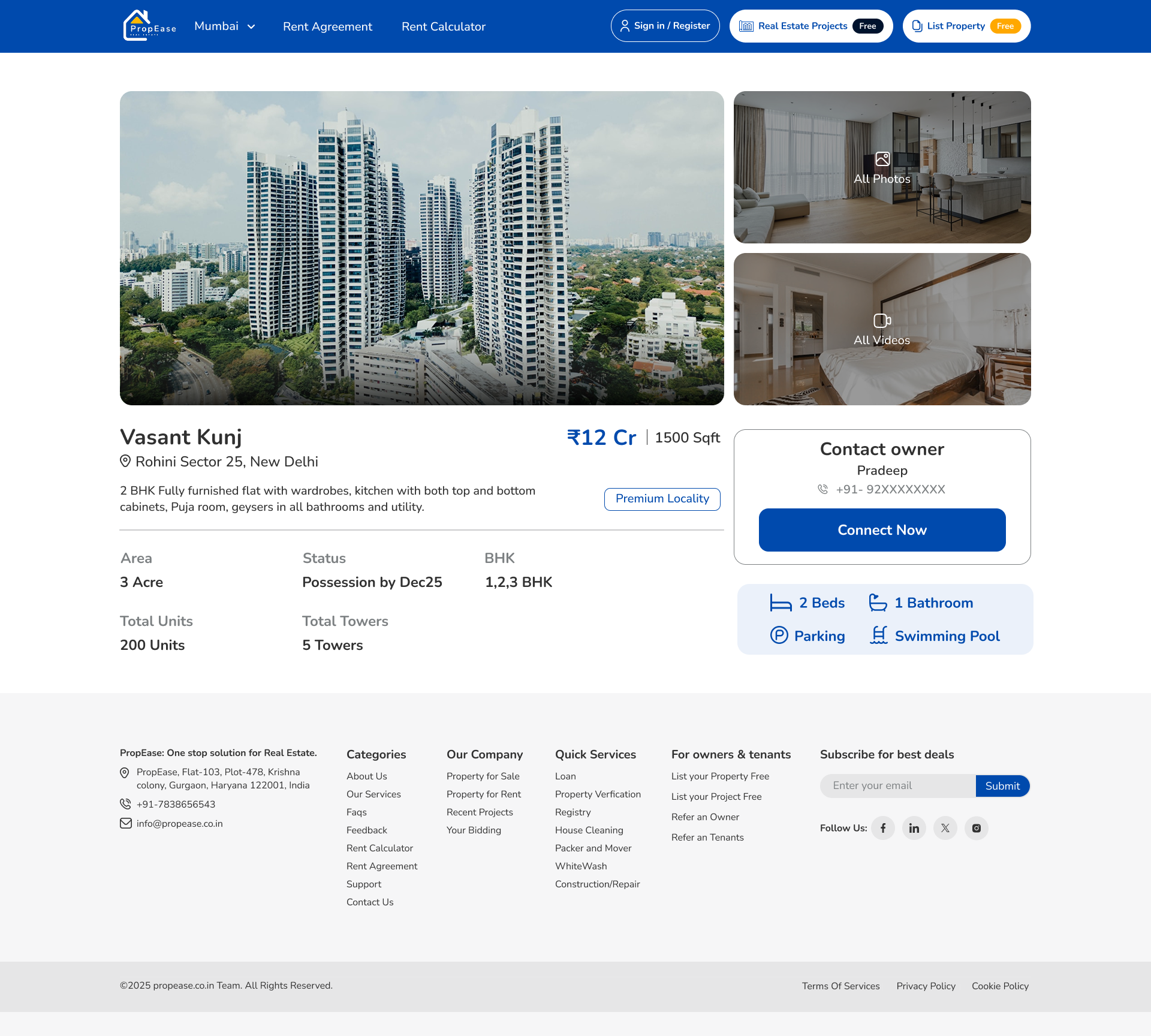
Property Detail (Sale)
Same anatomy, sale-tuned.
Identical card-and-spec system as the rent detail page, but the sticky CTA shifts from 'Connect Now' to 'Schedule Site Visit', and the meta strip drops Maintenance for an EMI Calculator link — one design, two financial languages.
07
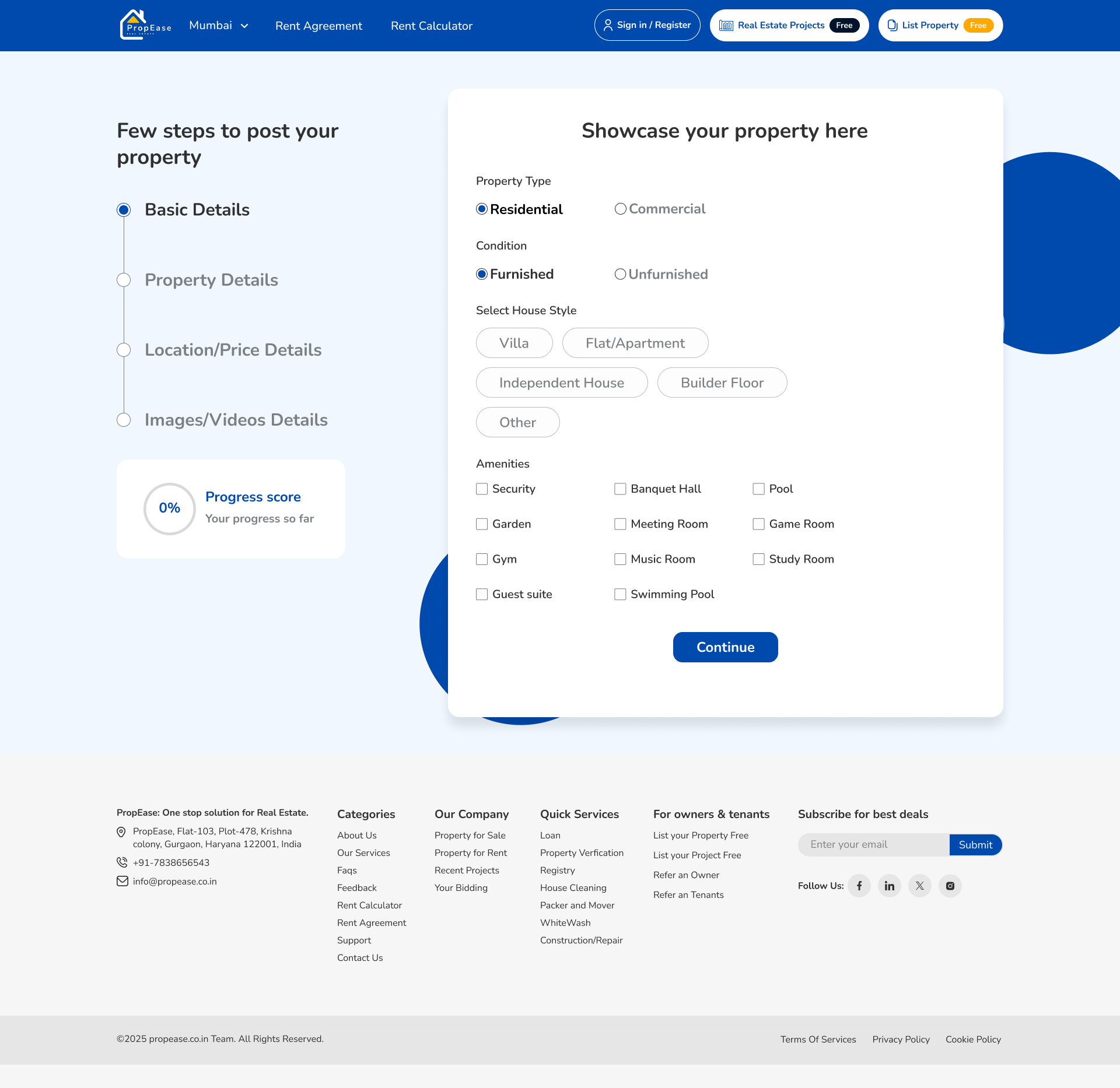
Post Property
Listing free, with the friction stripped out.
A two-step form, step one on screen: Property For (Sale/Rent), Type, City, Locality, Address, Plot, Floor, Furnished/Unfurnished. No phone-call pop-up at the end — the listing just goes live, then a yellow Free badge reminds the owner why they're here.
08
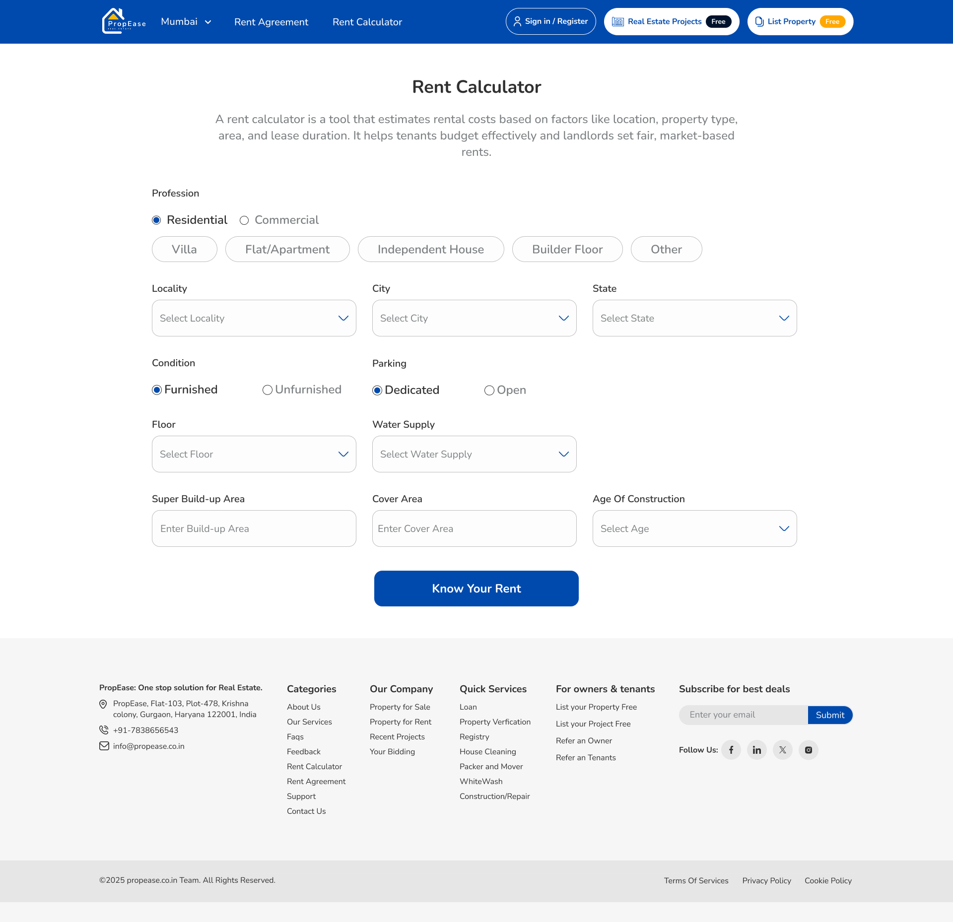
Rent Calculator
A lead engine disguised as a tool.
Residential/Commercial toggle, type chips, locality/city/state, furnished, parking, floor, water supply, super build-up area, cover area, age of construction. One blue 'Know Your Rent' button. The number anchors the page; the listings rail loads underneath.
09
Rent Agreement
Paperwork inside the product, not on WhatsApp.
Left rail captures owner & tenant details, deposit, lock-in, notice period and clauses. The right rail renders a live A4 preview that updates as the user types. One PDF download — and the deal closes without anyone ever leaving PropEase.
Usability Testing · Weeks 11–12
What broke in front of real users — and what we changed.
Two rounds of moderated tests with 14 participants (8 tenants, 4 owners, 2 builders) on a clickable Figma prototype. Four findings led to direct UI changes before dev handoff.
Buy / Rent toggle invisible above the hero photo
Before
Toggle sat as a thin pill on the photographic hero — 6 of 8 users in round-one tests scrolled past it and tried to use the URL.
After
Lifted the toggle into a solid white capsule pinned to the top of the hero, with the active state filled in brand blue. Zero misses in round-two tests.
Rent calculator felt like a form, not a tool
Before
All 12 fields stacked vertically in one tall column. Users abandoned at field 7 — 'this looks like a loan application'.
After
Split into a 3-column grid grouped by Property / Location / Condition, with a sticky 'Know Your Rent' result card on the right that previews the number as fields fill in.
Owners didn't know 'List Property' was free
Before
Header link read 'List Property' in plain text. 4 of 6 owners assumed there was a paywall on submit and quit before opening the form.
After
Added the amber 'Free' pill next to the link, repeated it on the post-property submit button and on the success state. Submit rate climbed in round two.
Rent Agreement clauses felt legally risky
Before
Default clauses were pre-filled but un-editable. Tenants and owners both refused to download — 'I want my lawyer to see this first'.
After
Made every clause editable inline, added a 'Reset to default' link, and surfaced a small 'Reviewed by a partner advocate' caption under the preview.
Design Principles
Four rules that kept the marketplace from sounding like a broker.
Trust travels in one blue
The brand owns a single confident blue. Every confirm button, every active state, every owner-contact card uses it — no second 'primary' color anywhere. The result reads as institutional, not real-estate-broker pushy.
Free is a feature, not a footnote
Free. Listings stay free for owners and tenants — 'List Property' wears a yellow Free badge in the header. Zero brokerage isn't tucked into Why PropEase; it's the loudest design element on every page.
One card, six surfaces
Project and property cards appear on Home, Listing, Project Detail cross-rail, Bidding history, Recent Projects and the personal dashboard. We designed them once with photo, locality, price, BHK and meta — every surface composes from that single atom.
Help, not chat
Instead of a chatbot, we shipped four 'Request Services' tiles — Loan, Verification, Registry, Rent Agreement, House Cleaning, Whitewash, Construction. Real services with real partners, surfaced exactly when a transaction makes them relevant.
Tenant Journey
From a city pick to a signed agreement, ninety seconds in.
00:00
Land on Home
City picker locked to Mumbai. Hero reads 'Home to Stay. Shop to Grow. Just Rent it.' A Buy/Rent toggle sits above six chips: Residential, Commercial, Farm House, New Launch, Plots, Projects.
00:10
Browse a category
'Explore Now' rail shows live counts: 70 Apartments, 25 Villa, 35 Independent House, 60 Builder Floor — each a photographic chip, not a dropdown.
00:25
Open the Listing
Top Properties grid with locality, price, BHK, sqft and owner avatar. Same atom appears in Top Properties for Rent and Top Properties for Commercial — three rails, one card.
00:45
Open a property
Photo header + All Photos + All Videos panel. Eight-spec strip (Furnished, Age, Floor, Area, Builder, Type, Maintenance, Status) and a sticky Owner card with Connect Now CTA.
01:05
Try the Rent Calculator
Twelve fields — profession, locality, parking, water supply, floor, super build-up area, age of construction. One blue 'Know Your Rent' button. A confident number, instantly.
01:25
Generate the agreement
Owner and tenant details, deposit, lock-in, notice. A live A4 preview renders on the right. Download the PDF — the deal closes inside PropEase, not over WhatsApp.
Design System
One blue. One badge. One card.
Wordmark
PropEase
A condensed sans with a roof-shaped mark over the 'P' — institutional, never loud. Always blue on white.
Free badge
A single amber pill that follows 'List Property' and 'Real Estate Projects' everywhere — the loudest reminder that PropEase doesn't charge.
Primary CTA
Every confirm action — Connect Now, Know Your Rent, Submit, Offer Now — uses the same brand blue. There is no second 'primary' button anywhere.
Smart Surfaces
Useful nudges, never a chatbot.
No AI sidekick. Instead, four quiet insights surface on the dashboard rail — reading your saved properties, your last calculator estimate and live owner activity in your chosen locality. One helpful line at a time.
Rohini Sector 25 had 18 new 2BHK rentals listed this week — median ₹24,800/month.
Owners on PropEase typically close a tenant within 11 days of listing, free of brokerage.
Your last calculator estimate for a 1720 sqft furnished 2BHK in Rohini was ₹25,000/month.
Three of your saved projects offer possession by Dec 2025 — two are under ₹1.5 Cr.
Personal Reflection
What twelve weeks of PropEase taught me.
Senior work is not the screens that shipped — it's the screens that didn't, and the reasons why. Three honest notes from the project.
What I'd do differently
Run the moderated usability tests in week 6, not week 11. We carried two visual decisions (the photographic hero and the wizard-style agreement) for a month longer than we needed to, because we trusted the moodboard over a real user. The cost was two extra sprints of rework that a 90-minute test in week 6 would have prevented.
What I learned
Trust in real estate is built by what you refuse to do. Refusing a second primary colour, refusing a chatbot, refusing to send the agreement to a third party — every 'no' tightened the product. The strongest design decisions on PropEase were the things we left out, not the things we added.
What surprised me
The rent calculator outranked the home page on SEO within eight weeks. I designed it as a credibility tool, not an acquisition channel — the growth lead wired it into a city-by-city landing strategy and turned a 12-field form into our cheapest signup. A reminder that designers don't own how the work gets used.
Next case study
Have a marketplace that needs a calmer second draft?
I help founders turn portals into products — one trusted color, one shared card, and a checkout that actually closes inside the app.