Case Study · Hospital & Medical Services Website
Designing healthcare information that patients actually trust.
ProHealth is a multi-department hospital and medical services provider serving patients across Cardiology, Emergency, Paediatrics, Psychiatry and Neurology. We designed their full public website — from a homepage that establishes trust on first contact, through department listings, doctor profiles, and appointment booking — creating a digital experience that feels as compassionate as the care the hospital delivers.
Client
ProHealth
Industry
Healthcare · Medical Services
Service
UI/UX · Information Architecture
Platform
Web (Desktop + Mobile)
Team
1 UX Designer · 1 Content Strategist
Timeline
4 months
Goal
Serve anxious patients and referring physicians on the same screen.
Patients arrive worried and time-pressured; physicians evaluate specialisations and credentials. Both audiences had to find what they needed in seconds.
Challenge
Calm blues — not bureaucratic blues.
Healthcare defaults to either sterile corporate white or vague soft language. ProHealth needed clinical excellence that still felt warm and accessible.
Outcome
Eight templates that hold together as one calm system.
Homepage, About, Departments, Department detail, Doctor directory, Doctor profile, Blog, Contact — plus a persistent appointment booking widget.
8
Page templates designed
6
Specialist departments
150K+
Patient recoveries surfaced as social proof
Project Timeline
Four months from research to booking flow.
01 · Month 1
Discovery & User Research
02 · Month 2
Information Architecture & Wireframes
03 · Month 3
Visual Design & Component System
04 · Month 4
Doctor Directory & Booking Flow
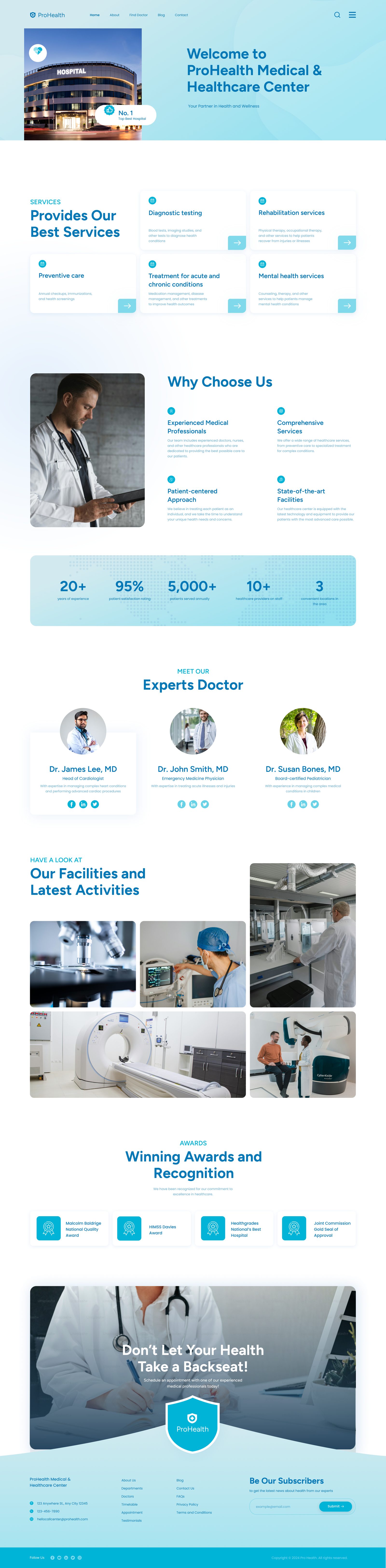
Section 1 · Homepage
The first screen does the heaviest lifting.
A worried patient lands on the homepage and meets warmth and credibility at the same time — empathetic headline, real photography of medical professionals, floating stat bubbles for social proof, and a booking strip that lets them act before they ever scroll.
- Empathetic headline anchors the visit in warmth
- Real photography signals trust — no stock medical clichés
- Floating stat bubbles keep numbers contextual, not corporate
- Persistent booking strip serves the most time-sensitive visitor first
Design Pillars
Warm enough to trust, clinical enough to believe.
Trust on First Contact
Real photography of doctors and surgical teams — no stock hand-holding, no empty hospital corridors.
Findable Specialisations
Six departments presented without hierarchy — the patient's path to the right care is always one click away.
People, Not Database Entries
Doctor profiles read like personal pages — qualifications, experience, and a human presence.
Section 2 · Department Architecture
Making specialisations easy to navigate.
Six departments — Emergency, Cardiology, Paediatrics, Obstetrics & Gynaecology, Psychiatry and Neurology — presented in a flat 3-column grid with no hierarchy. Every department is equally findable, because routing a patient to the right care is the highest-priority action on this page.
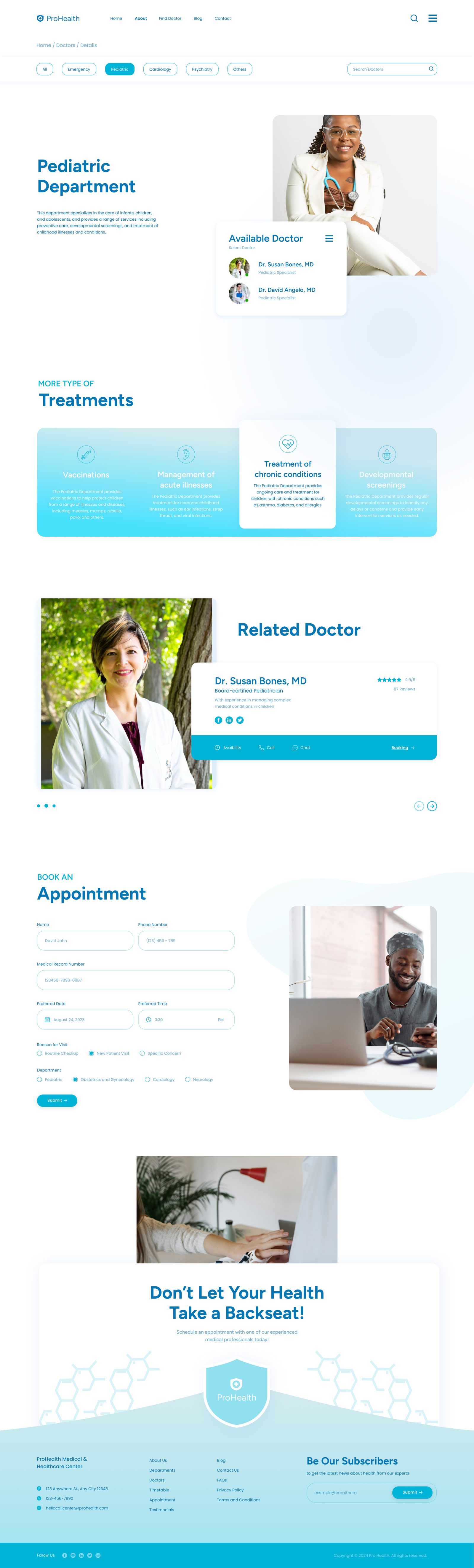
Department detail — services, team and equipment
Section 3 · Doctor Profiles
People choose doctors, not departments.
The directory filters by department and searches by name. Individual profiles open with portrait photography and a department banner, then a rich bio — qualifications, board certifications, years of experience — and structured sections for Degrees, Experiences and Contact. Patients should feel they know this person before they ever step into the office.
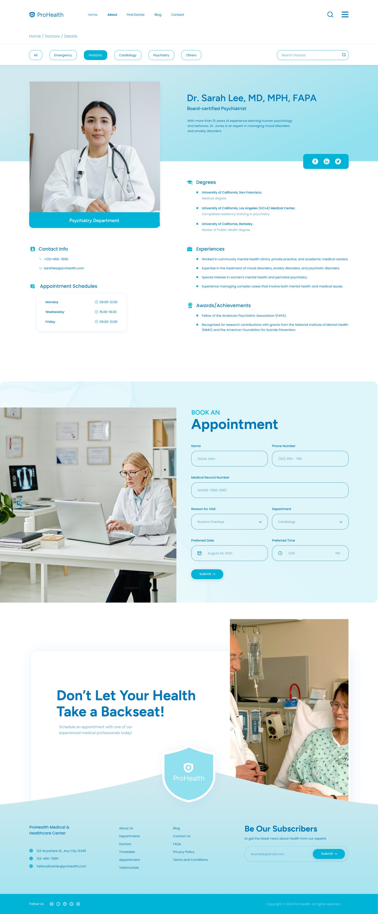
Filter by specialisation
Chips for All / Emergency / Paediatric / Cardiology / Psychiatry / Others — and a name search alongside.
Human bio, not a database row
Qualifications, board certifications, and a specialisation summary written to be readable.
Structured trust signals
Degrees, Experiences, Contact Info, and social links — every detail earns the appointment.
Supporting Pages
About — who's behind the care.
The About page extends the homepage's warmth — leadership, hospital story, and the values that ground every patient interaction.
Design System
A teal that heals.
Cyan-teal (#0EA5E9) replaces the institutional navy most hospitals default to. The result is lighter, more optimistic, and more accessible — without sacrificing clinical credibility.
Teal Primary
#0EA5E9
Light Blue
#EFF6FF
Soft Teal
#E0F2FE
Dark Navy
#0C4A6E
White
#FFFFFF
Buttons
Teal primary; navy outline secondary — calm contrast, no alarm.
Booking strip
Persistent across the site — patients act before they scroll.
Filter chips
Filled teal for active state; white with soft teal border for the rest.
Want to see more? Let's talk about your project.