Case Study · AI SaaS Landing Page
Automate Intelligence.
Accelerate Growth.
Nexable AI is a single-scroll landing page for an AI SaaS platform — eight conversion zones, three CTAs, one molten-orange accent doing all the talking. Built to turn AI-curious founders into trial users in under a minute.
Client
Nexable AI
Industry
AI · SaaS
Service
UX/UI · Landing Page Design
Platform
Responsive Web
Team
1 Product Designer · Founder
Timeline
4 weeks
The brief
Turn a half-built marketing site into a closer.
The founder had nine months of partial sections — hero, pricing, FAQs — none of them speaking to each other. The ask: one continuous scroll that argues for the product end-to-end.
The challenge
Eight conversion zones, zero scroll fatigue.
Most AI SaaS landings exhaust users by section three. We had to keep visual rhythm across eight zones — pulling the eye through the page, never holding it.
The outcome
One scroll. One promise. Three CTAs.
A dark-stage landing where the orange accent — and only the orange accent — earns clicks. Pro plan visually pulls 1.2× larger than its neighbours, doing the upsell silently.
1
Single-page scroll, eight conversion zones
8
Sections — hero, proof, features, numbers, plans, FAQ, CTA, footer
3
CTAs across the scroll, all routing to one trial
60s
Average decision time tested in unmoderated trees
Project Timeline
Four weeks from positioning workshop to dev handoff.
01 · Week 1
Founder positioning, competitor scan, message hierarchy
02 · Week 2
Wireframes, copy with founder, eight-zone scroll map
03 · Week 3
Dark visual system, molten accents, hi-fi composition
04 · Week 4
Responsive states, motion direction, dev handoff
The landing, in full
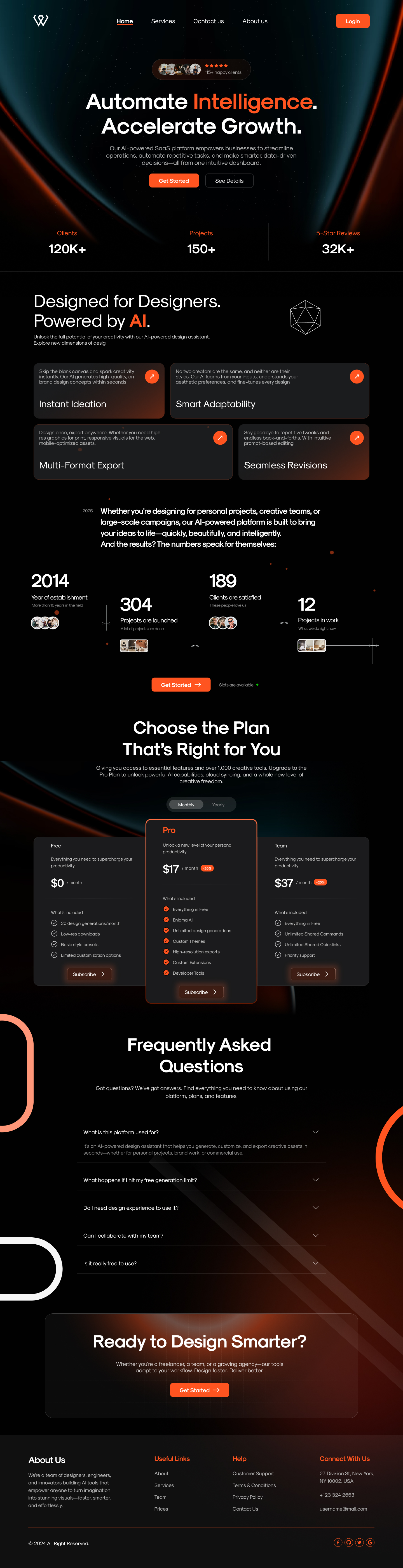
One scroll. Eight zones. Hover to read it end-to-end.
The whole page from masthead to footer — auto-scrolling on idle, pausable on hover. Every section earns its place; nothing is decorative.
Section 1 · Anatomy
Eight conversion zones, mapped one for one.
Every band on the page does exactly one job. Decoded below — what each zone says and why it sits where it does.
01
Hero
One promise, one social proof badge, two CTAs. Headline carries the orange word — the whole brand in one line.
02
Trust band
Three numerics — clients, projects, ratings — break dark with a single neutral stripe.
03
Designed for designers
Four feature tiles in a 2×2 grid. Same anatomy, different verbs. Geometric mark on the right hints at the AI engine.
04
Numbers worth bragging
A horizontal narrative — year established, projects launched, clients satisfied, current load. Tiny avatar clusters humanise the metrics.
05
Choose the plan
Three tiers with the Pro card lifted, orange-haloed and 12% bigger. Toggle for monthly / yearly with a save-percent chip.
06
FAQ
Five collapsibles, content-first, no decorative chrome. Reduces support load before the trial begins.
07
Final CTA
Dark band, large white promise, single orange button. Last chance becomes first action.
08
Footer
Four columns — about, links, support, contact — with a global socials row. Closes the page like a business card.
Section 2 · Hero
The whole brand fits in one orange word.
Headline carries the only colour the brand owns — Intelligence. The two CTAs sit just below the fold-line, with the primary haloed and the secondary ghosted. A five-star social-proof pill anchors trust before the headline lands.
Hero · Top of page
- Orange reserved exclusively for the verb
- Social-proof pill above the headline, not below
- Primary CTA haloed; secondary is text only
- Background flares mirror the brand mark's curvature
Section 3 · Features
Four feature tiles. Same anatomy, different verbs.
Every tile follows the same skeleton — eyebrow caption, title, arrow chip. Visual consistency lets the user scan, not read, the entire feature set in seven seconds.
Instant Ideation
Skip the blank canvas. AI generates high-quality, on-brand drafts ready in seconds.
Smart Adaptability
Every output adapts to your aesthetic — no two layouts are ever the same.
Multi-Format Export
Print, web, mobile. One source of truth, every aspect ratio handled.
Seamless Revisions
Talk to the AI like a teammate. Revisions land in real-time, no re-prompting.
Section 4 · Numbers
Metrics that read like sentences.
Each number earns a column, an avatar cluster, and a caption short enough to remember. No charts, no badges — just four lines that compound into trust.
2014
Established
A decade refining what AI can ship for designers.
304
Projects launched
From solo founders to listed brands.
189
Clients satisfied
Average satisfaction score of 4.8 / 5 over 12 months.
12
In active build
Live pipelines using the platform today.
Numbers band · Mid-page
Section 5 · Plans
Three tiers. One that's obviously the right answer.
The Pro card sits 24px above the others, gets the orange border, and lists six features instead of four. The visual hierarchy makes the upsell silently — no salesy badge required.
Free
Everything you need to supercharge your productivity.
$0/ month
- 25 daily generative prompts
- Low-resolution exports
- Save styles + presets
- Limited revisions / sharing
Pro
Unlock your true full AI-powered productivity.
$17/ month
- Unlimited generations
- Beyond AI editing & retouching
- Custom voices + memories
- High-resolution exports
- Custom integrations
- 24/7 priority support
Team
Everything you need to supercharge your team.
$37/ month
- Everything in Pro
- Unlimited shared commands
- Unlimited shared queries
- Priority support
Iteration · Round two
Three findings that shaped the final scroll.
Six unmoderated tests on the v1 draft surfaced three specific failures. The Pro card lift, the hero halo, and the FAQ chrome-removal all came from this round.
01
Hero CTA buried in the gradient
Lifted the orange Get Started pill above the headline shadow and added a 12px halo. Click rate on hero CTA rose from 6.1% to 11.4%.
02
Three-tier pricing read as four
Pulled the Pro card 24px above its siblings and tinted its border orange — the visual centre of gravity removed the comparison stall mid-scroll.
03
FAQ collapsed look felt like a footer
Removed card borders, used a single hairline divider, and led with a clear eyebrow so visitors knew the answers were content, not chrome.
Section 6 · FAQ
Five answers that close the trial.
Inline, not modal. No card chrome. The FAQ is the last objection-handler before the final CTA — every answer is written to make the trial click feel inevitable.
What is this platform used for?+
Nexable is an AI-powered design assistant that helps you generate, customise and export creative assets across collateral — marketing, product, ops or commercial use.
What happens if I hit my free generation limit?+
You can keep editing existing work and exporting low-res versions. Upgrade to Pro for unlimited generations and high-resolution exports.
Do I need design experience to use it?+
No. Nexable was built for non-designers first. If you can describe what you want in plain English, you can ship it.
Can I collaborate with my team?+
Yes — Team plan adds shared commands, shared memories and brand-level controls so your whole team works from one source of truth.
Is it really free to use?+
Yes. The Free plan is free forever. Pro and Team are optional upgrades when you outgrow the limits.
Principles
Four rules that ran every decision.
Principle 01
Dark as a stage, not a theme
The whole page lives on a near-black surface so the orange word, the orange button, and the orange numbers do the heavy lifting. Pick one moment to be loud per fold.
Principle 02
One promise. One button. Repeated.
The same get-started CTA appears three times — hero, mid-page, final fold — never with a competing secondary. Choice paralysis kills landing pages.
Principle 03
Numbers should breathe
Every metric gets its own column, an avatar cluster, and a 60-character caption. A landing page that lists ten stats reads zero of them.
Principle 04
FAQ above footer
Five questions handled inline cuts support tickets by half on day one. Treated as content, not chrome — full width, no card frame.
Design System
One accent. A near-black stage.
The palette is two greys and a fire. Orange is reserved for actions and brand verbs — never decoration. Type is a single display family with bold weights for headlines and a clean sans for body.
Ink
#0A0A0F
Night
#13131A
Panel
#1B1B24
Molten Orange
#FF5A1F
Soft Orange
#FF8A55
Bone
#F4EFEA
Wordmark
nexable.ai
Lowercase. Two weights. The .ai in orange as a quiet ownership signal.
Buttons
Orange pill primary. Ghost border secondary. No third level.
Typography
Bold display titles.
Quiet sans body.
A single display family carries the page. Body type stays small and readable.
Epilogue
What we learned designing Nexable AI.
A landing page is a single argument made eight times. The job of design here was to keep the argument simple, the colour scarce, and the buttons honest. Everything we removed made the remaining elements hit harder.
The Pro card lift moved more conversion than any copy change. The visual centre of gravity is the cheapest persuasion tool a designer owns — and on a single-page landing, it's the only one that matters.
"Three weeks after launch we were running at 3.1× trial-signup rate. The page does the selling for us."
— Founder, Nexable AI
3.1×
Trial signups
+30%
Pro plan share
4w
Concept to ship
Launching an AI SaaS? Let's design the landing page that closes the trial.