Case Study · Luxury Hotel Website
Where five-star hospitality begins before guests ever arrive.
Luxe Haven is a beachside luxury hotel positioned as a 5-star destination experience. We designed their full web presence — from the immersive homepage through the room catalogue, individual room detail pages, and booking flow — crafting a visual identity that translates the atmosphere of a premium resort into a digital experience that sells stays on sight.
Client
Luxe Haven Luxury Hotel
Industry
Hospitality · Tourism
Service
UI/UX · Booking Experience
Platform
Web (Desktop + Mobile)
Team
1 UI Designer · 1 UX Strategist
Timeline
4 months
Goal
Win the direct booking — not the OTA commission.
Build a website that could go head-to-head with Booking.com on visual quality while turning curious browsers into confirmed direct bookings.
Challenge
Hotels all look the same online.
Stock pools, stock beds, the same widget. Luxe Haven needed real differentiation — a site that feels like the lobby before you click Book Now.
Outcome
A complete hotel web experience.
Homepage, room catalogue, detail pages, restaurant, news and contact — anchored by a warm cream and gold identity that reads as effortlessly high-end.
10+
Page templates designed
3
Featured room categories with detail pages
1
Inline booking widget on every page
Project Timeline
Four months from brand research to handoff.
01 · Month 1
Brand Research & Competitor Audit
02 · Month 2
Booking Flow Architecture & Wireframes
03 · Month 3
Full Visual Design
04 · Month 4
Room Detail Pages & Handoff
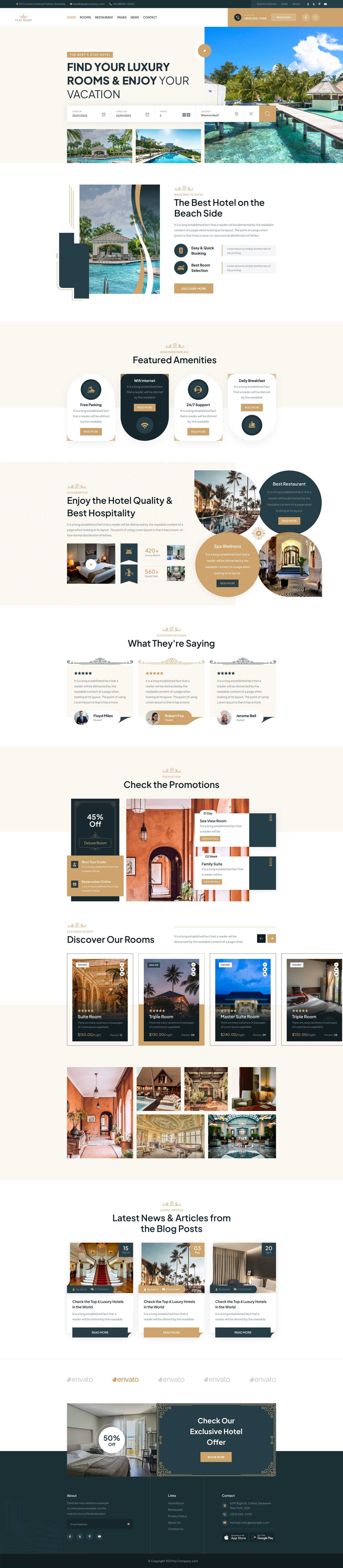
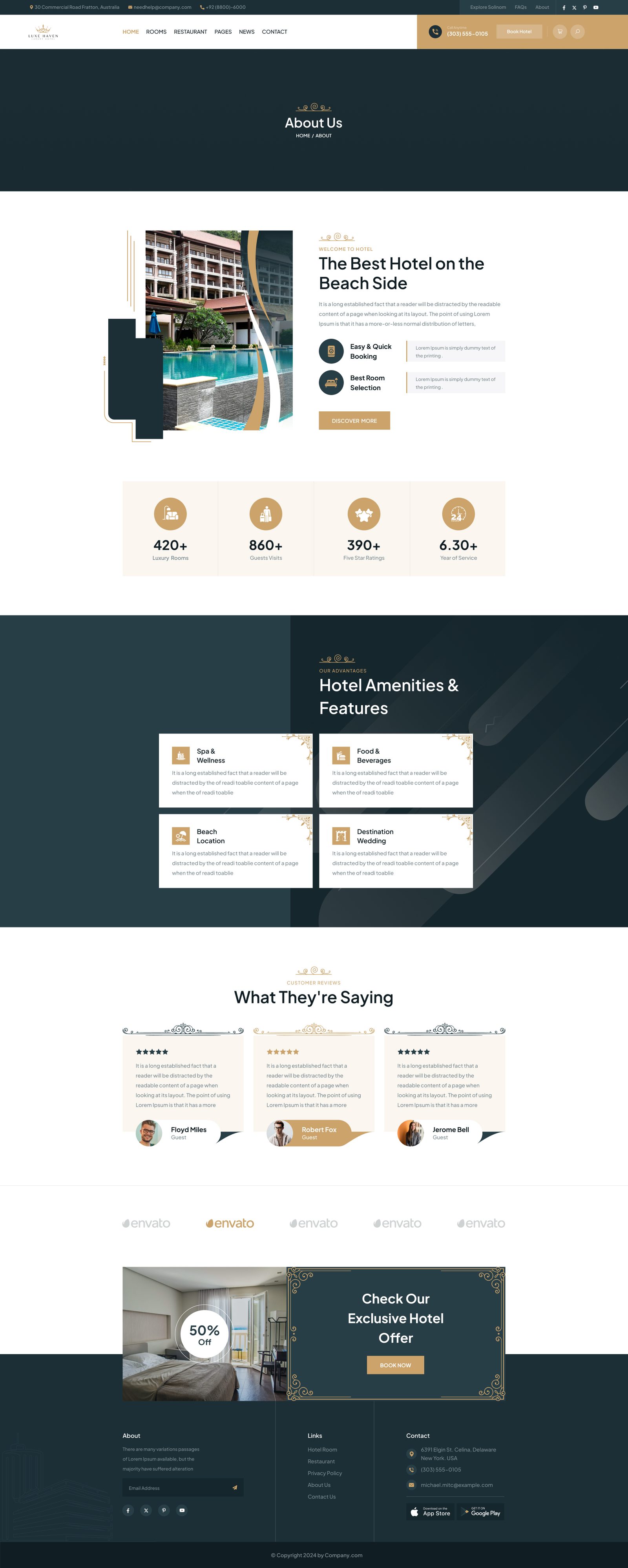
Section 1 · Homepage
The website is the lobby.
A split layout opens on headline and booking widget against warm cream, with property photography — azure water, palms, overwater bungalows — anchoring the right. The inline booking bar sits directly below the hero: check-in, check-out, guests, location, search. No popup. No second page.
- Aspirational tropical photography above the fold
- Inline booking — zero friction from intent to action
- Gold accents signal luxury without shouting
- Lifestyle image grid reinforces the fantasy before any functional UI
Brand Pillars
Heritage luxury, frictionless booking.
Heritage Luxury
A cream and gold palette that reads as effortlessly high-end — timeless over trendy.
Photography-first Rooms
Each room card lets the photo do the selling — price, capacity and rating support, never compete.
Zero-friction Booking
An inline booking widget on every page — date, guests, location, search. Done.
Section 2 · Room Catalogue
Photography-first browsing.
Most hotel websites win or lose the booking on the room list. We made it photography-first — large card format, a prominent dark price badge, a Featured marker, plus star rating and capacity. Decisions get made without ever drilling into a detail page.
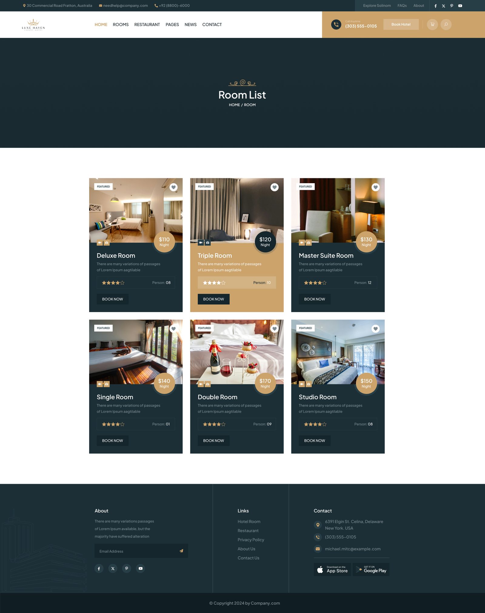
Deluxe Room
$110/nightWarm amber light, comfort-led.
Triple Room
$120/nightCool grey tones, emphasising space.
Master Suite
$130/nightRich burgundy, exclusivity-led.
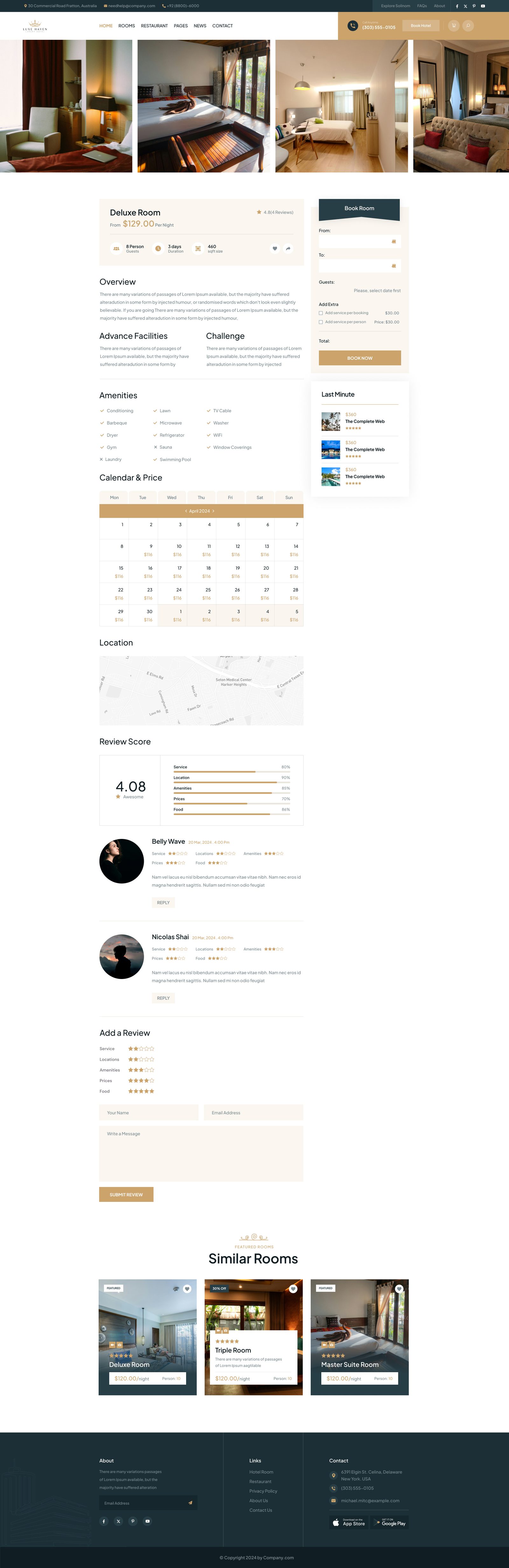
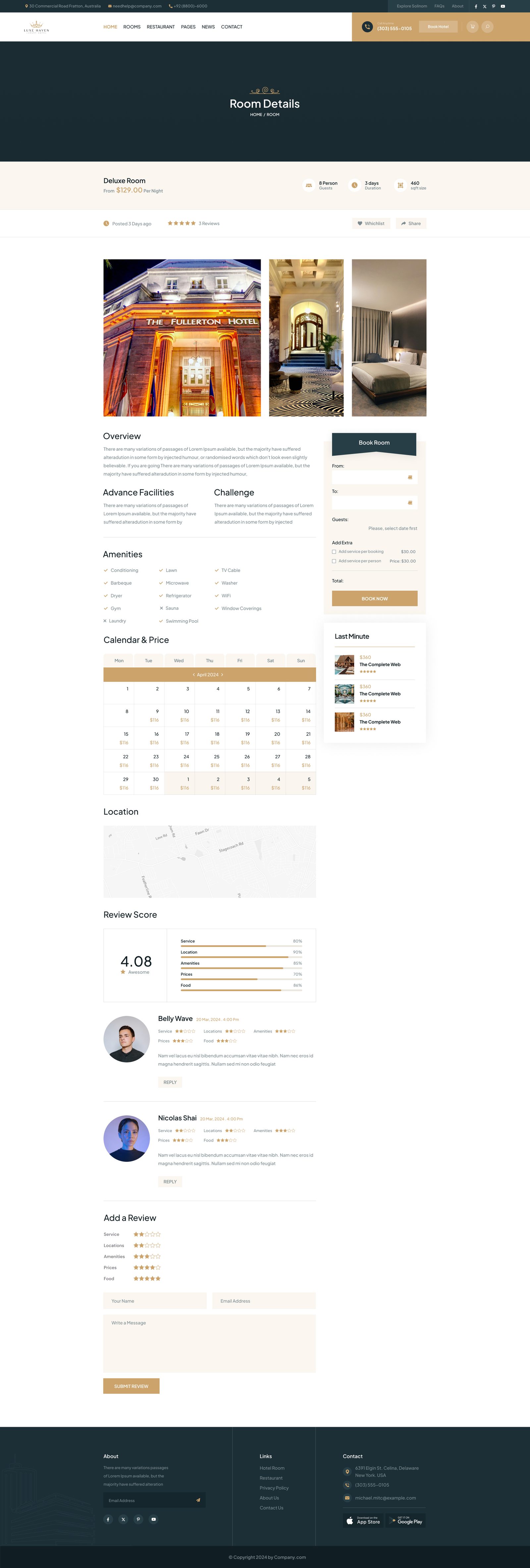
Section 3 · Room Detail Pages
Every detail earns the booking.
A dark-toned banner sets the premium tone, then a clean product-detail format takes over: large photography on the left, name, price, reviews, availability, quantity and dual CTAs on the right. The UI stays quiet so the room's photography can do its job.
Supporting Pages
A full system, not just a homepage.
Beyond hero and rooms, the design covers brand story, product, cart, checkout and account — the unglamorous surfaces where most luxury sites lose the booking.
About — brand story
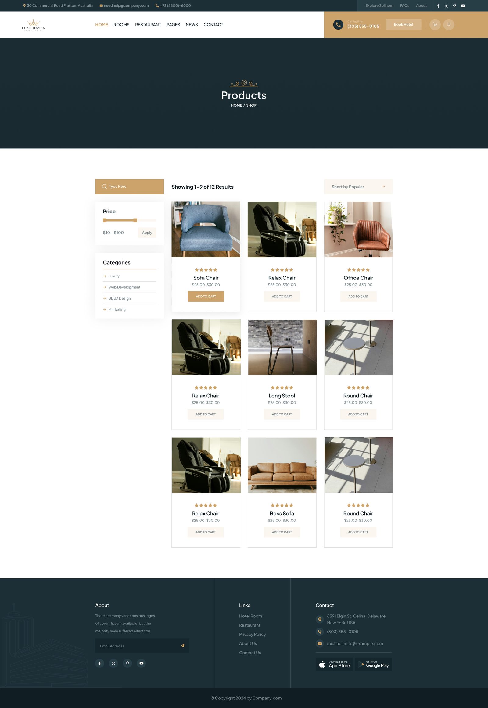
Shop — product list
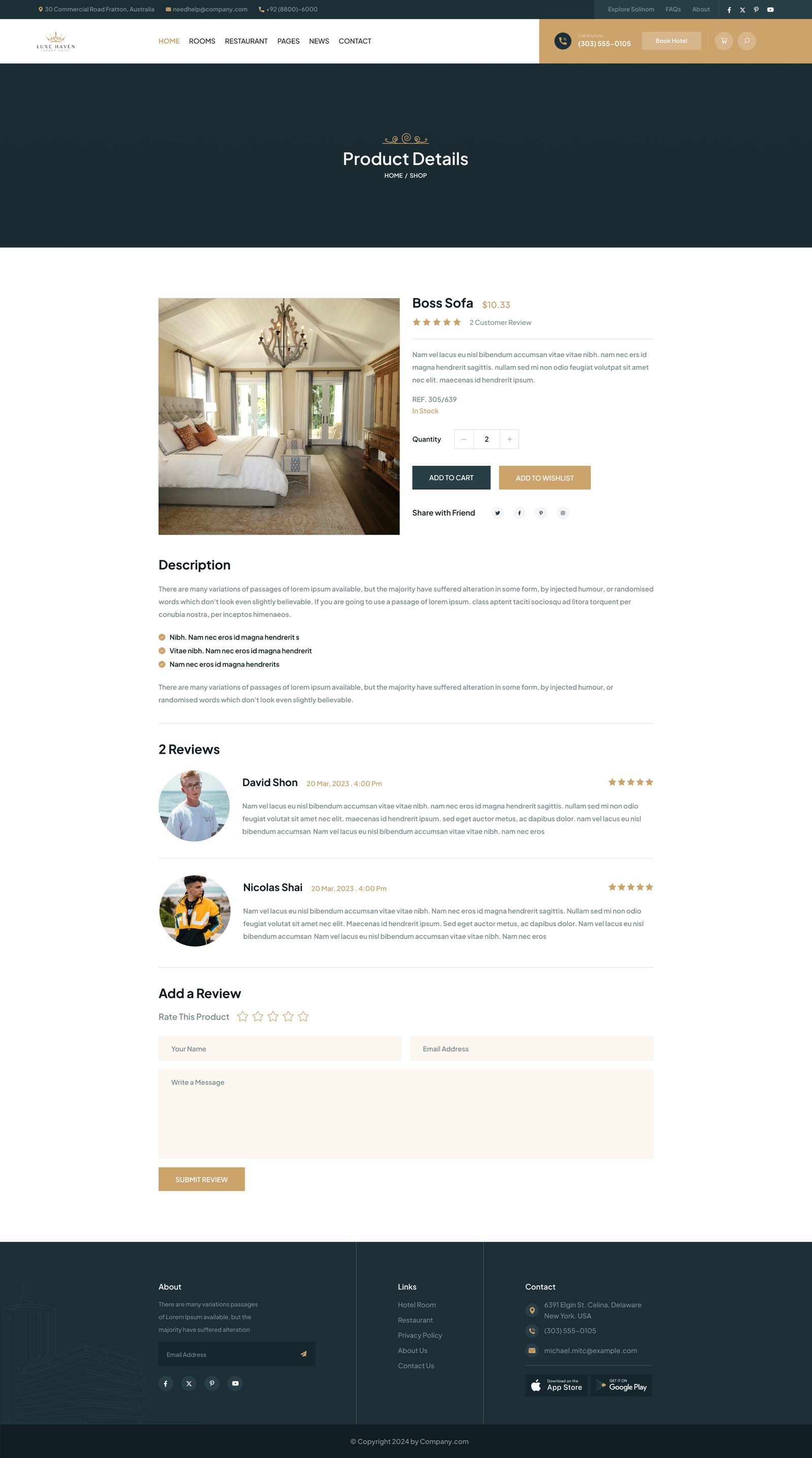
Product detail
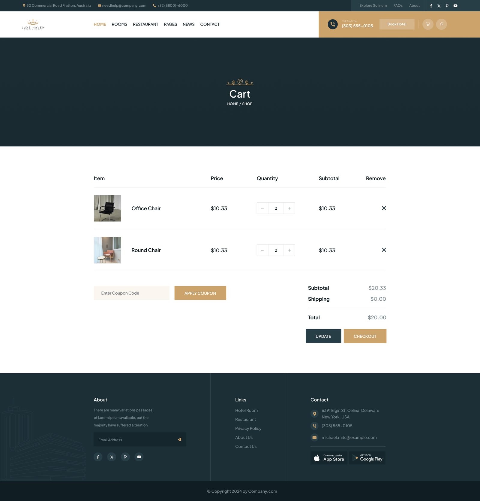
Cart
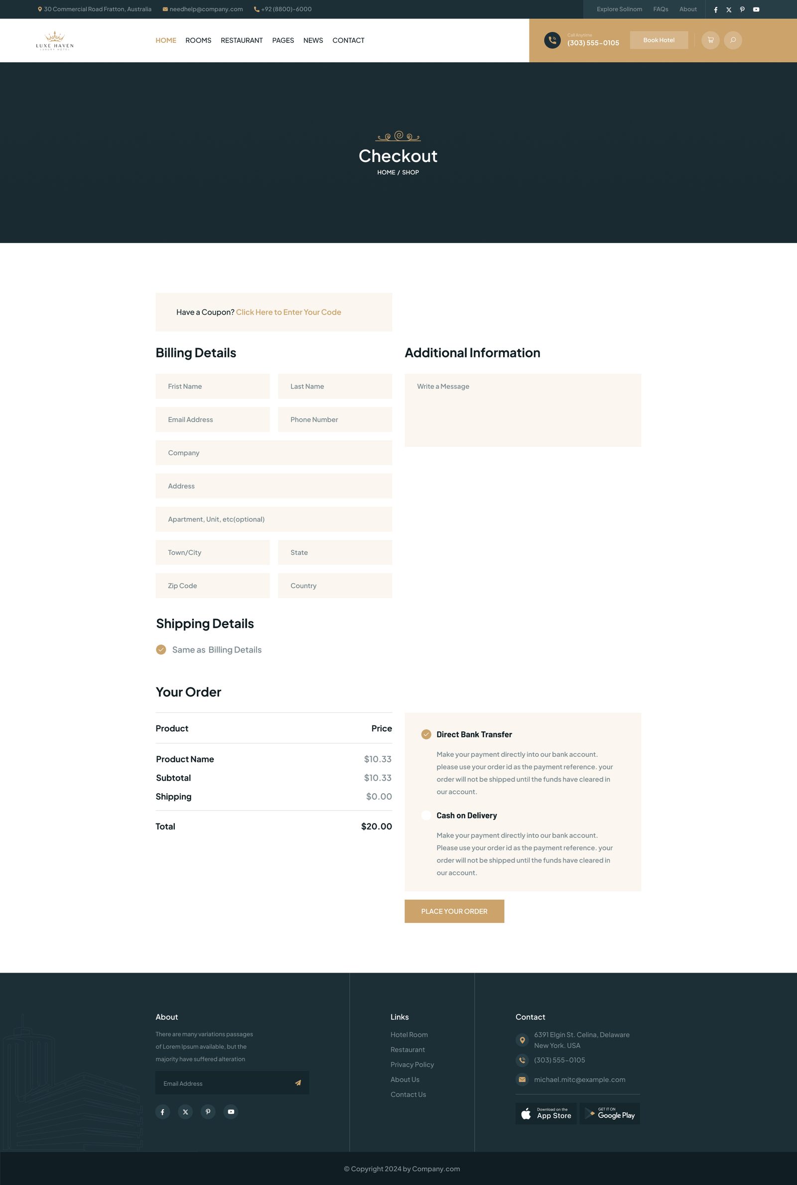
Checkout
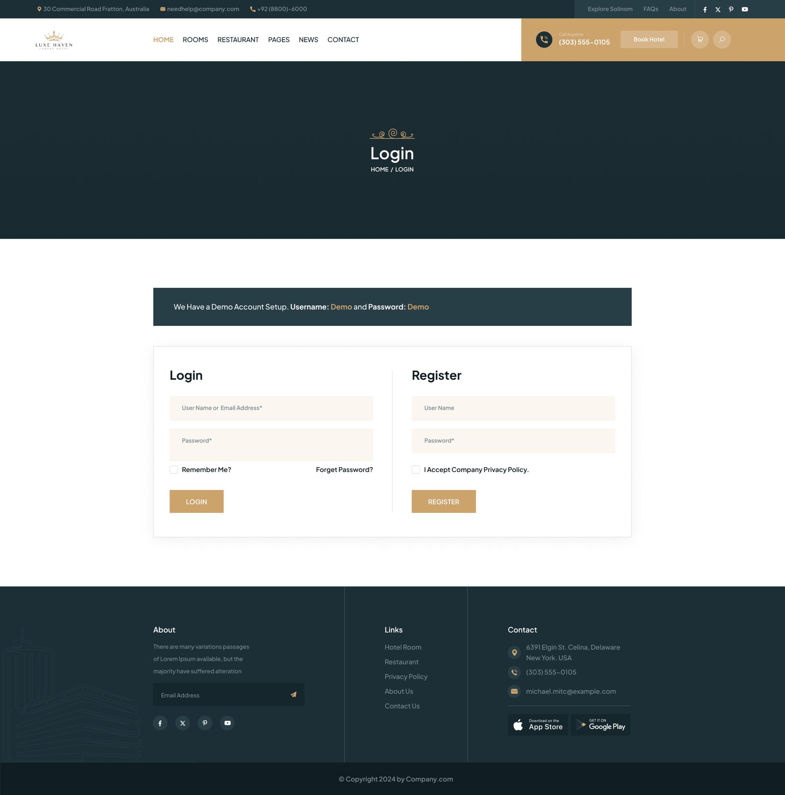
Login
Design System
Warm cream and gold — understated luxury.
Built around one principle: timeless over trendy. No gradients, no neon, no startup purple. The palette anchors on warm cream, forest dark teal, and gold — the visual language of heritage luxury brands.
Warm Cream
#FAF5EE
Deep Teal
#1A3A3A
Gold Accent
#B8860B
Near Black
#1A1A1A
White
#FFFFFF
Buttons
Dark teal primary; gold outline as the elegant secondary.
Booking bar
One horizontal bar, available on every page.
Typography
Strong serif display.
Clean sans body.
Display weight earns the luxury cue; the body stays calm and readable.
Want to see more? Let's talk about your project.