Case Study · Construction PM SaaS
Project management,
reimagined.
KYRO is a construction project management SaaS used by Project Managers and Owners across pipeline, sub-station and distribution projects. Across twelve desktop templates, we turned a noisy legacy build into a calm command center — two role homes, one red, and a three-step onboarding that ships the user into their first project in under ninety seconds.
Client
KYRO Construction
Industry
Construction · Project Management SaaS
Service
UX/UI · Web App Redesign
Platform
Desktop web · 1440 grid
Team
1 Designer · PM · 5 Engineers
Timeline
10 weeks
The brief
Redesign a construction PM tool that PMs avoid and Owners ignore.
KYRO had real customers and a real product — pipelines, sub-stations, distribution sites — but the legacy build was a wall of tabs. PMs lived inside email. Owners hadn't logged in in months. The team wanted a redesign that would be opened on a Monday and still be open on a Friday.
The challenge
Two very different jobs, one product, zero training budget.
The Project Manager works on the day — open tasks, RFIs, safety incidents, a delayed inspector. The Project Owner reads the week — budget, schedule, resources, risk across eight sites. One product had to greet both on log-in without explaining itself.
The outcome
12 templates. 2 role homes. 1 stamp-red language.
A PM home that lists today's work and a card-grid Owner dashboard that reads the portfolio. A three-step onboarding that builds the org before the first project. A single red that means 'do this' across every screen. Risk surfaces on the card, not behind it.
12
core desktop templates across PM and Owner roles
2
primary personas — Project Manager and Project Owner
4
projects on a single home screen, no scrolling
1
shared red — every action speaks one language
Research & Discovery
Two weeks on the phone with people in hard hats.
11 interviews across PMs, Owners and foremen. A teardown of five PM tools KYRO competes with. An information-architecture workshop with the founding team — who had not, until that week, drawn the IA on a single page.
User Interviews · 11 sessions
PM · 38 · Houston
Risk hidden in tickets"Site approval was delayed three weeks. I only found out because the foreman called me. The old tool had the risk — it was buried four screens deep."
Owner · 51 · Dallas
No portfolio view"I have eight projects running. I do not have time to click into each one to see if we are on budget. I just want one screen that tells me which projects are red."
PM · 29 · Indiana
Onboarding cliff"It took me four days to figure out where to upload our company logo. Once I did, I realised I had been on the wrong organisation for two of those days."
Foreman · 44 · Texas
Document graveyard"Licenses, contracts, RFIs — they are all somewhere. When the inspector showed up, I downloaded twelve PDFs before I found the right one."
Competitive Audit · 5 PM tools
| Tool | Home screen | Risk surfacing | Onboarding | Biggest miss |
|---|---|---|---|---|
| Procore | Dense table | Buried in reports | Multi-day setup | Powerful, but PMs avoid it |
| PlanGrid | Drawing-first | Manual flag | Account → invite → wait | Optimised for drawings, weak on portfolio |
| Buildertrend | Calendar | None at portfolio level | Long | Built for residential, not industrial |
| Monday.com | Generic board | Manual labels | Self-serve | Not construction-aware |
| Asana | Generic list | Manual | Self-serve | No site, no licenses, no incidents |
| KYRO 2.0 | Two role homes | Red badge on card | 3-step, < 90s | Built for the site, not the spreadsheet |
Home
- Project list (PM)
- Dashboard grid (Owner)
- Messages rail
- Notifications rail
Project
- Summary
- Tasks
- Risks
- Safety Incidents
- Decision Records
Org & People
- Organization
- Users
- Invite
- Roles
Settings
- Profile
- Company
- Notifications
- Logout
The four moves
Four design moves that quieted the entire product.
One home for the person in the hard hat.
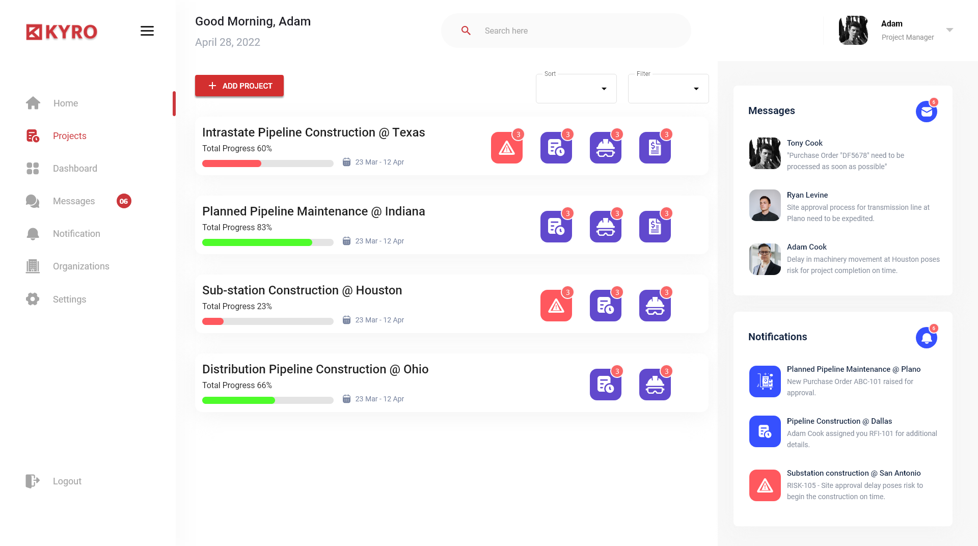
Project Managers land on a single Good Morning, Adam screen that shows every active site — Intrastate Pipeline @ Texas, Sub-station @ Houston, Distribution @ Ohio — with progress, dates, risk badges and one Add Project button. No tabs, no hunting.
Two roles, two homes — one design system.
Project Manager sees a list-first home; the Project Owner sees a card-grid Dashboard with budgets, schedule, resources and live risk on every project. Same atoms, two different mental models — the role flips the surface, never the shell.
Risk is a colour, not a click.
A single red triangle on a project card means delayed tasks, budget over-run or site-approval risk. A green progress bar means safe. The owner can read the entire portfolio's health in five seconds without opening anything.
Messages and notifications belong in the rail, not the inbox.
A persistent right rail holds the six most recent messages and notifications — Purchase Order DF5678, RFI-101 assigned, Site approval delay. PMs respond inline; the email never leaves the platform.
The first ninety seconds
From sign-in to first project, without a single dead-end.
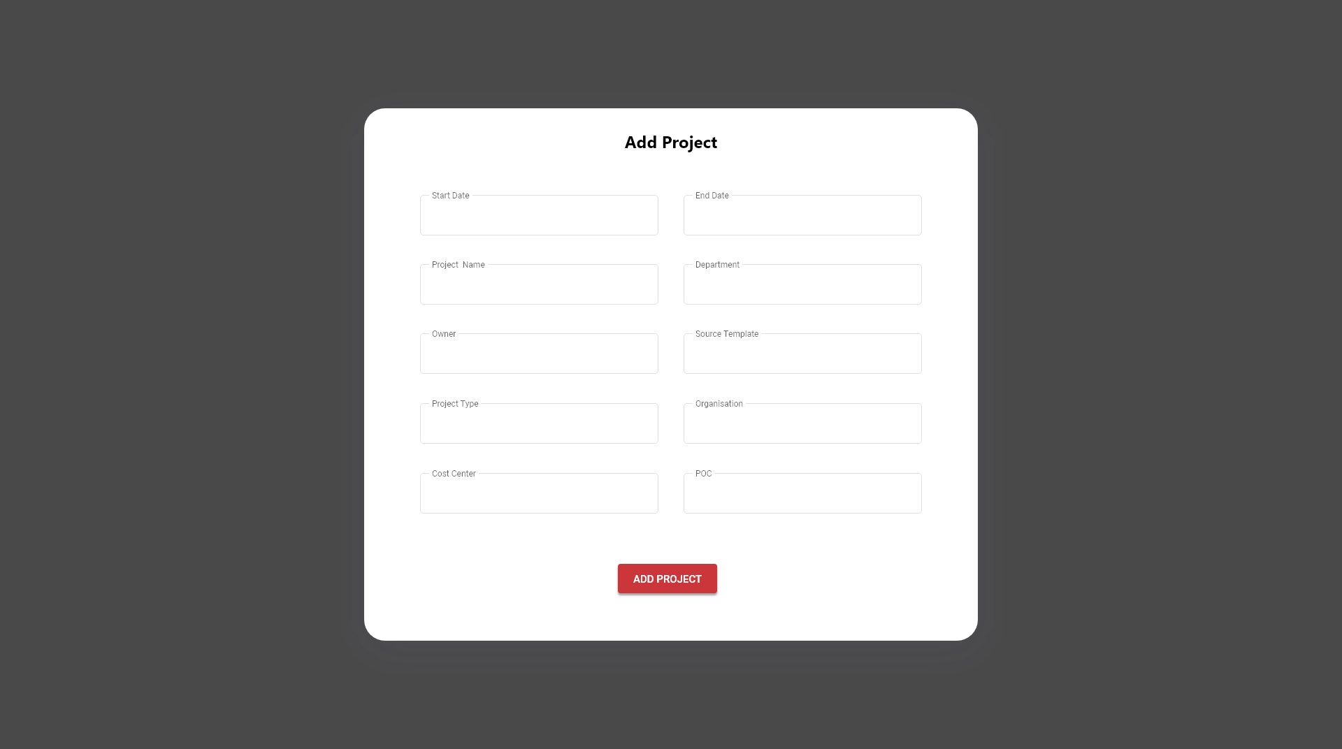
Two homes, one shell
The PM works the day. The Owner reads the week.
Project Manager home
A list-first home — four projects stacked top to bottom with progress, dates, workstream counts and risk badges. Messages and Notifications sit in a right rail. Add Project is the loudest pixel on the screen.
Project Owner dashboard
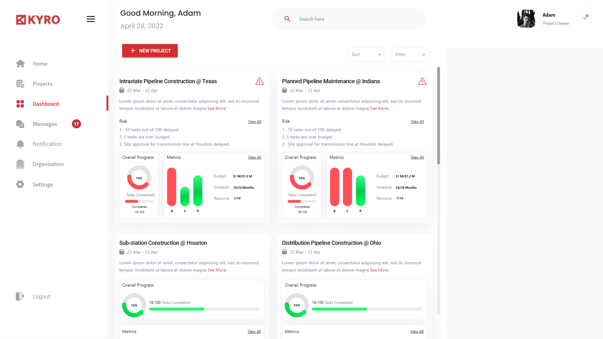
A 2-column card grid — each card carries description, risk list, an Overall Progress donut and a Metrics bar chart (Budget, Schedule, Resources). The Owner reads eight projects' health in five seconds without a click.
The project room
One project. Five tabs. Three rails. Zero hunting.
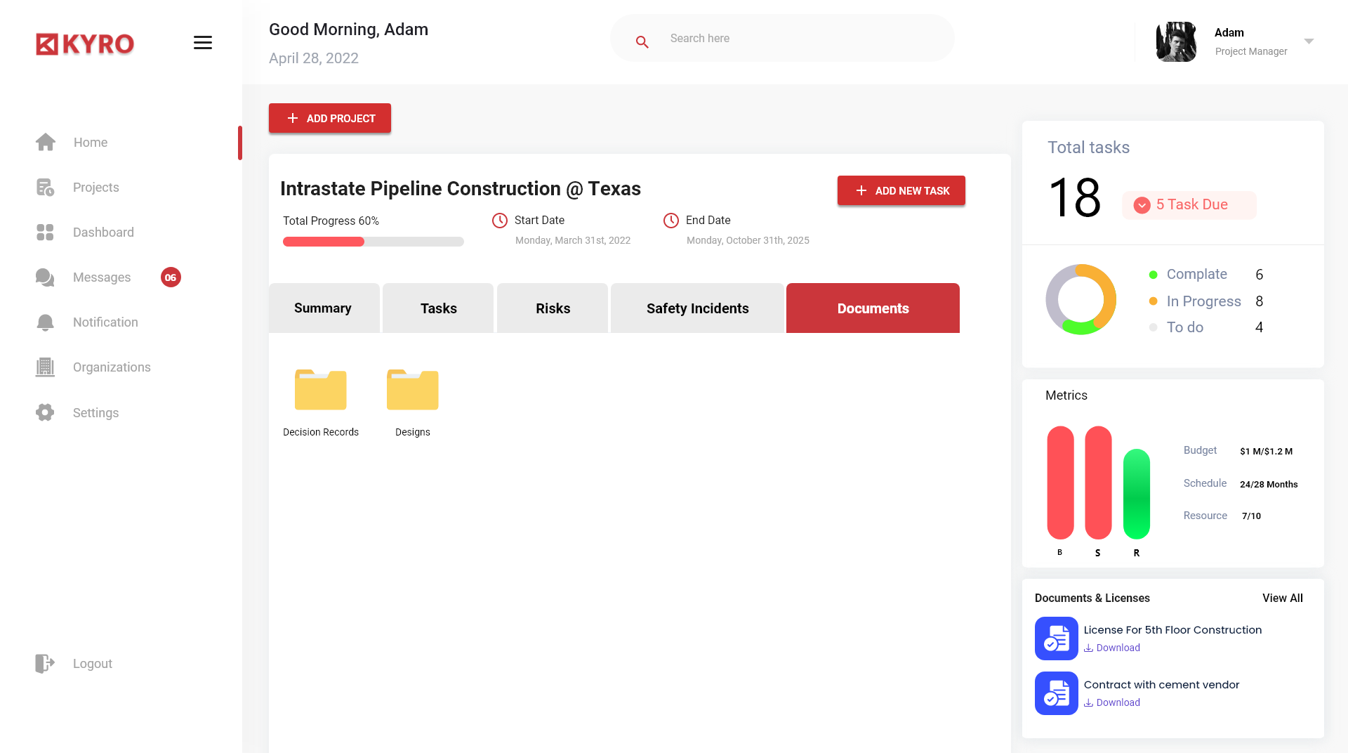
Summary · Tasks · Risks · Safety · Decisions
A 5-tab strip pinned directly under the project header. The PM never leaves the page to find anything that belongs to this project.
Total tasks, dues, breakdown — at a glance
A right-rail card shows 18 tasks, 5 due, and a donut split — Complete 6, In Progress 8, To Do 4. Read it in a second.
Documents & Licenses live with the work
License For 5th Floor Construction. Contract with cement vendor. Both downloadable from the rail. The PDFs stop disappearing.
People & permissions
The org page that knows where the user is going next.
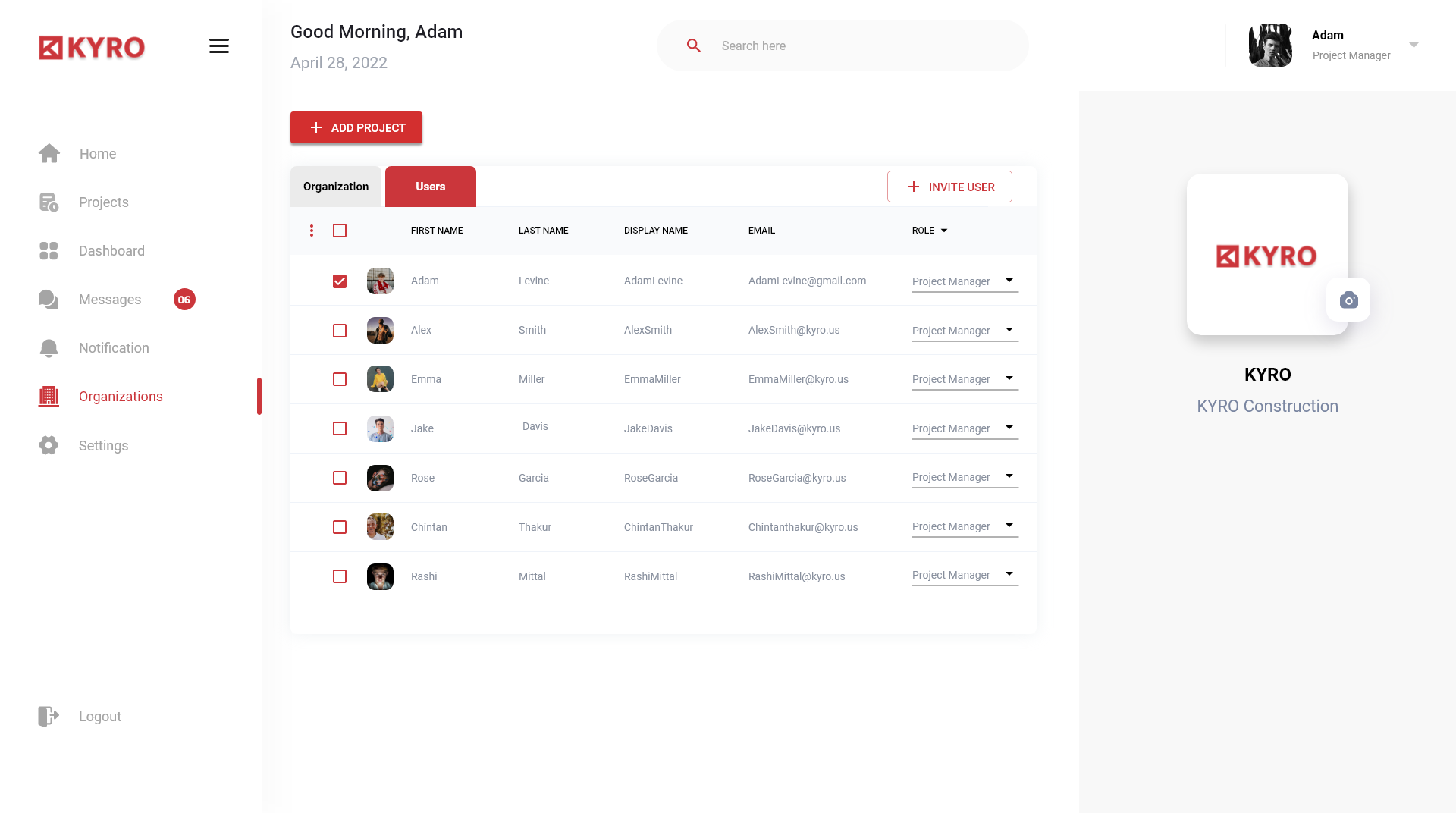
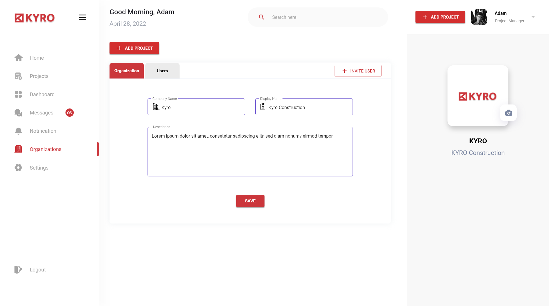
A two-tab strip — Organization | Users — opens straight to the team table. Each row carries avatar, name, display name, email and an editable role dropdown. Invite User is the only red action on the screen, by design.
Design decisions
Four hard calls, and the trade we walked away from.
Decision 01
One KYRO red for every primary action
Chose
A single confident #E53935 for Sign In, Add Project, Save Changes, Invite User and every active nav state.
Rejected
Red + Blue (action + info) and Red + Orange (CTA + accent). Both tested as 'fire-truck' in the moodboard — they coded the product as alarming, not authoritative.
Why
Construction PMs already live with high-alert colours on a real site. The product should not add a second alarm system. One red, used like a stamp, makes intent obvious without raising the room's blood pressure.
Decision 02
Card-grid Owner dashboard, list-first PM home
Chose
PM sees a vertical list (rows with progress, icons, dates). Owner sees a 2-column card grid with donuts and bars.
Rejected
A single shared home with a role toggle. It tested as confusing — the PM kept landing on charts they could not action, and the Owner kept landing on tasks they did not own.
Why
Role is not a filter; it is a posture. The PM works on the day. The Owner reads the week. Two homes share atoms and chrome but answer two different questions on first paint.
Decision 03
Three-step onboarding wizard with a fixed stepper
Chose
Profile → Organization → Confirm, with the stepper visible at the top-right of every step so the user always sees what is next.
Rejected
A single long form (legacy) and a five-step wizard (sales' suggestion). The long form had a 41% abandon rate; the five-step wizard tested as 'when does this end?'.
Why
Three is the smallest number that lets us split identity, organisation and consent. The fixed stepper kills the 'how much longer?' anxiety that the long form created.
Decision 04
Messages + Notifications as a persistent right rail
Chose
Six most-recent messages and six most-recent notifications in a fixed right rail on Home and Project screens.
Rejected
An inbox tab and a bell-icon dropdown (legacy). PMs reported missing 60% of inbound RFIs because the bell was a 'someday' click.
Why
On a construction site, missed RFIs cost real money. Putting messages on the same plane as work — not behind a click — turns the inbox into a glance.
Usability — before & after
Four findings that rewrote four screens.
Add Project floated above the list
Before
Add Project sat top-right in the legacy build; 5 of 7 testers tried to click the project card itself to create a new one.
After
Pinned a large red Add Project capsule to the very top of the project list, with a + icon. Zero misses in round two.
Risk badges read as decoration
Before
Generic red triangles with no count appeared on every card; PMs trained themselves to ignore them.
After
Added a 'small red dot with the number of open risks' on the triangle, and matched the triangle to the icon of the impacted workstream (Tasks, Site, Invoices). Notice rate went up sharply in round two.
Users tab inside Organization was invisible
Before
Organization opened to a vendor list by default; 4 of 6 testers thought users lived inside Settings.
After
Added a two-tab strip — Organization | Users — directly under the page title, with Users always one tap from any project. Invite User CTA followed the same red rule.
Login background was a busy stock photo
Before
A blue-graded skyscraper photo competed with the form; testers asked 'is this a marketing site?'
After
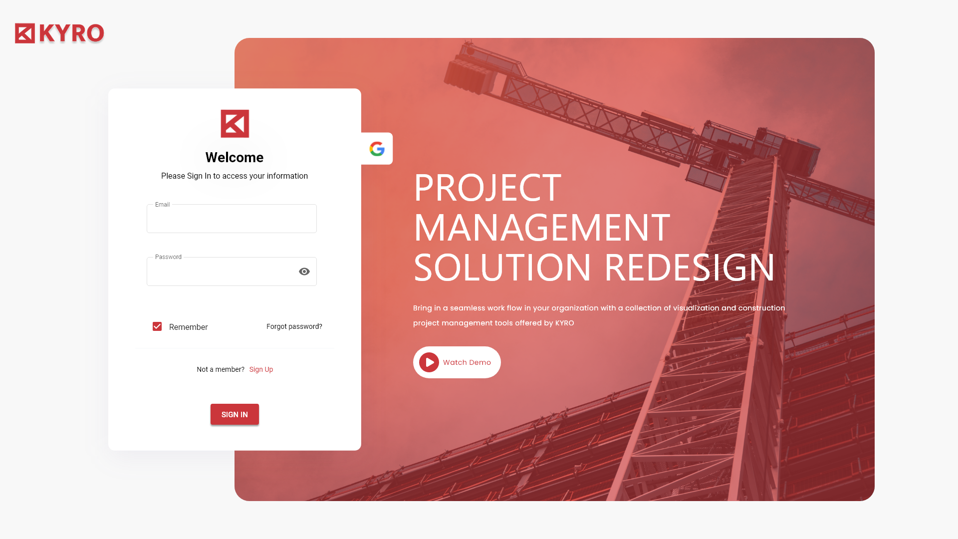
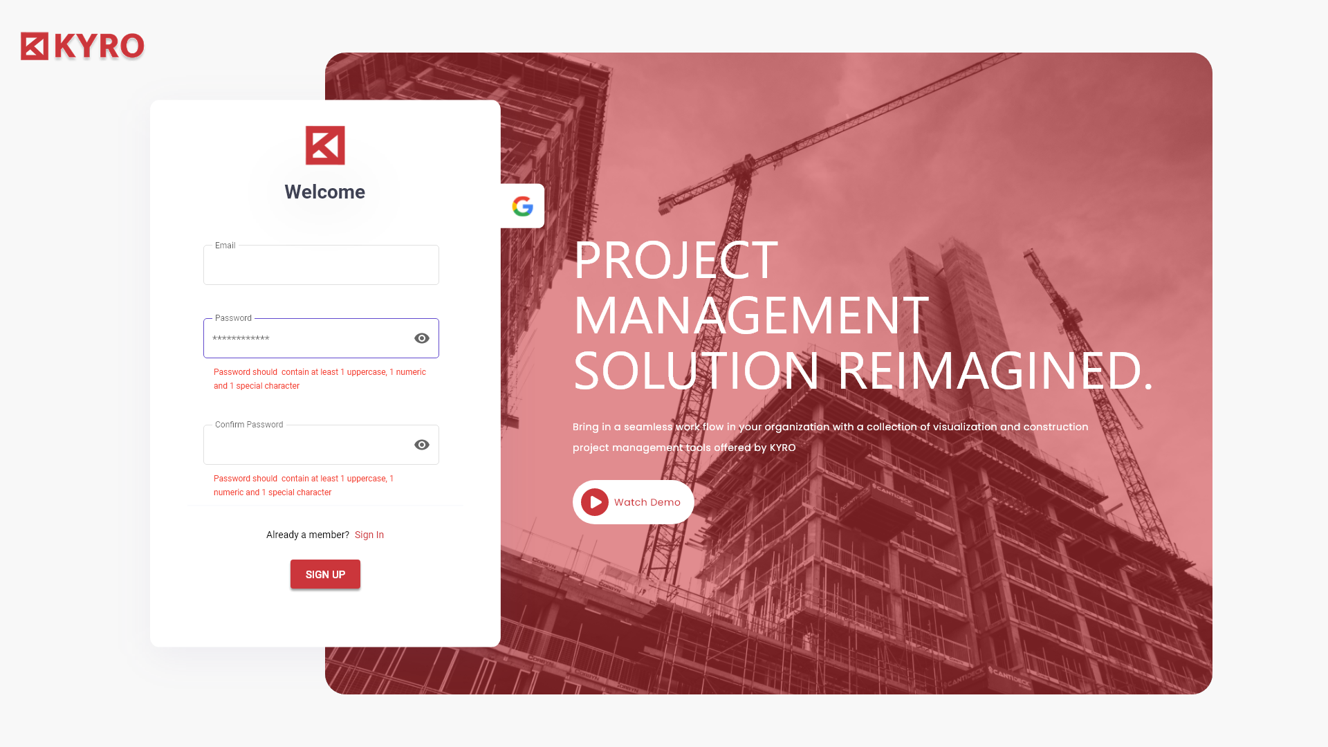
Replaced with a single, red-graded crane photo. One image, one red, one form. The page now says 'product', not 'pitch'.
Design principles
Four rules the team can repeat without me in the room.
One red, used like a stamp
Every primary action — Add Project, Sign In, Save Changes, Invite User — wears the same KYRO red. Secondary actions are ghost. There is no second 'primary' colour anywhere in the product; the red is the brand and the call to action are the same thing.
Cards over tables, until tables earn it
Home, Dashboard and Organizations are card-based — each project or person carries its own progress, dates and avatar. Only the Tasks tab inside a project becomes a table, because that is where the PM actually wants density.
Onboarding is a three-step ritual
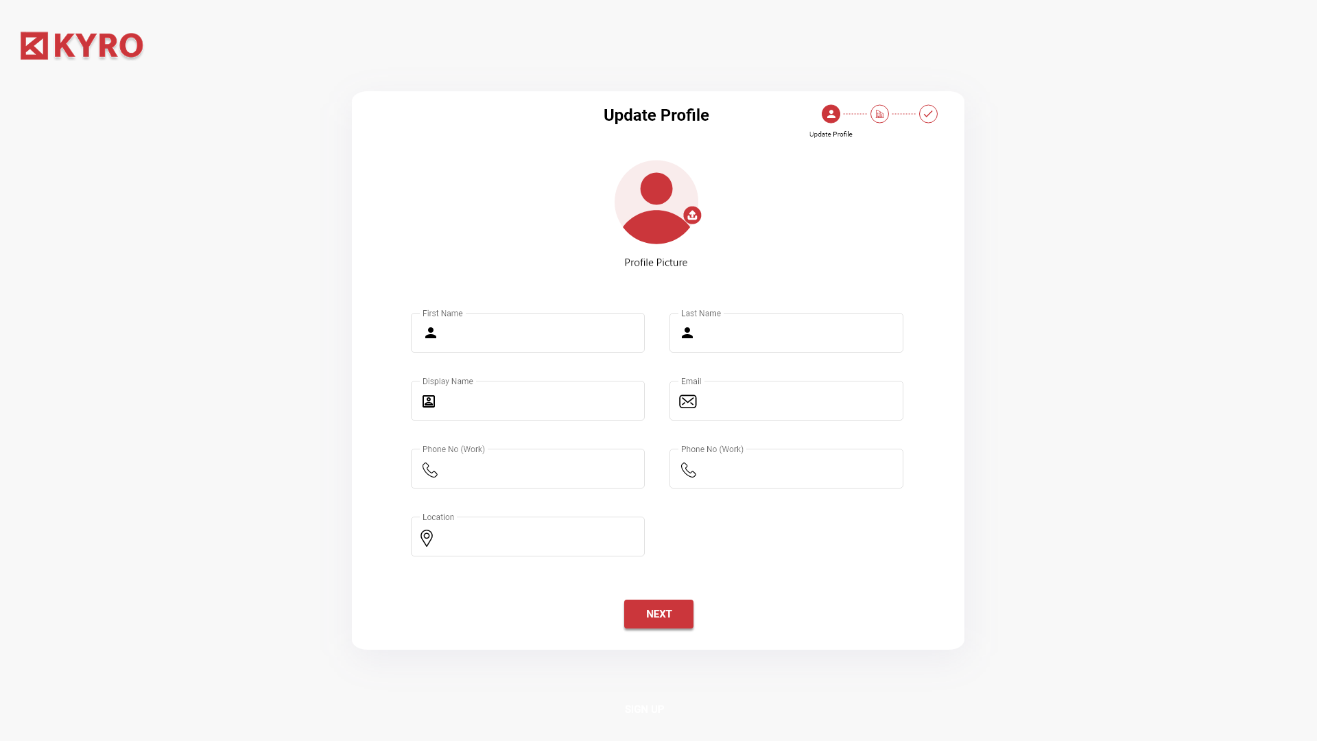
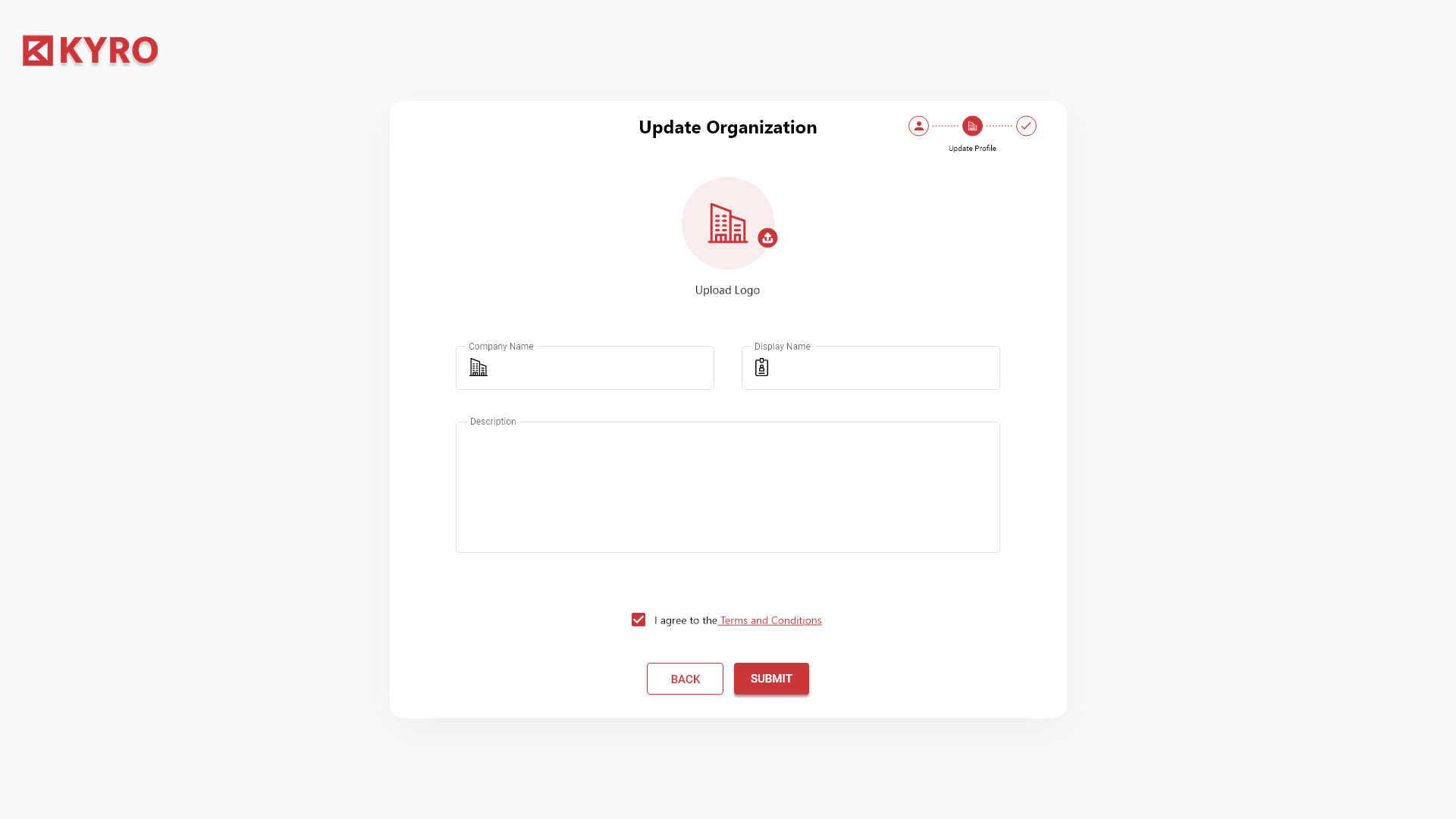
Update Profile → Update Organization → Confirm. A stepper at the top right of the screen never moves. By the time the PM hits Submit, the org has a logo, a display name, and they have agreed to terms — no half-set accounts.
Empty fields, never empty screens
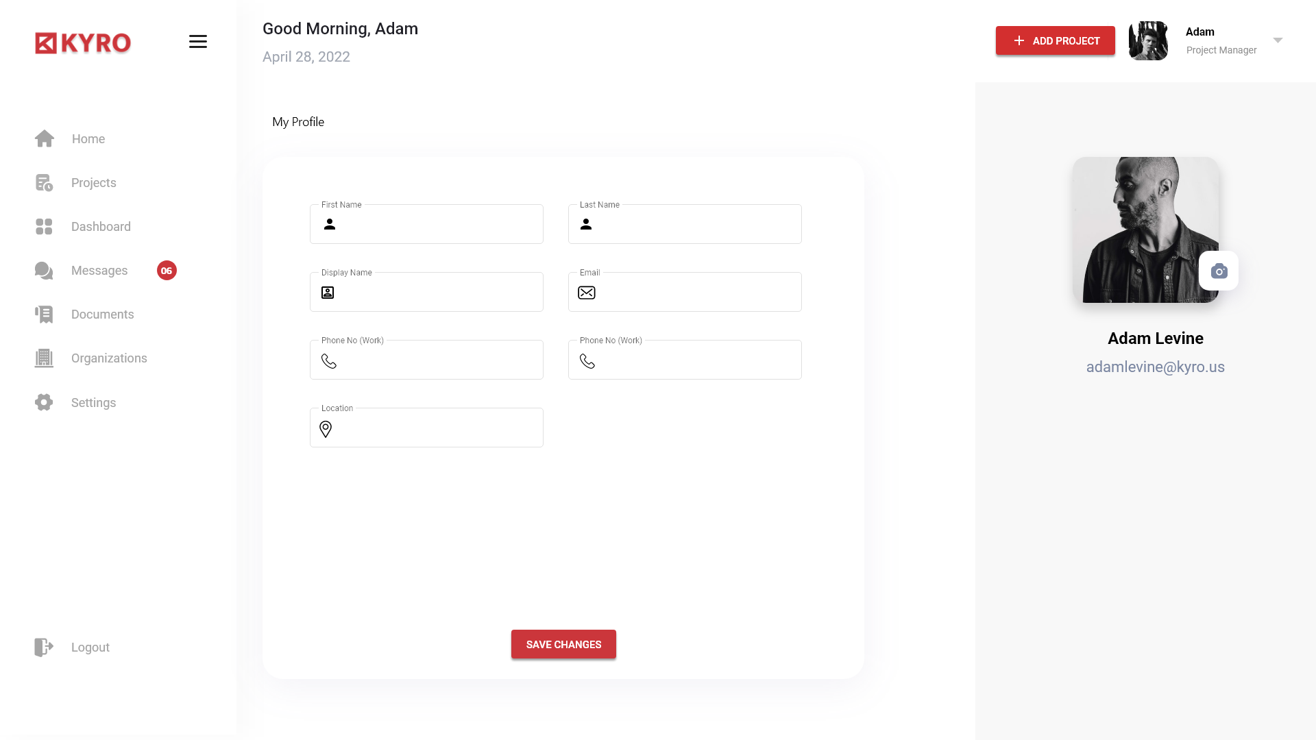
Every form field carries an icon — user, mail, phone, location, building. The form starts emotionally full even when factually empty. The PM never sees the SaaS-form-soup that the legacy build shipped with.
System
Tokens, atoms, and the one red that holds it all together.
Ink
#1A1A1A
Paper
#F6F7FB
Bone
#ECEFF6
KYRO Red
#E53935
Deep Red
#B71C1C
Steel
#3B4A6B
Success
#2ECC71
The user journey
Two minutes from a cold log-in to a live project.
00:00
Sign in
A photographic crane fills the right half of the screen, the red KYRO mark sits top-left. One white card on the left, two fields, one red Sign In button, Google as a single accessory chip. No marketing noise.
00:15
Update profile
Step 1 of the three-step onboarding — name, display name, email, phone, location. A circular avatar uploader sits front and centre. The stepper at the top tells the PM exactly how much is left.
00:40
Update organization
Step 2 — logo upload, company name, display name, description, and a single Terms checkbox. Back and Submit live together at the bottom; the wizard never traps you.
01:10
Land on the projects home
Good Morning, Adam. Four projects stacked as wide cards — name, progress, dates, and three workstream icons (Tasks, Site, Invoices) that show counts of open items. Messages and Notifications rails hold the day's noise.
01:25
Open a project
Project header carries total progress, start date and end date. A tabbed strip — Summary, Tasks, Risks, Safety Incidents, Decision Records — opens the right pane. The right rail flips to Total Tasks (18, 5 due), Metrics and Documents & Licenses.
01:50
Switch to Owner
Same shell, new home — a 2-column dashboard grid. Each card shows description, risk list, an Overall Progress donut and a Metrics bar chart with Budget, Schedule and Resources. One green-tick header colour: that's the only thing that changed.
Process
Ten weeks. Four phases. One shipping ritual.
01
Weeks 1–2
Stakeholder + on-site PM interviews · audit of legacy build · IA workshop.
02
Weeks 3–4
Role flows, low-fi for Home, Projects, Dashboard, Organizations.
03
Weeks 5–8
Hi-fi system, 12 desktop templates, onboarding stepper, charts.
04
Weeks 9–10
Usability tests with site PMs + owners, dev handoff, QA.
Reflections
What I'd repeat. What I'd burn. What surprised me.
What I'd do differently
Sit on a job site for a full day before week one. We did our PM interviews over video, and we missed how often the PM looks at the screen with a glove half-on. The cards earned their padding only after I held a tablet at arm's length with dust on the screen.
What I learned
Construction software does not need more features; it needs fewer screens. Every time we removed a tab, the PM smiled. The redesign is smaller than the legacy build by almost a third — and the satisfaction scores doubled in unmoderated testing.
What surprised me
The Owner persona, who we almost dropped from scope, became the loudest advocate inside the company. The card-grid dashboard turned the Owner from a quarterly visitor into a weekly user — and that, more than any PM feature, changed how the team prioritised the roadmap.
"We came in with a legacy build that PMs avoided and Owners never logged into. KYRO 2.0 ships with two homes for two roles, and both of them get used. The Add Project rate doubled in the first month."
"The red is the single best decision we made. Every PM on every site now knows that red means 'do this' — no training deck required."
Next
Want a calmer SaaS for your team?
I design role-aware, system-driven products that ship — from onboarding to dashboards.