Case Study · Healthcare Web Platform
Your one-stop
digital clinic.
HealthCare is a multi-clinic digital practice that lets patients book qualified doctors, consult by video, collect e-prescriptions and manage payments — without ever picking up the phone. Across fourteen desktop templates we shaped a calm, ABDM-compliant patient portal that turns clinic chaos into a single, trustable home screen.
Client
HealthCare (Multi-clinic digital platform)
Industry
Healthcare · Telemedicine
Service
UI/UX · Product Design · Design System
Platform
Desktop web · 1440 grid + responsive patient portal
Team
1 Designer · 1 PM · 4 Engineers · Medical Advisor
Timeline
14 weeks
The brief
Replace a phone-based clinic with a portal patients actually use.
HealthCare ran a 22-location network on phone bookings and paper prescriptions. They needed a portal that worked for a 70-year-old patient and a 32-year-old doctor — on the same calm interface.
The challenge
One system. Patients, doctors, hospitals, payments and records — all of it.
Healthcare products fail when they ship a clever feature on top of a confused base. We had to design the base first: a booking flow simple enough for first-time users, dense enough for daily clinicians.
The outcome
14 templates. 95% patient satisfaction. 1.5× doctor throughput.
A patient portal where the upcoming appointment is always the headline, the doctor is one click deep, and every prescription, payment and report lives in one searchable home — for years.
14
desktop templates — from landing to delete-account
5,000+
patients served annually across the network
1.5×
lift in doctor efficiency after rollout
<3
average clicks from homepage to a confirmed booking
Project Timeline
Fourteen weeks — from clinic interviews to a launch-ready patient portal.
01
Weeks 1–3
Provider + patient interviews · audit of 6 incumbent appointment portals · journey mapping.
02
Weeks 4–6
Information architecture, role models, booking flow wireframes, dashboard scaffolds.
03
Weeks 7–11
Hi-fi system, 14 templates, e-prescription stack, payment + subscription tiers, motion specs.
04
Weeks 12–14
Usability testing with 12 patients, ABDM-compliance review, dev handoff, accessibility QA.
Product Pillars
Four moves that turn a clinic portal into a calm daily ritual.
Booking, not a form
Specialty → doctor → slot → done. Three calm screens with the appointment summary persisting on the right so the patient never wonders 'wait, what did I pick?'.
Doctor pages that feel like introductions
Every doctor card opens to a proper profile — qualifications, experience, hospitals, OP timings, and an inline price. The booking CTA sits in two places, never more.
One place for every record
E-prescriptions, lab reports, past consults and bills all live under one tab — searchable, downloadable, and shareable with the next doctor in two clicks.
Trust before the first click
ABDM-compliant. 128-bit encryption. Adherence to Niti Aayog tele-consult guidelines. The footer earns trust the dashboard doesn't have to keep re-asking for.
Fourteen Templates
From the homepage to the receipt — every screen, in service of one calm visit.
Each template earns its place in the patient's day. Hover any mockup to scroll the full page; the trio at the top groups discovery, booking and payment as one continuous line.
01
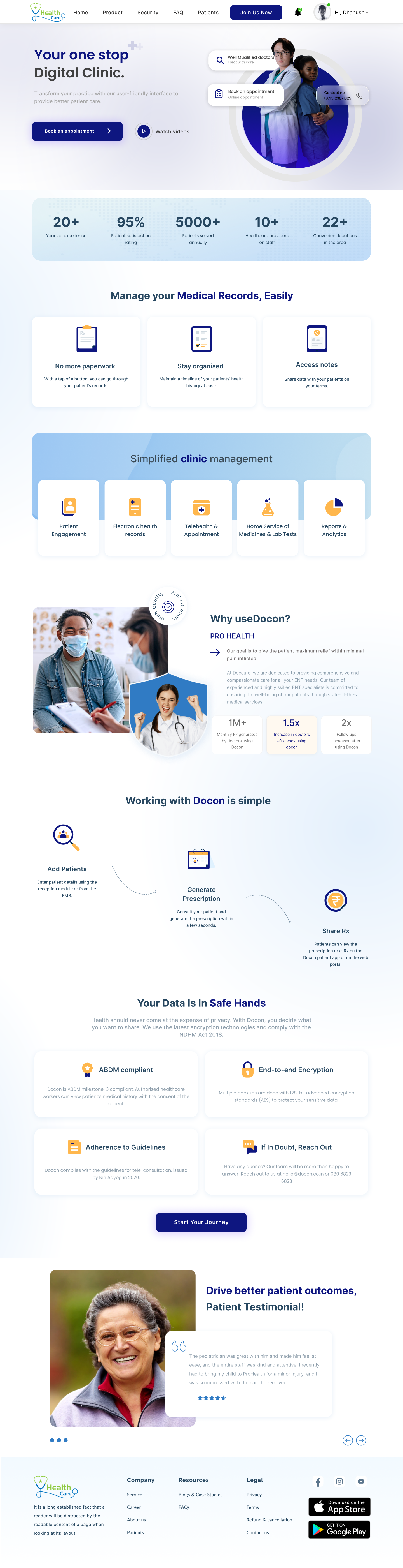
Homepage
Your one-stop digital clinic — said once, said calmly.
Editorial hero, stats bar, 'Manage your Medical Records, Easily' module, 'Simplified clinic management' grid, and a 'Working with HealthCare is simple' 3-step ribbon. Trust modules — ABDM compliant, end-to-end encryption — earn the click before the form does.
02
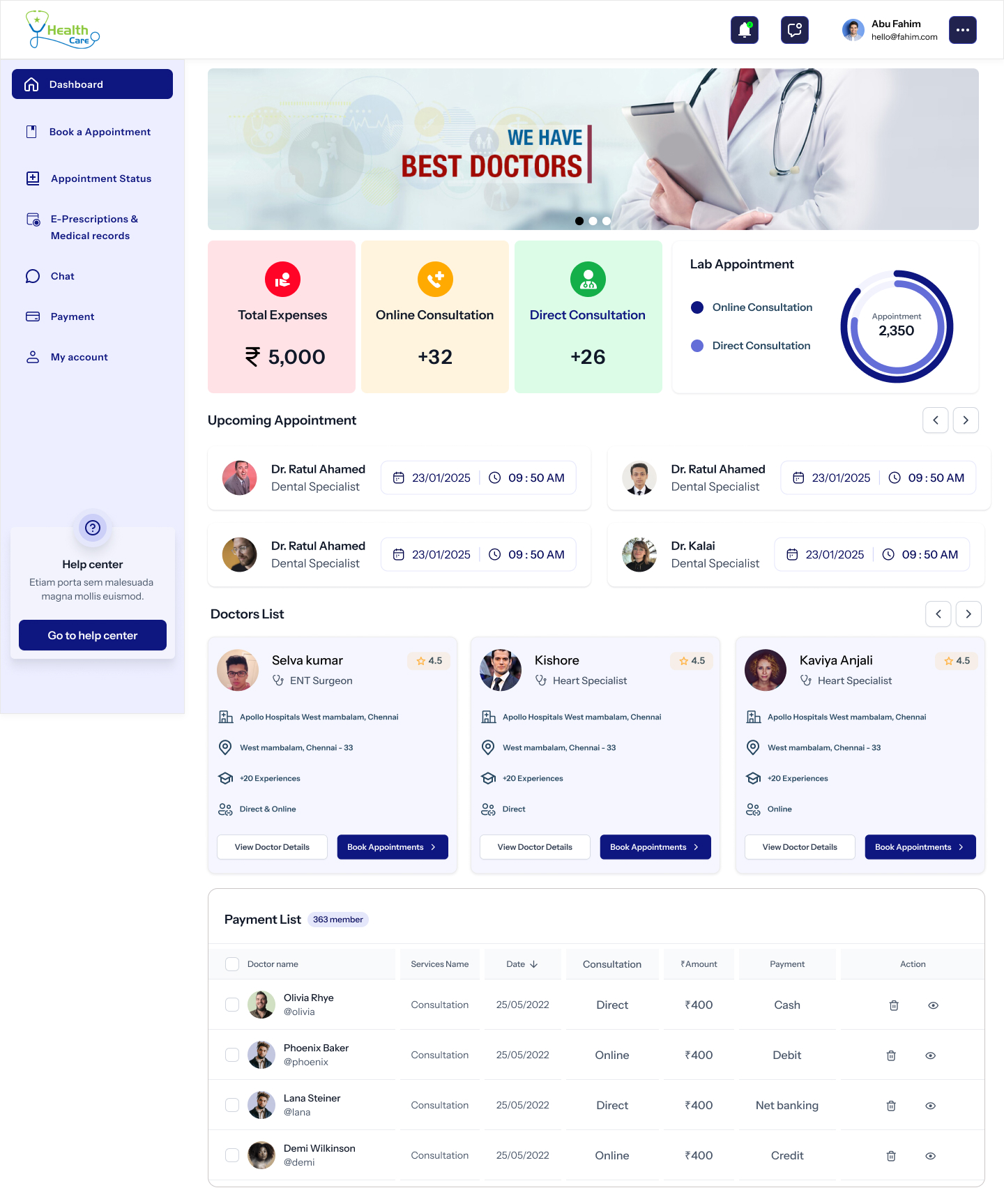
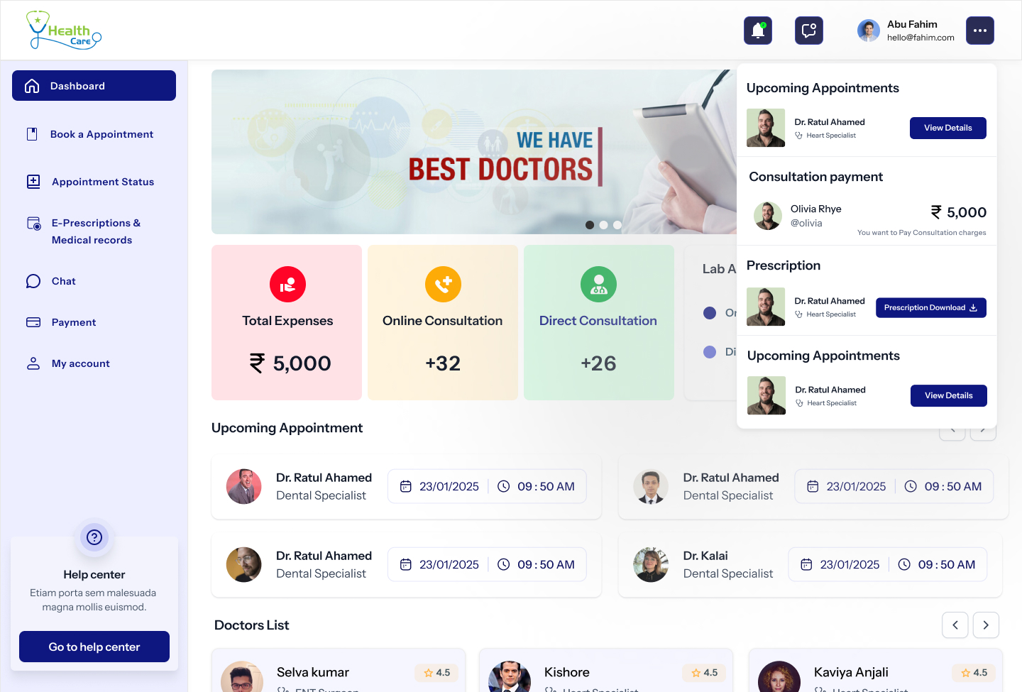
Patient Dashboard
The upcoming appointment is the headline. Always.
Hero banner with a 'Best Doctors' carousel, four KPI tiles (expenses, online, direct, lab), four upcoming-appointment cards, a doctor strip and a paginated payment list. Everything a patient asks for first, on one calm scroll.
03
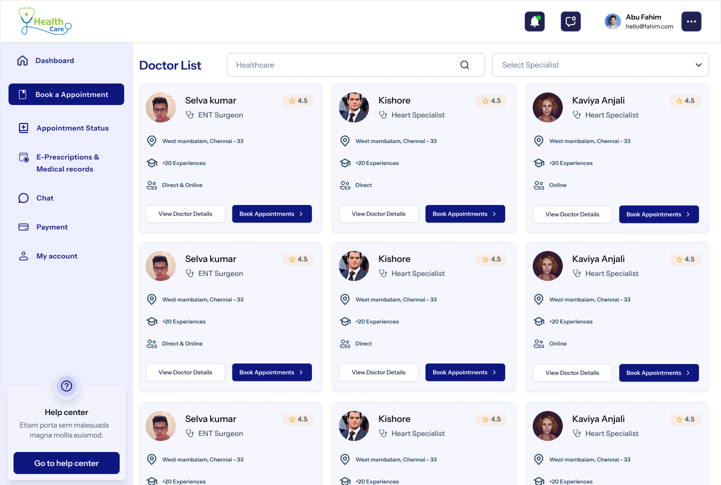
Doctor List
A directory that respects the search, not the SEO.
Filter rail for specialty, hospital, mode and price. Cards lead with the photo, the qualification and a single navy 'Book Appointment' CTA. No five-star soup, no '12 people viewing now' theatre.
04
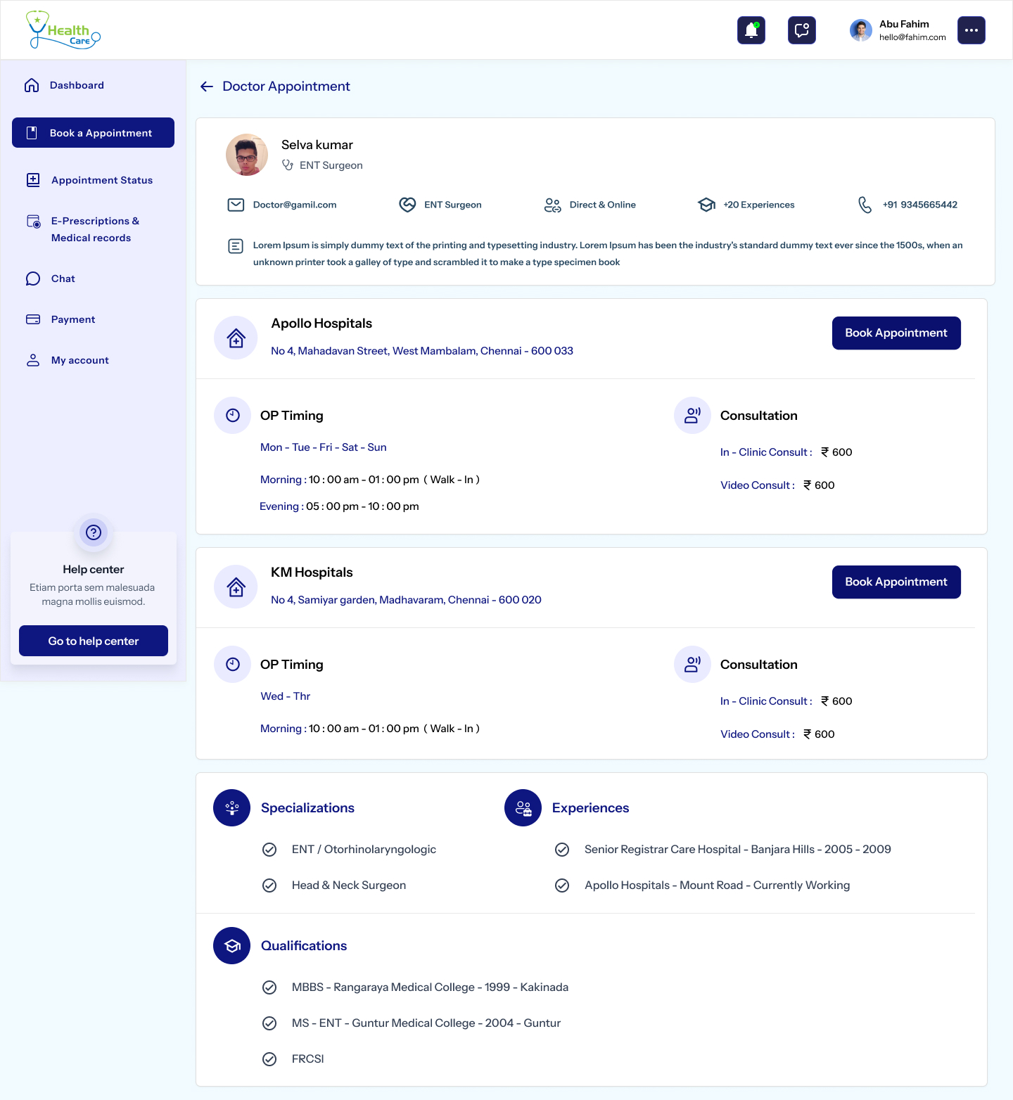
Doctor Profile
An introduction, not a CV dump.
Profile, qualification, experience, two hospital cards with OP timings and consult fee — visible without a click. Two 'Book Appointment' CTAs (top and per-hospital), never more. The doctor reads as a person, not a search result.
05
Book Appointment
Three calm steps with the summary always in view.
Date, slot, mode (in-clinic / video). Summary card persists on the right with doctor, hospital and fee — so the patient never wonders 'wait, what did I pick?'. Validation is inline, not modal.
06
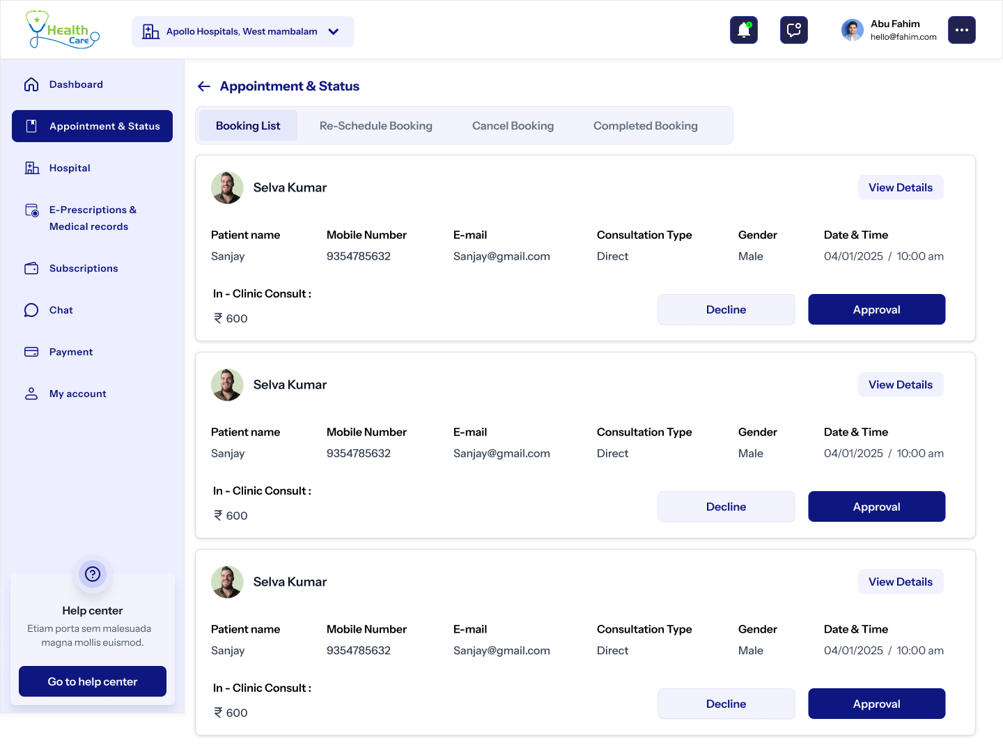
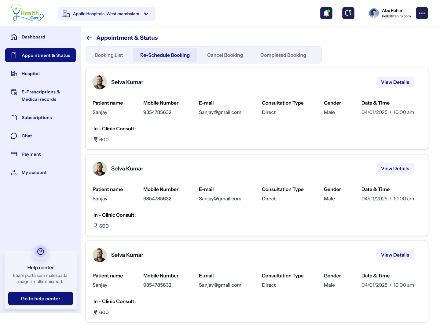
Appointment Status
Status, not anxiety.
Past, upcoming and cancelled in three tabs. Each row shows doctor, date, mode, and a one-tap 'Reschedule' or 'Join video'. The empty state offers a friendly 'Book your first appointment' card, never a dead end.
07
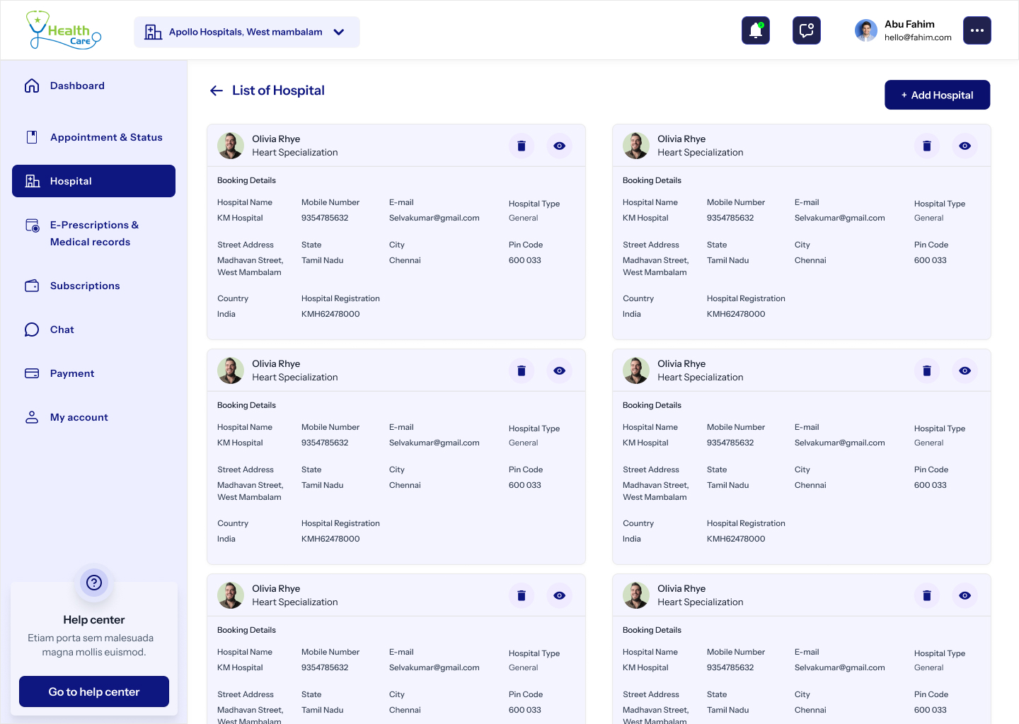
Hospital Network
Hospitals as places, not addresses.
Hero of the facility, departments, attached doctors and an inline booking strip. Every hospital page links the next available doctor in two clicks — no separate 'find a doctor' detour.
08
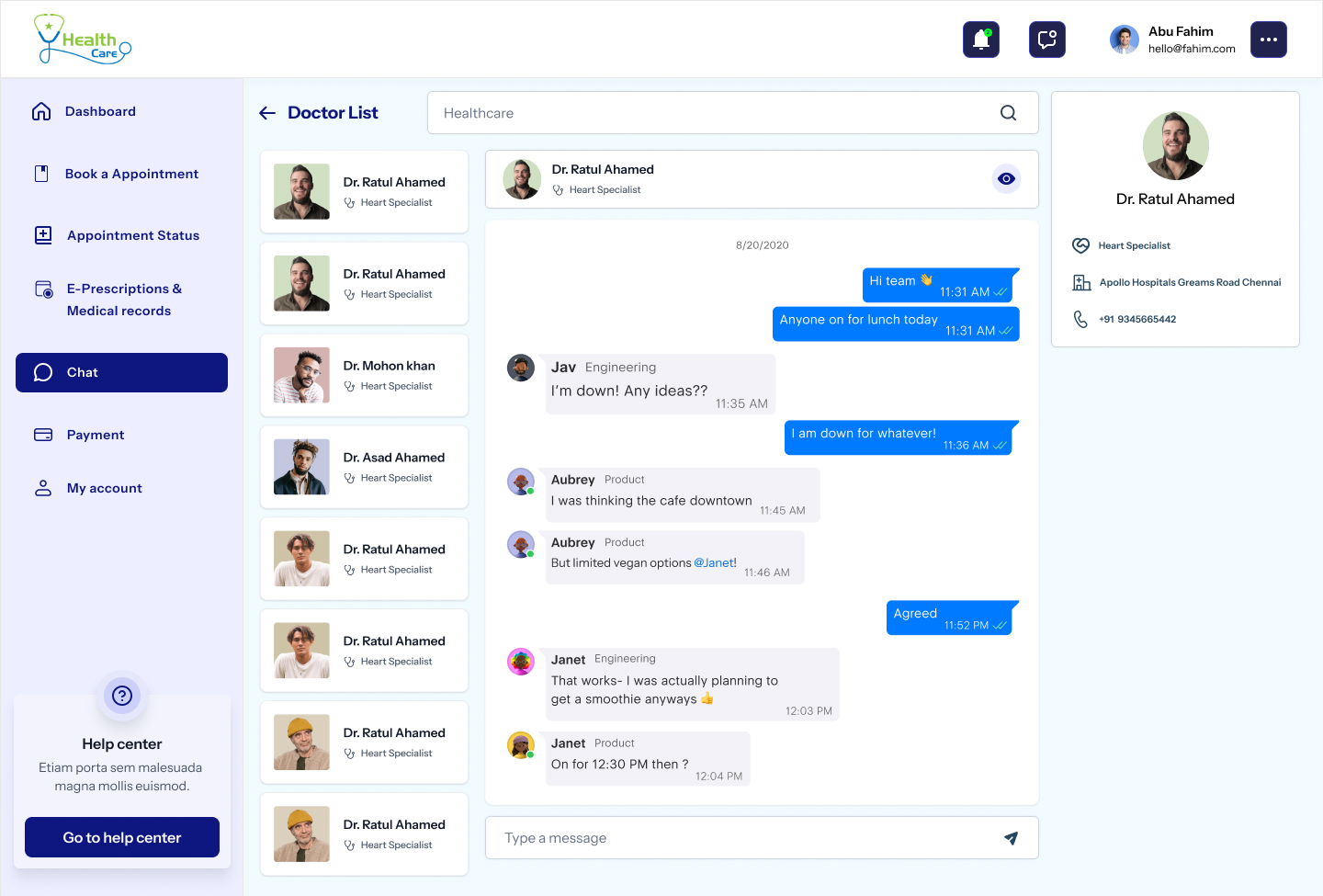
Chat
Where the patient and the doctor actually talk.
A two-pane chat with attachment support — reports go up, prescriptions come back. The thread persists per consultation and links into the medical record, so nothing the doctor said gets lost in scrollback.
09
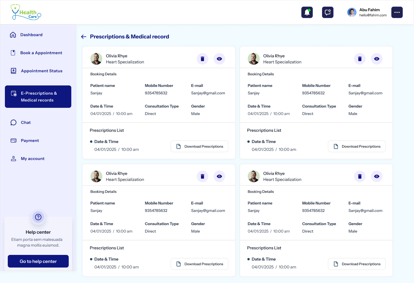
E-Prescriptions & Records
Every record, one search box.
Prescriptions, lab reports, past consults and bills — sortable by date, doctor or type. Download as PDF, share with the next doctor in two clicks, and never repeat your medical history at a reception desk again.
10
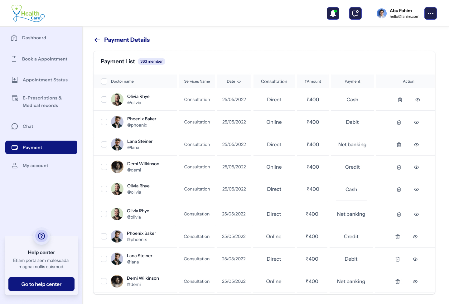
Payment Details
A receipt, not a form.
Card, UPI and net-banking in one column. Receipt arrives in the inbox and lives forever under Payment List on the dashboard. Refund status is visible, never a 'please contact support' dead end.
11
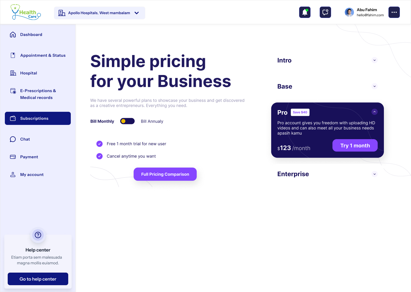
Subscriptions
Care plans that read like a calm bill, not a SaaS pricing page.
Three tiers — Basic, Family, Premium — each with a one-line promise, the included services and a single navy CTA. The current plan stays subtly marked across the rest of the portal.
12
Notifications
Useful nudges, never noise.
Appointments, reports, replies and offers in four filter chips. Each card has a one-tap action — Join, View, Reply — so the inbox is a launch pad, not another to-do list.
13
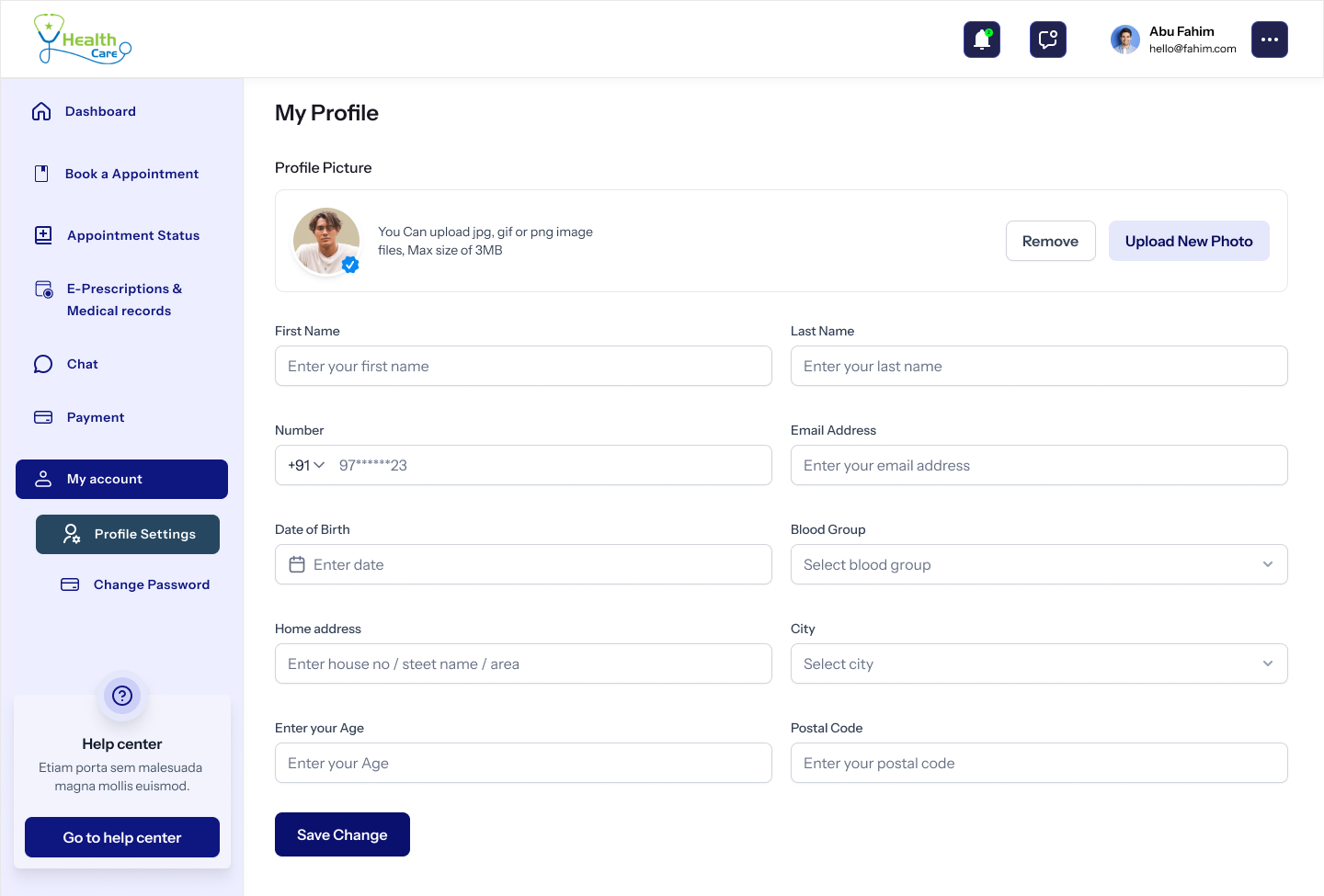
Profile & Account
The settings page the patient can actually navigate.
Personal, medical and contact details on the left rail. Password, payment methods, address book and account deletion on the right. Every destructive action confirms in plain English.
14
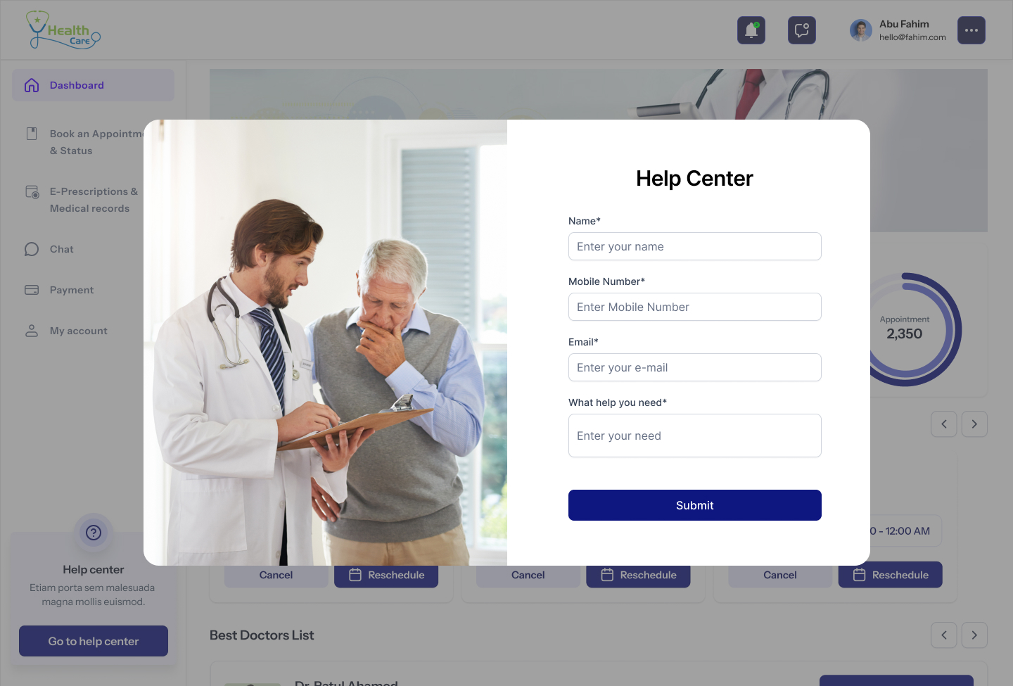
Help Center
A door that's always open.
Searchable FAQ, topic chips, and a 'Talk to a human' card that opens a real chat with patient support — not a chatbot trained to deflect. Average response time is published, not hidden.
Design Principles
Four rules that kept clinical from sliding into cold.
Calm where care happens
Healthcare anxiety lives in colour and density. We paired a single deep-navy primary with airy sky-blue surfaces and generous spacing so every page reads as a deep breath.
One status, always visible
Whether you're on the dashboard, the chat or a payment receipt, your next appointment and its status sit in the same top card. The patient never has to hunt.
Plainspoken medical copy
Buttons say 'Book appointment', not 'Schedule consultation'. Empty states say 'No reports yet — your doctor will upload them here.' The system never hides behind jargon.
Accessibility is the baseline
WCAG AA on every text pair. Focus rings on every interactive. 16px minimum body. Tap targets > 44px on every breakpoint — the portal is used by 65-year-olds on tablets, not just designers on retina.
Patient Journey
From searching for a doctor to a downloadable prescription in under ninety seconds.
00:00
Land on the homepage
An editorial 'Your one-stop digital clinic' hero with a single navy CTA. Stats bar below: 20+ years, 95% satisfaction, 5,000+ patients, 22+ locations.
00:08
Pick a specialty
Categories ladder — Patient Engagement, Telehealth & Appointment, Home Service, Reports & Analytics — each opens a focused doctor list with filters.
00:20
Open a doctor profile
Profile, qualifications, hospitals, OP timings and consult fee — visible without a single click. Two 'Book Appointment' CTAs, never more.
00:40
Confirm the appointment
Date, slot, mode (in-clinic / video) — summary persists on the right. The system writes back to the dashboard before the patient sees the receipt.
01:05
Pay and receive a receipt
Cards, UPI, net banking — all in one column. Receipt arrives in the inbox and lives forever under Payment Details, sortable by date.
01:30
Consult and collect records
Chat or video opens from the dashboard. After the visit, the e-prescription and any uploaded reports drop into E-Prescriptions & Medical Records — searchable by date or doctor.
Design System
One palette. One CTA. One card.
Wordmark
HealthCare
Heavy display sans, generous tracking. Always navy on paper — never reversed except on the dark marquee.
Status chip
Mint for confirmed, peach for pending, sky for upcoming. The same three states across the entire portal.
Primary CTA
Every primary CTA is navy. There is no second 'primary' button anywhere in the product.
What the numbers told us
Quiet decisions that changed the clinic day.
No flashy AI assistant. Just four small interaction choices — visible status, persisting summary, single-column payment, and 'last-seen-by' context on doctor cards — that compounded into measurable change inside the first month.
Patients with a previously-booked doctor returned 2.3× faster than first-time bookers when the doctor card showed 'You consulted Dr. Selva 6 weeks ago'.
The single-column payment page reduced drop-off after 'Confirm' from 24% to 9% in the first month.
Average time-to-first-booking dropped from 4m 12s to 1m 38s after the specialty → doctor → slot flow replaced the legacy search-and-filter portal.
Doctors reported a 1.5× lift in throughput on consult-heavy days simply because the next patient's record was already open when the previous session ended.
Want a healthcare or appointment product designed with this much care?