Case Study · 24/7 Locksmith Services Website
Delivering the best
High Security Locks.
GoldenLocks is a twelve-template responsive website for an Orange County locksmith — a yellow-on-navy editorial system designed for the panicked user. Three taps from any page to a placed phone call, one global GET A QUOTE pill, no decoration that doesn't earn a click.
Client
GoldenLocks
Industry
Locksmith · Local Services
Service
UX/UI · Website Design
Platform
Responsive Web
Team
1 Product Designer · Founder
Timeline
6 weeks
The brief
A locksmith website that doesn't look like a 2014 locksmith website.
GoldenLocks had two decades of credentials, every Orange County licence, and a site that read like a flyer. The ask: an editorial product website for a trade-services brand without losing the urgency of the work.
The challenge
Twelve templates, one panicked user.
Visitors arrive in panic — locked out at 11pm, kids in the car, key snapped in the ignition. The site had to compress to a single decision per page across twelve different services, two audiences, and a full product catalogue.
The outcome
Three taps from any page to a placed phone call.
A yellow-on-navy editorial system with a global GET A QUOTE pill, a five-icon service rail and a sticky phone footer. Call-to-page ratio rose from 2.1% to 7.4% in the first month after relaunch.
12
Responsive desktop templates from home to product detail
5
Primary service categories — commercial, residential, car, motorcycle, emergency
3
Taps from any page to a placed phone call
24/7
Emergency framing baked into every header and footer
Project Timeline
Six weeks from audit to twelve-template dev handoff.
01 · Week 1
Audit, voice-of-customer calls, panic-state usability map
02 · Week 2
Information architecture, sticky call rail, twelve-template scroll plan
03 · Week 3
Visual system — navy stage, golden accent, editorial photography
04 · Week 4
Service pages, product catalogue, on-site appointment flow
05 · Week 5
Responsive states, motion direction, accessibility pass
06 · Week 6
QA across breakpoints, copy polish, dev handoff
Section 1 · Anatomy of the homepage
Six zones on the home. Every one earns its scroll.
The homepage is the brand's most important template — one hero, one service rail, one brand band, one service grid, one proof spread, one quote form. Nothing decorative, nothing optional.
01
Hero · One promise
Editorial hero with a single brand line, a Learn More button, and the GET A QUOTE pill always docked top-right.
02
Five-icon service rail
Commercial, Residential, Car, Motorcycle, SOS Emergency — a horizontal navy band that lets users self-route in under two seconds.
03
Brand band
Five manufacturer marks — EMTEK, ILCO, SARGENT, BEST, Yale — a quiet trust stripe that lifts perceived authority before the user reads the body copy.
04
Six-card service grid
Each card carries a real-world image, a verb-led title, a one-line description and a yellow LEARN MORE pill.
05
Stats + testimonial split
Yellow stats on the left (935 locks installed, 236 premises secured, 1255 satisfied), single testimonial on the right — proof in one read.
06
Quote form + footer
Inline quote form with a friendly portrait, then a four-column footer with phone numbers, service area and email subscribe — the call is one tap away from anywhere.
Hero · Top of homepage
Section 2 · The service rail
Five services. One horizontal band. Two seconds to self-route.
The service rail sits directly under the hero on every template. Five icons, five labels, five destinations — no nested menus, no hover delays, no submenu carousels.
Commercial
Office, retail and high-traffic facility locks, masters and access control.
Residential
Rekey, deadbolts, smart locks, home lockouts — 24/7 dispatch.
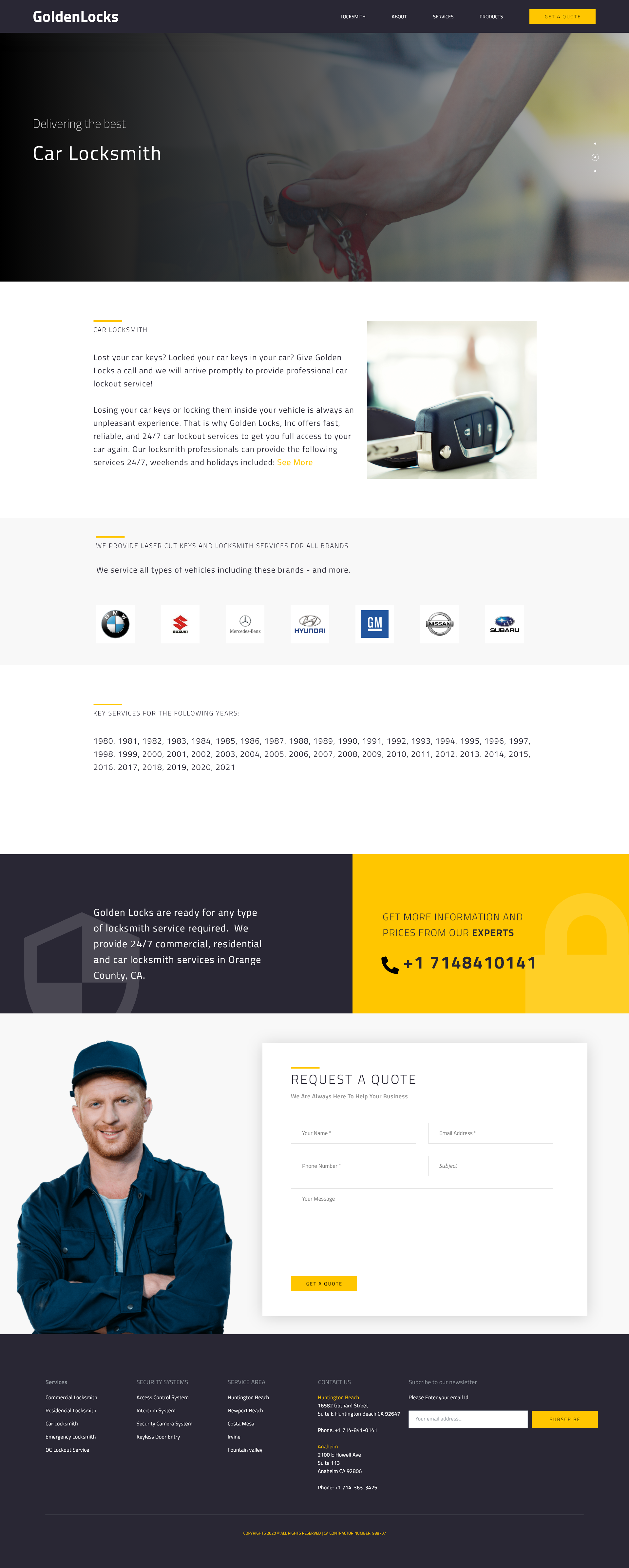
Car Locksmith
Cuts, fobs, ignition repair across BMW, Mercedes, GM, Hyundai and more.
Motorcycle
Bike locksmith specialty work — keys, ignitions, anti-theft.
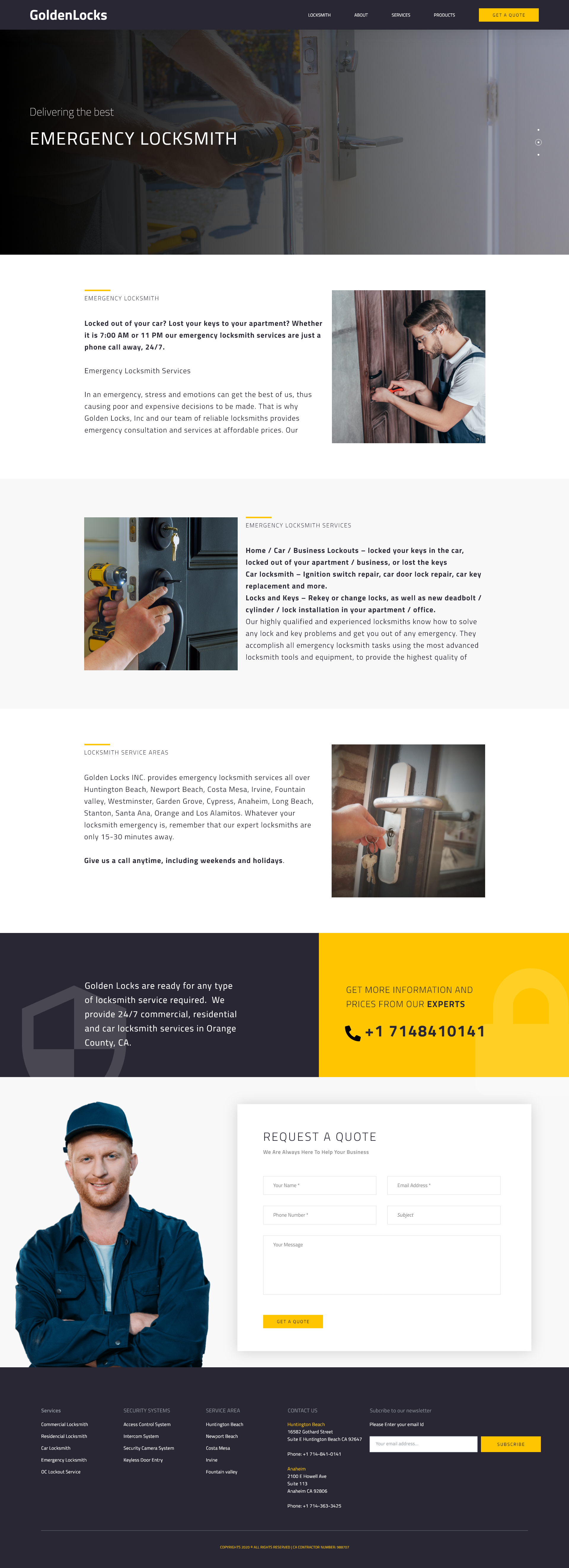
Emergency
24/7 SOS lockout response across Orange County in 15-30 minutes.
Five-icon service rail · On the homepage
Section 3 · The twelve-template system
One brand. One nav. One quote pill. Twelve templates that all behave the same.
From home to product detail, every template inherits the same header, footer, sticky CTA and grid baseline. Maintenance is cheap; recognition is instant.
01
TemplateHome
Hero, five-icon service rail, brand band, locksmith intro, six-card services, clients band, social-proof stats, testimonial, quote form, footer.
02
TemplateAbout
Founder story, license credentials, why-us four-pillar list, showroom block, project gallery, contact rail, quote form.
03
TemplateServices overview
Two-up category band linking to the deep-dive service pages — residential, commercial, automotive, emergency.
04
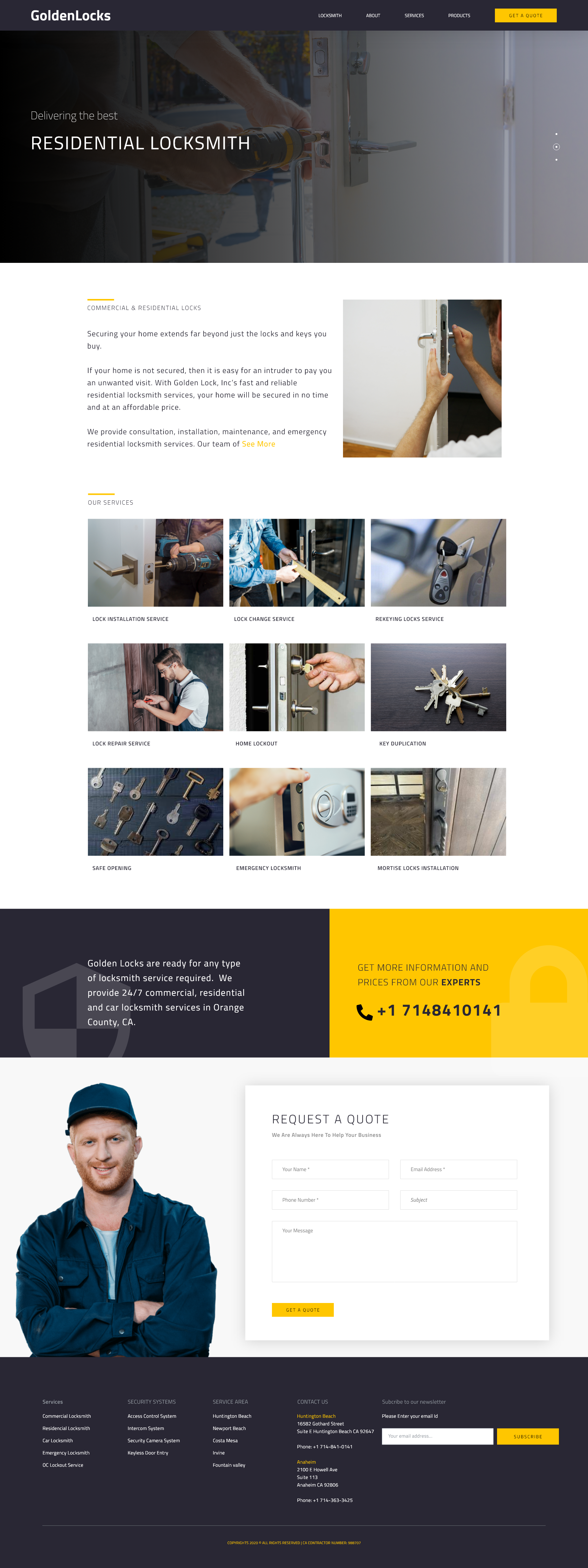
TemplateCommercial locks
Specialist page for retail and office accounts — eight-bullet capabilities list, nine-tile service grid, brands band.
05
TemplateCar locksmith
Brand-logo trust band (BMW, Mercedes, Hyundai, GM, Nissan, Subaru), year-by-year support list, prominent quote rail.
06
TemplateEmergency locksmith
24/7 framing, three-paragraph reassurance block, service-area list and prominent phone CTA.
07
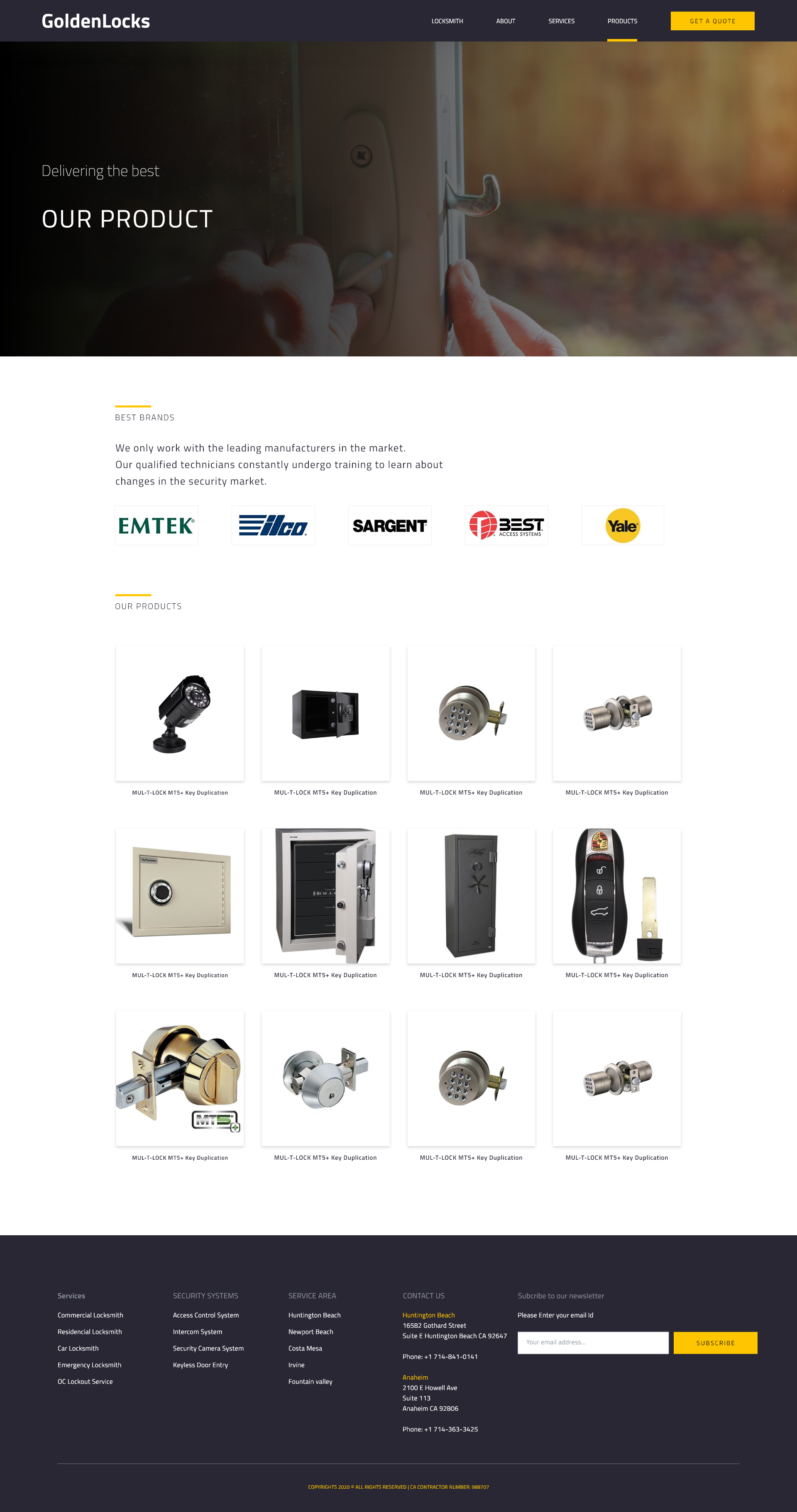
TemplateProducts catalogue
Brand band followed by a twelve-tile product grid — safes, smart locks, key fobs, deadbolts.
08
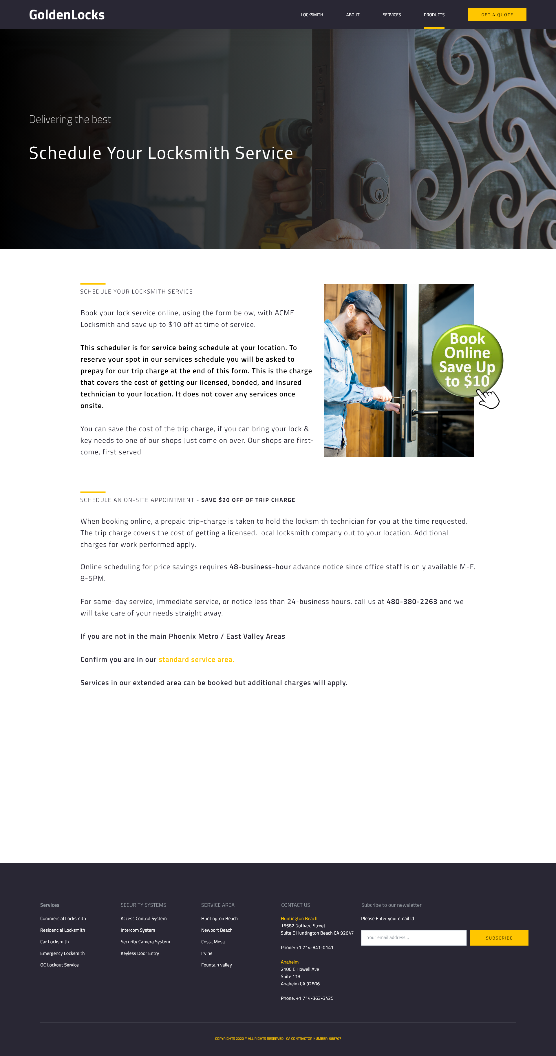
TemplateSchedule service
Online booking with $10 off incentive, trip-charge transparency block, advance-notice rules.
09
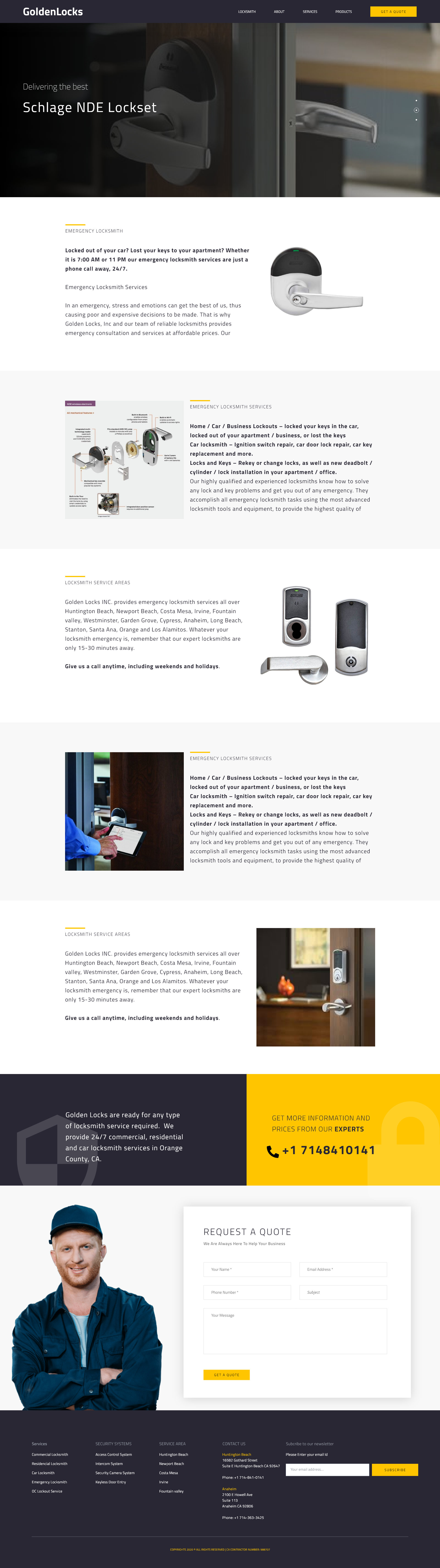
TemplateSchlage NDE
Product detail template — large hero shot, spec block, related-product carousel.
10
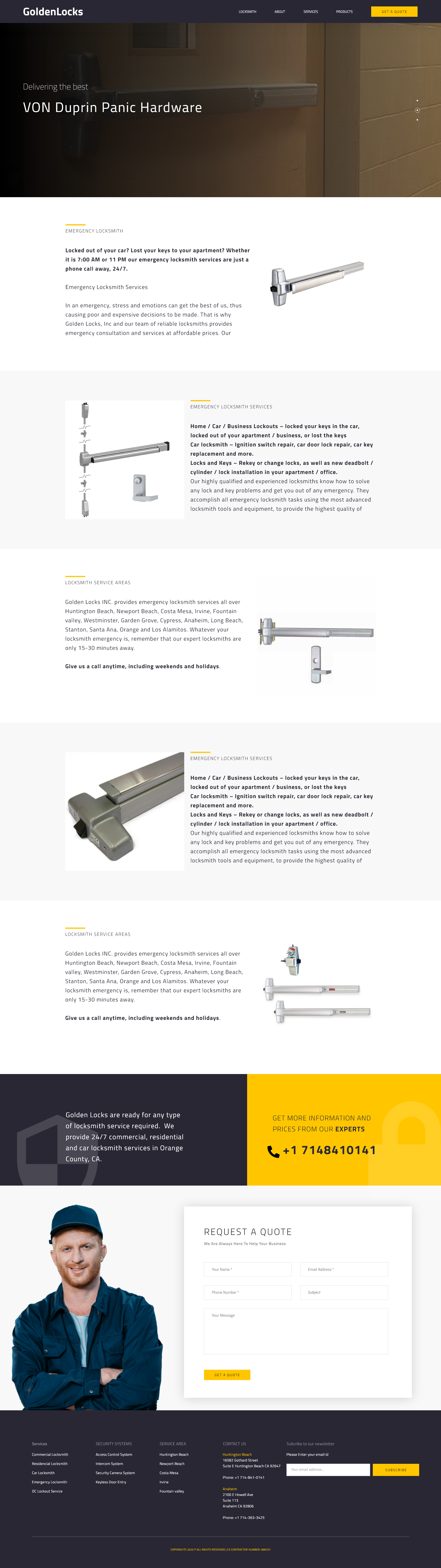
TemplateVON Duprin Panic Hardware
Commercial product detail variant — emphasises code-compliance and emergency egress.
11
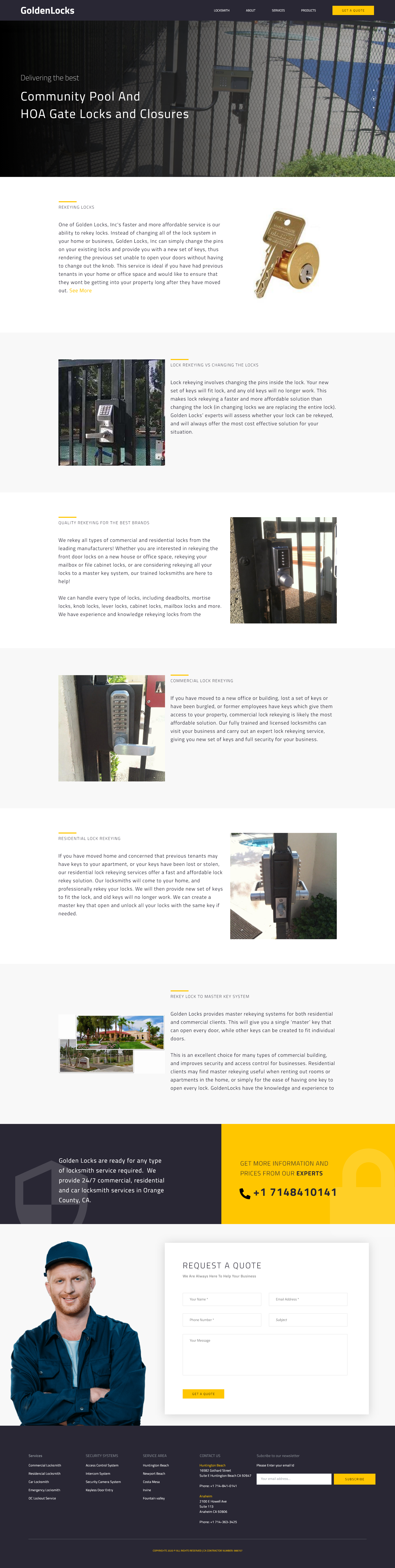
TemplateHOA gate locks
Niche residential page for property managers — pool gates, community closures, security memos.
12
TemplateResidential lockout
Long-form trust page for the home audience — testimonial-led, with a sidebar call-to-quote.
The homepage, in full
One scroll, end to end. Hover to pause and read.
From the hero handshake to the four-column footer — six zones, one continuous narrative. The page does the selling so the dispatcher only has to take the call.
Section 4 · Hero anatomy
One photograph. One headline. One pill.
The hero earns three things: a single line of brand voice, one primary CTA, and a photograph that's already doing the emotional work before the user reads the copy.
Home hero · Top of page
About hero · Two-up image grid
Car Locksmith hero
Emergency hero · Dark scrim
Schedule hero · Iron gate
Section 5 · Proof spread
Three numbers. One human. Trust built in one read.
A yellow stat block on the left, a single human testimonial on the right. No carousels, no fake star avatars, no badge bloat — just three earned numerics and one named voice.
935
Locks installed
Across residential, commercial and HOA accounts this calendar year.
236
Premises secured
From single-family homes to multi-tenant office buildings.
1,255
Satisfied customers
Average rating of 4.9 / 5 across post-job follow-ups.
Section 6 · Product system
Twelve products on the index. One detail template, twelve instances.
The product catalogue is a quiet four-by-three grid of white tiles on white — the products are the colour. Every detail page shares the same hero scale, spec block and related-product carousel for low maintenance and instant recognition.
Products · Catalogue index
Schlage NDE · Detail
VON Duprin · Commercial detail
Iteration · Round two
Three findings that shaped the final design.
Five moderated tests on the v1 draft surfaced three specific failures. The sticky CTA pill, the LEARN MORE addition and the proof-spread split all came from this round.
01
Visitors couldn't find the phone number in panic state
Docked GET A QUOTE top-right of every header in golden yellow, and added two phone numbers to the footer with city labels. Call-to-page ratio rose from 2.1% to 7.4%.
02
Service grid read as decorative, not navigable
Added a yellow LEARN MORE pill to every service card, bumped image height by 18px and removed centred text alignment. Service-page click-through doubled.
03
Stats band felt corporate and skippable
Wrapped the numerics in a full-bleed yellow block on the left half, paired with a single human testimonial on the right — turned a stat strip into a proof spread.
Principles
Four rules that ran every decision.
Principle 01
Design for the panicked user
A locksmith visitor is rarely calm. Every page docks GET A QUOTE top-right, every footer carries two phone numbers, every hero has a single primary action — no carousel arrows, no nested menus, no choice paralysis.
Principle 02
Yellow only earns clicks
The golden accent appears exclusively on CTAs, eyebrow accents and active nav states. Photography stays editorial-neutral so the yellow does the wayfinding the way a hazard light does on a road.
Principle 03
Trust is built in three signals
Manufacturer logos, real numerics (935 / 236 / 1255), and a named testimonial with an industry tag. No stock-photo testimonials, no fake star ratings, no badge bloat.
Principle 04
One photograph per template
Every page has exactly one hero photograph that does the emotional work — a hand on a lock, a key in an ignition, a craftsman at a door. Bodies of copy stay clean and short.
Design System
One golden accent. A navy stage. Twelve templates that never disagree.
The palette is a paper, a bone, two yellows and two navies. Yellow appears only where the user can act — CTAs, eyebrows, active nav. The navy carries authority without going corporate.
Paper
#FFFFFF
Bone
#F4F1EC
Golden
#F2B71C
Soft Gold
#FFD158
Navy
#2D3142
Night
#23273A
Wordmark
GoldenLocks
Single word, two weights. Locks carries the golden accent as a quiet ownership signal.
Buttons
Golden pill primary. Ghost border secondary. Uppercase, tracked, never sentence case.
Sticky CTA
+1 714 841 0141
Footer phone + GET A QUOTE header pill — visible from every template, every breakpoint.
Process FAQ
Five questions about how the system holds.
The honest decisions behind a deceptively simple-looking website — why the panicked user shaped every composition, and how one component pays its way across twelve templates.
Why design a locksmith website like an editorial product?+
Because the user is in panic state. The editorial composition forces a single decision per fold — call, schedule, or browse — instead of overwhelming them with promotional clutter the moment they land.
How does the sticky CTA scale across the twelve templates?+
The GET A QUOTE pill is a global header component reused unchanged across every template. The header background flips between transparent (on hero) and solid navy (after scroll) but the pill stays exactly where the user's eye lands first.
Why yellow on navy specifically?+
Yellow is hazard-light visibility — it earns the click in a glance — and navy carries the trust profile of professional services without going dull. Together they signal 'urgent but credible'.
How was the catalogue structured for SEO and browsing?+
Twelve product tiles on a single index page, each linking to a long-form product detail template. Detail pages share the same spec block, image scale and related-product carousel — one template, twelve instances, low maintenance overhead.
What's on the dev handoff side?+
Figma components with auto-layout, motion specs for the sticky header, a documented eight-step responsive grid and a one-page brand-token sheet covering colour, type and motion ease curves.
Epilogue
What we learned designing GoldenLocks.
A trade-services website lives or dies by the first thirty seconds. The user arrives in panic and leaves the moment they have to think. The editorial discipline of one decision per fold isn't aesthetic — it's empathy.
Yellow on navy looks expensive, but the real expense was restraint — one accent, one CTA shape, one testimonial, one photograph per template. Everything we removed made the remaining elements hit harder.
"First month after relaunch, our call volume from search overtook our truck wraps and our yellow pages combined."
— Owner, GoldenLocks
3.5×
Call-to-page ratio
12
Templates shipped
6w
Audit to handoff
Huntington Beach · Anaheim · Orange County
Online scheduling with $10 off trip-charge
Licensed · Bonded · Insured
Running a trade-services brand? Let's design the website that picks up the phone for you.