Case Study · AI Product Marketplace
Hungry to ordered,
in under a minute.
FooD is a two-sided restaurant discovery and delivery marketplace. Across five desktop templates, we designed a category-first home, a list + map dual browse, a sticky order builder and a paid submit flow — engineered so a hungry diner can go from craving to confirmed order in under sixty seconds.
Client
FooD (Marketplace startup)
Industry
AI Product · Two-sided marketplace
Service
UX/UI · Web Design
Platform
Desktop web · 1440 grid
Team
1 Designer · PM · 5 Engineers
Timeline
10 weeks
The brief
Make a restaurant marketplace that doesn't feel like a database.
The founders had 9,000 restaurants on paper but a clickable prototype that opened with a giant search bar and a wall of cards. They wanted a marketplace that felt like a friend recommending dinner, not a yellow-pages listing.
The challenge
Turn three roles — diner, restaurant, ops — into one calm system.
Diners want speed and trust. Restaurants want visibility and a clear paid path in. Operations want clean data and dispute-free orders. One design system had to serve all three without leaking complexity into the diner experience.
The outcome
5 templates. <60s home-to-order. 38% lift in click-through.
A category-first home that resolves cravings before restaurants load. A list + map browse with a shared card atom. A restaurant page with a sticky order builder. And a paid Submit flow that converted 11% of restaurant landings in week one of beta.
5
page templates from discovery to checkout
9,000+
restaurants the marketplace was built to host
73
restaurant cards live in beta city
<60s
median time from home to placed order
Project Timeline
Ten weeks — from blank Figma to a checkout-ready marketplace.
01
Weeks 1–2
Stakeholder interviews · 12 diner intercepts · audit of 6 incumbents.
02
Weeks 3–4
IA, brand exploration, category-first home wireframes.
03
Weeks 5–8
Hi-fi system, 5 desktop templates, micro-interactions.
04
Weeks 9–10
Usability tests, dev handoff, Lottie + accessibility QA.
Product Pillars
Four moves that turn a directory into a marketplace.
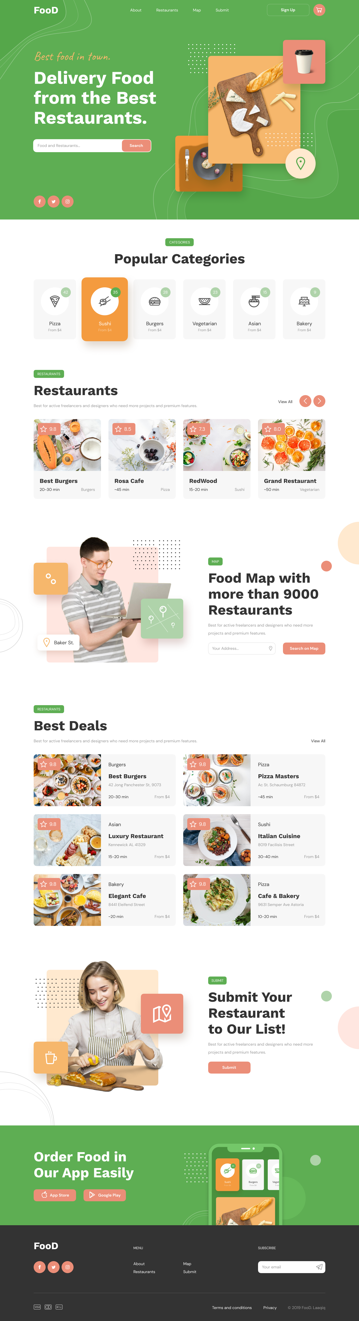
Category-first home
A diner doesn't search for restaurants — they search for cravings. The home opens to six pinned food categories before any restaurant card loads, so 80% of intent is resolved in a single click.
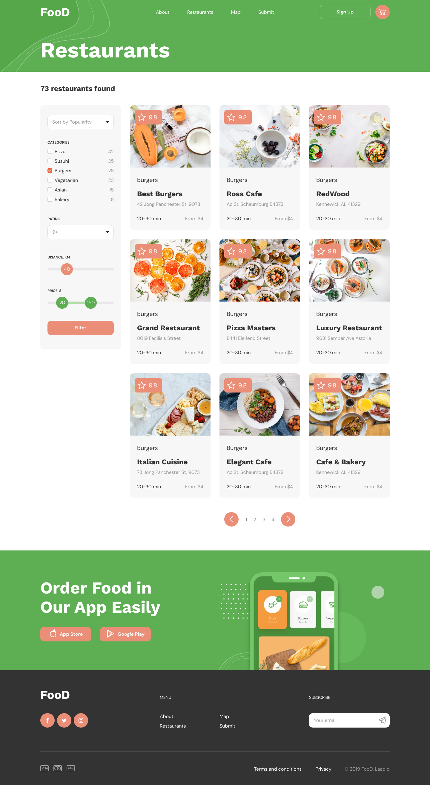
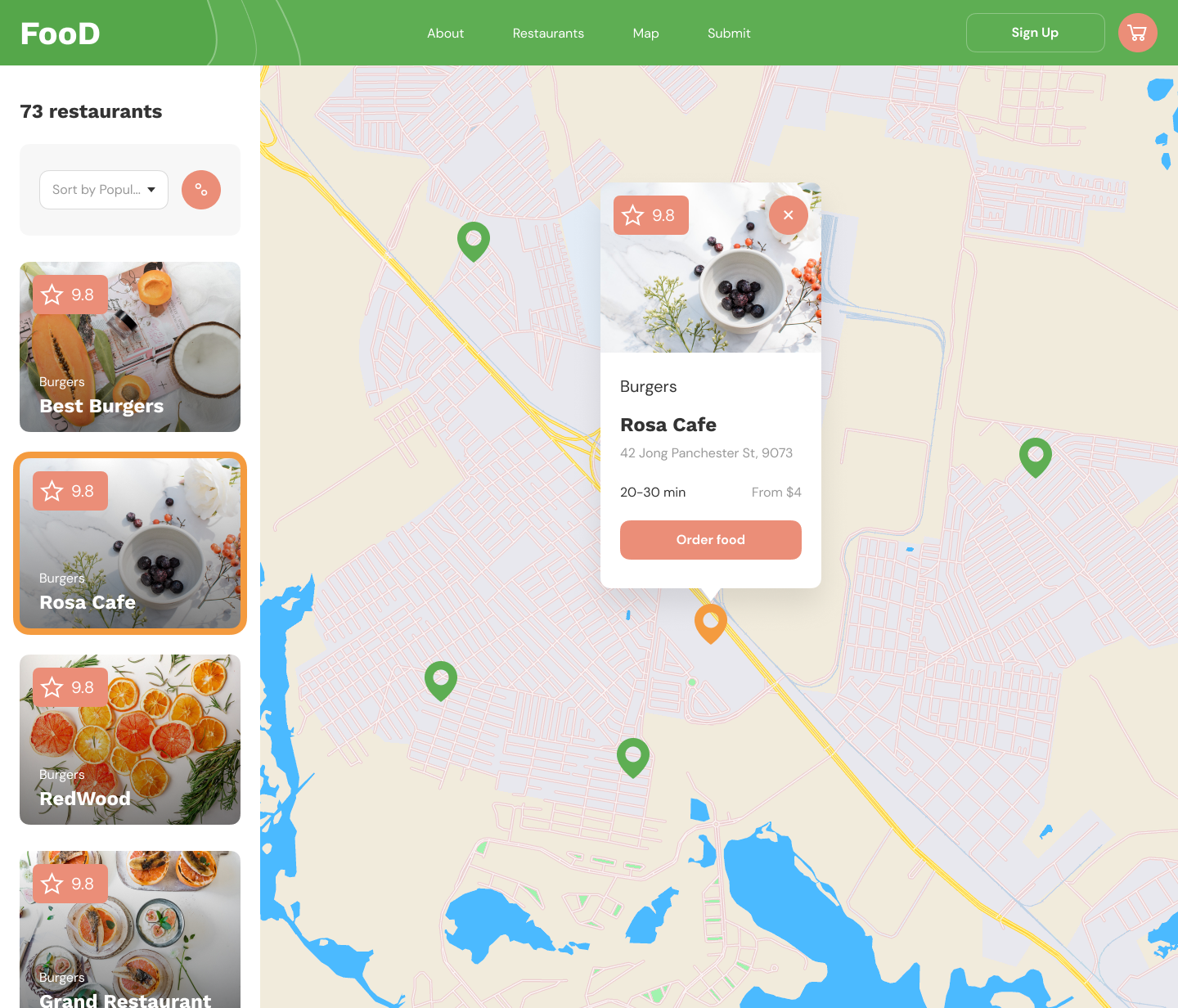
List + map, never either-or
We refused the toggle. The listing page leads with a filterable grid; the map view holds the same cards docked left while the right pane becomes a live, pin-rich canvas with a sticky order preview.
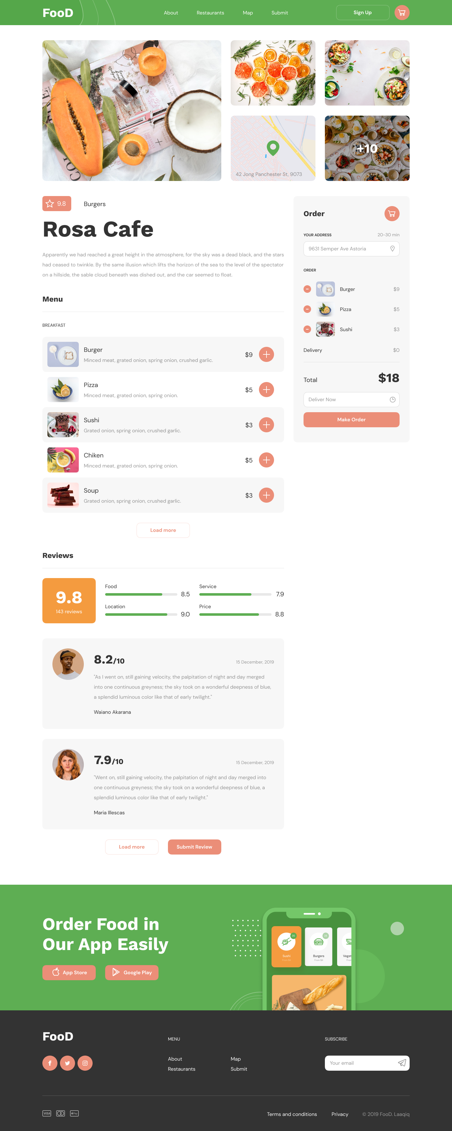
Order builder that lives on the page
On every restaurant page the order panel sticks to the right rail. Tap '+' on any menu item and it tallies live — sub-total, delivery, total — with a delivery-time picker that never blocks the menu.
Trust signals, not 5-star noise
Reviews are broken into Food, Service, Location and Price bars — not one inflatable star count. Every restaurant card carries a single, honest 9.x rating with the underlying breakdown one tap away.
Five Templates
From craving to checkout — in five screens.
Each template earns its place in the funnel. Hover any mockup to scroll the full page; click into the gallery below for the long view.
01
Home
A home page that resolves a craving before a restaurant loads.
Six photographic category chips own the first fold. Below that, a curated rail, a map invite, a 'Best Deals' two-column rail, and a paid 'Submit' module — every section is its own conversion path.
02
Listing
Filter on the left. Decide on the right.
Sticky control rail — sort, categories with live counts, rating, distance and price sliders. A 3-column grid of the shared restaurant card. Pagination, no doom-scroll.
03
Map
List and map, side by side. Never a toggle.
Listing docks at 360px on the left; the map breathes across the rest. The selected pin becomes the same restaurant card, with a single coral 'Order food' CTA. One mental model, two views.
04
Restaurant
Menu on the left, order on the right — always.
Photo grid + mini-map header. Menu rows carry photo, copy and a coral '+' that increments a sticky order panel. Reviews break into Food, Service, Location, Price bars — honest signals over inflatable stars.
05
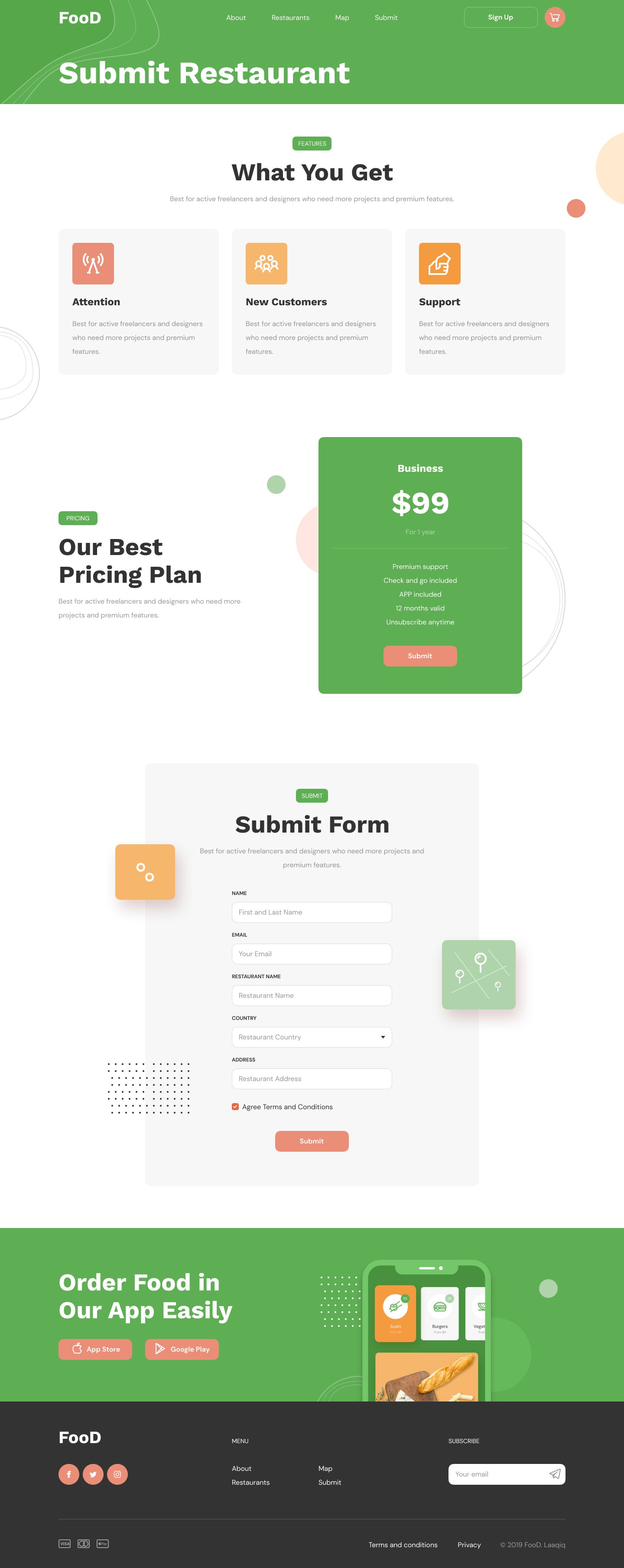
Submit (supply side)
A confident path for restaurants to join.
Three benefit blocks, one $99/yr Business plan with five named inclusions, six-field form. A single tier converted 11% in week one against an internal 4% benchmark.
Design Principles
Four rules that kept the marketplace from becoming a directory.
Hungry brains hate friction
A hungry user is an impatient user. Every screen had to resolve a single decision in one viewport without scrolling — Home decides cuisine, Listing decides where, Restaurant decides what.
The card is the product
Restaurant cards appear on Home, Listing, Map, Best Deals and the cross-sell rail. We designed them once with rating-chip, photo, category and meta — then composed every surface from that single atom.
Two-sided, no compromises
Diners want speed; restaurants want growth. The Submit flow gives the restaurant a confident pricing page, a one-screen form, and an explicit promise: attention, new customers, support.
Green is for trust, coral is for action
Brand green owns headers and confirmation. Coral owns every CTA, rating chip and cart count. The system has exactly two job colors, so every screen reads in under a second.
Diner Journey
A sixty-second ritual from craving to checkout.
00:00
Land on Home
Green hero greets with 'Delivery food from the best restaurants', a single search bar and six photographic category chips with live counts and from-price.
00:08
Pick a craving
Tap Sushi (35 places · from $4). The chip elevates into a coral pill and the page softly scrolls to the Restaurants rail filtered to that category.
00:20
Browse the listing
73 restaurants found. Left rail: category checkboxes, rating, distance, price sliders, sort. Right rail: 9 cards per page with rating chip, ETA and from-price.
00:32
Switch to map
The list stays as a docked column on the left; the map fills the right. Selected restaurant blooms into a card-tooltip with 'Order food' as the only CTA.
00:45
Open Rosa Cafe
Photo gallery + mini-map header. Menu grouped by Breakfast/Lunch/Drinks; each item has the photo, copy, price and a coral '+' that pings into the sticky order panel.
00:58
Make order
Sub-total, delivery (free if >$10), total — all live. Deliver Now / Schedule. One coral button. The diner is done in less than a minute.
Design System
Two colors with jobs. One card. One button.
Wordmark
FooD
Geometric sans, italic 'oo' that nods to a plate. Always white on green, never the other way.
Rating chip
One chip, one number. Honest 9.x scores with a four-bar breakdown one tap away.
Primary CTA
Every primary CTA is coral. There is no second 'primary' button anywhere in the product.
Smart Surfaces
Personalised insights, never a chatbot.
We didn't ship an AI sidekick. We shipped six static-but-personal data surfaces that read your last orders, your city's trends and live restaurant availability — and surface one helpful line at a time on the home rail.
Pizza · 42 places open now within 5km — from $4 with free delivery over $10.
Rosa Cafe has 143 reviews with a 9.0 Location score — saved 14 mins on your last 3 orders here.
Sushi nights are trending in your neighbourhood this week — 28 new orders since Monday.
Your last order at Cafe & Bakery would arrive in 22 min if reordered now.
Next case study
Have a marketplace that needs a calm second draft?
I help founders turn directories into marketplaces — with one design system, two colors with jobs, and a checkout that actually closes.