Case Study · Mobile Digital Wallet
Designing a digital wallet that makes every transaction feel instant, safe and simple.
FastPay is a full-featured mobile wallet — cards, bill payments, transfers, mobile top-ups, QR payments, vouchers, statistics and ATM finder, all in one clean experience. The challenge: bring that functional complexity to the surface without making a single screen feel overwhelming.
Client
FastPay
Industry
Fintech · Digital Wallet
Service
UI/UX Design
Platform
iOS & Android
Tools
Figma · FigJam · Maze · Principle
Timeline
14 weeks

Problem
Wallet apps are either too thin or too bloated.
Oversimplified wallets do too little; full banking apps bury essentials under menus. Users just want to pay a bill, send money, top up a phone and check a balance — in under two minutes.
Goal
One wallet that surfaces every action without overwhelming a screen.
Consolidate cards, bills, transfers, top-ups, QR pay, vouchers, statistics and ATM finder into a single rhythm — and make the moment money moves feel like a trust receipt.
Outcome
40+ screens where speed reads as confidence.
From splash and biometric setup to a dashboard with one-tap quick actions, dramatic success modals with transaction IDs, and a Voucher layer that drives daily opens.
97%
Pay Bill task completion (vs 71% benchmark)
4 taps
Send Money from home — down from 9
58s
Median time to first payment after sign-up
+68
Net Promoter Score from usability testing
Project Timeline
Fourteen weeks from interview to testing.
01 · Weeks 1–3
18 interviews, diary study, competitive audit of 8 wallets
02 · Weeks 4–6
IA, first-click testing, transaction-flow wireframes
03 · Weeks 7–10
Wave-header visual system, card renderings, hi-fi screens
04 · Weeks 11–14
3 rounds of prototype usability testing with 24 users
Design Principles
Six principles that governed every screen.
One Tap to Any Action
Send, Pay Bill and Scan & Pay are always one tap from home.
Confirmations Build Trust
Every flow ends in a named success state with a tappable transaction ID.
Cards Feel Valuable
Real-world proportions, colour gradients, chip icons, masked numbers.
Spending is Visible
Statistics and history are first-class features, not buried settings.
Security is Celebrated
Fingerprint and passcode are framed as protective features, not friction.
Vouchers as Habit
A loyalty layer that earns daily opens even when there's no payment to make.
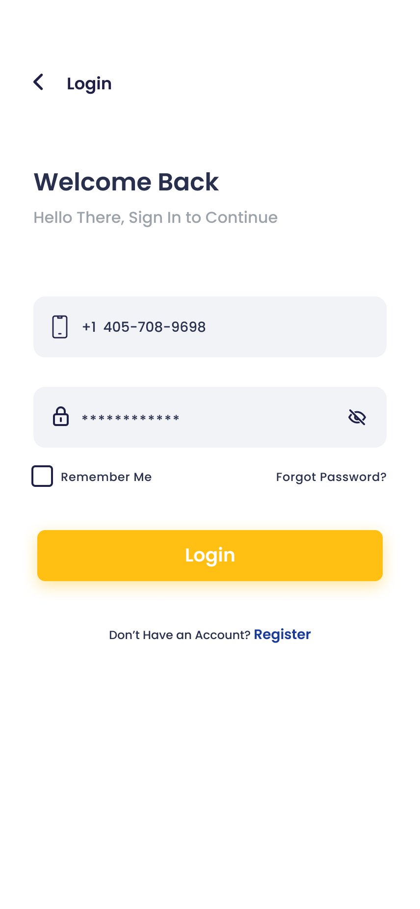
Section 1 · Onboarding & Auth
Warmth before the work — then three steps, no friction.
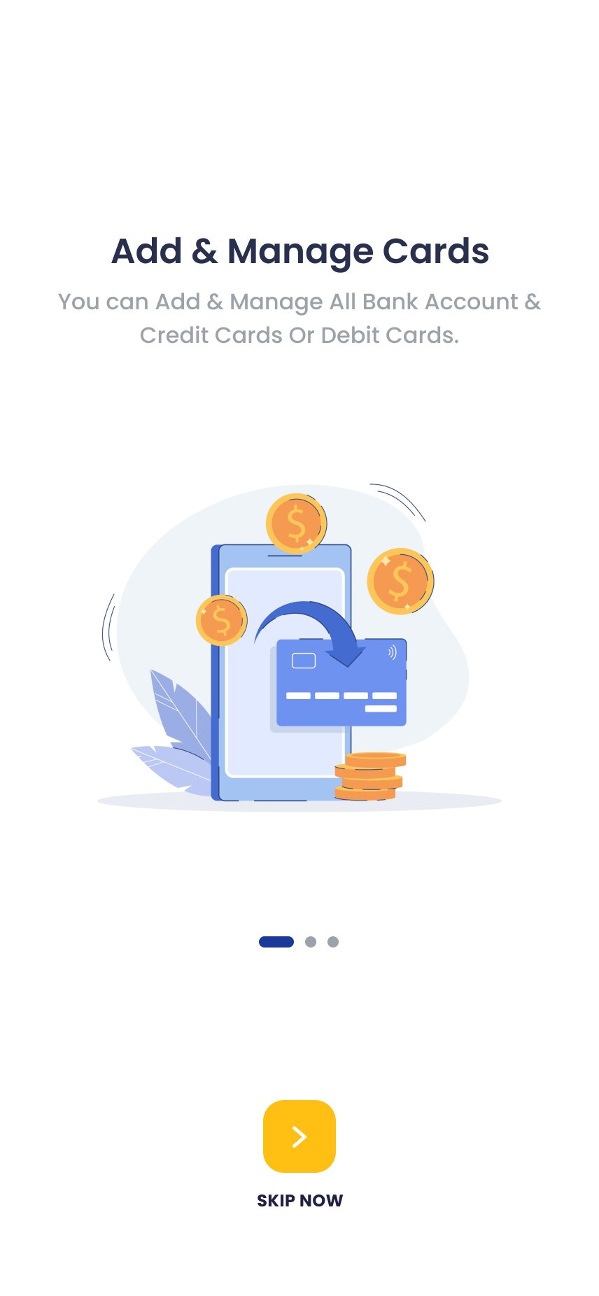
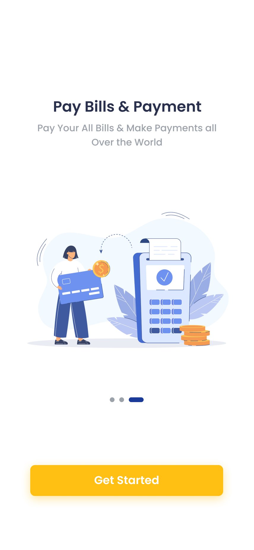
The amber splash screen communicates speed and confidence in a single second. Three aspirational onboarding slides motivate rather than instruct. Registration collects only name, phone and password. OTP and biometric setup are framed as protective features, not required steps.
Splash
Onboarding 1
Onboarding 3
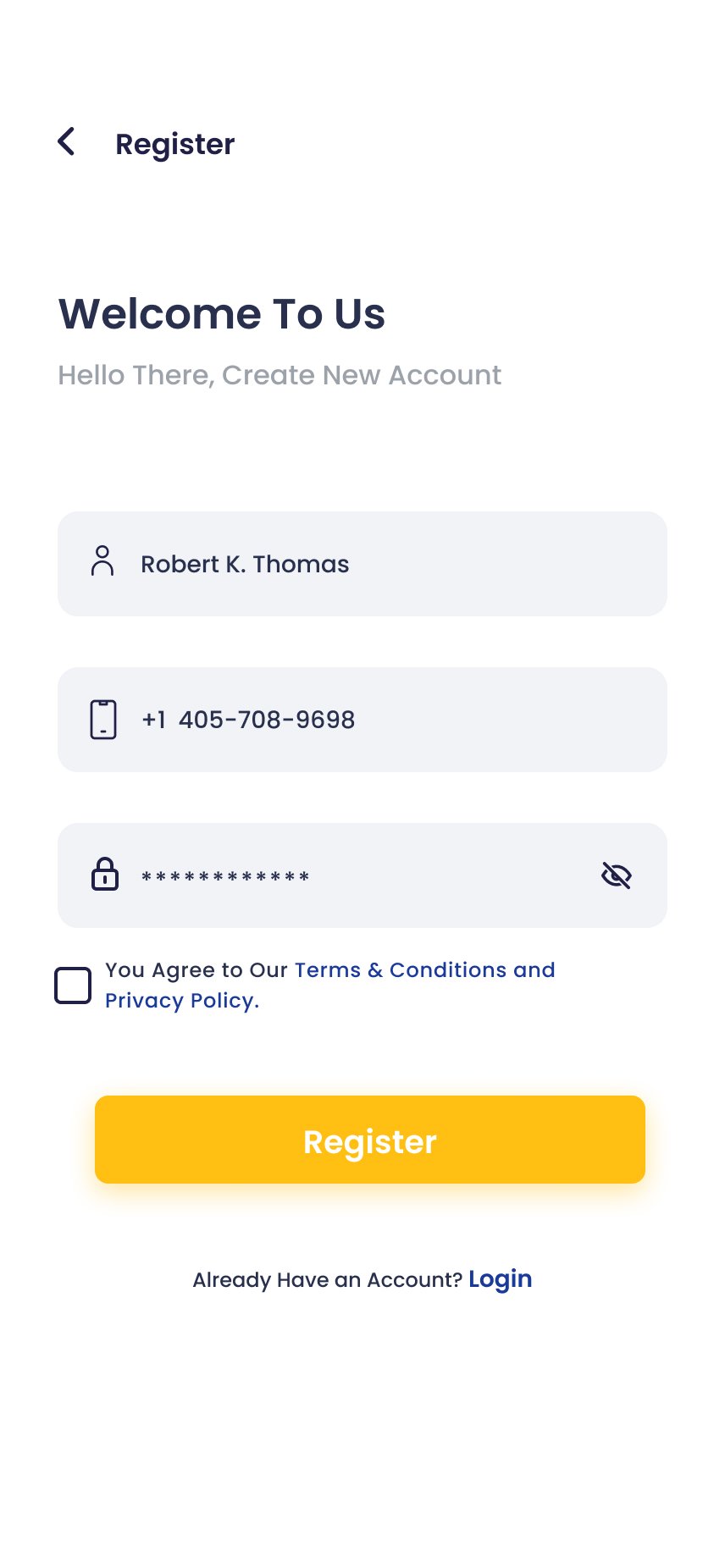
Register
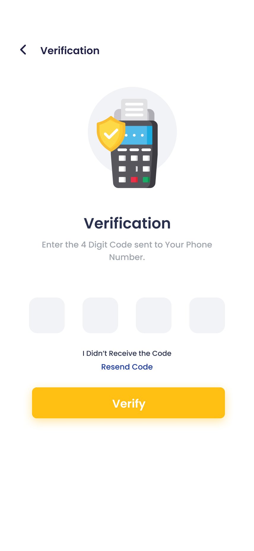
OTP Verification
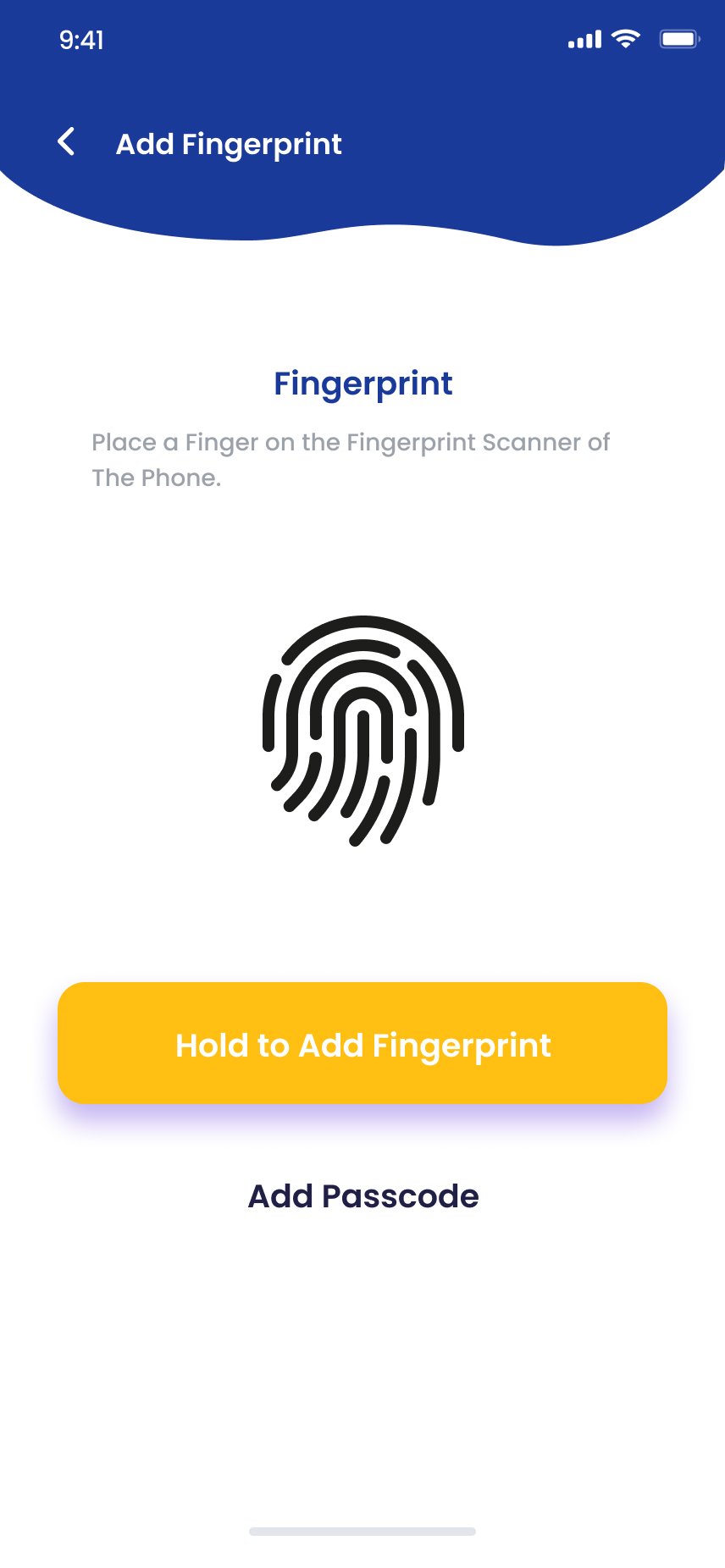
Biometric Setup
"Hold to Add Fingerprint" — tactile, not bureaucratic.
Framing biometric setup as a protective feature rather than a required step pushed completion to 91% in testing. The message: this protects you, not this is mandatory.
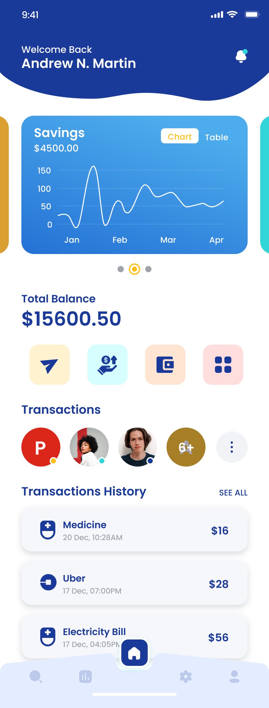
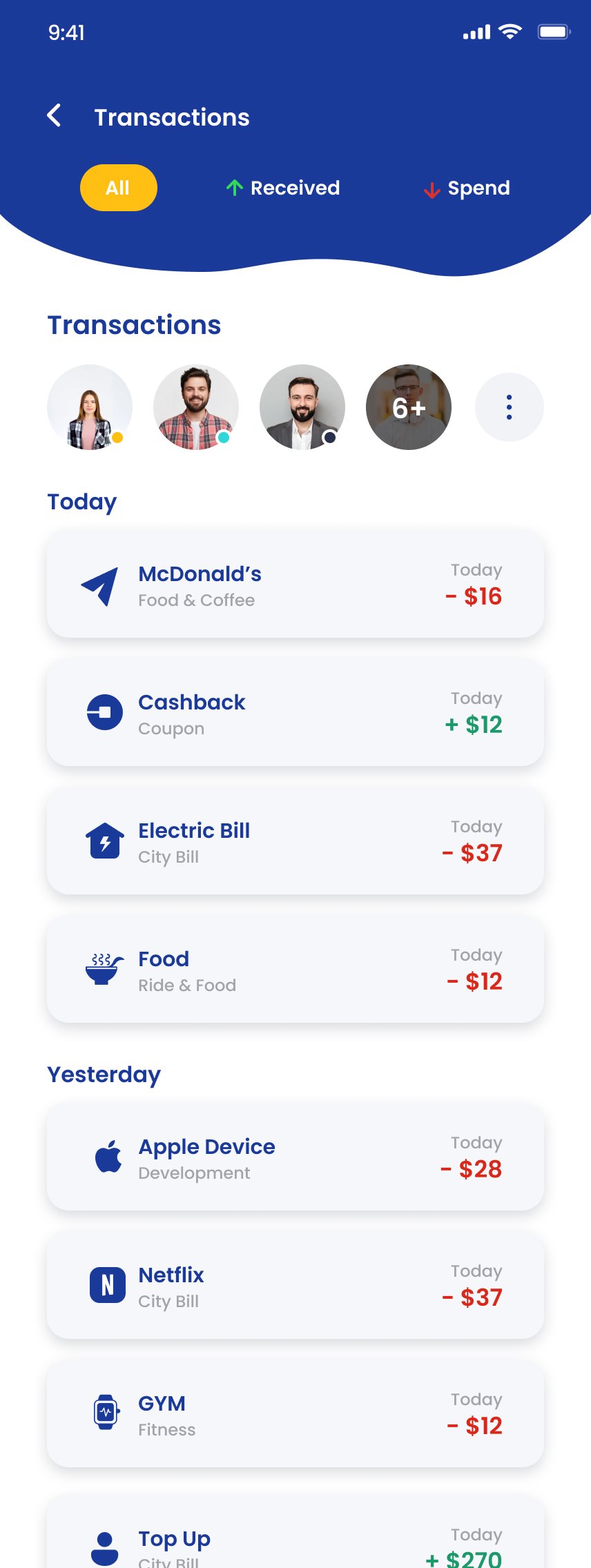
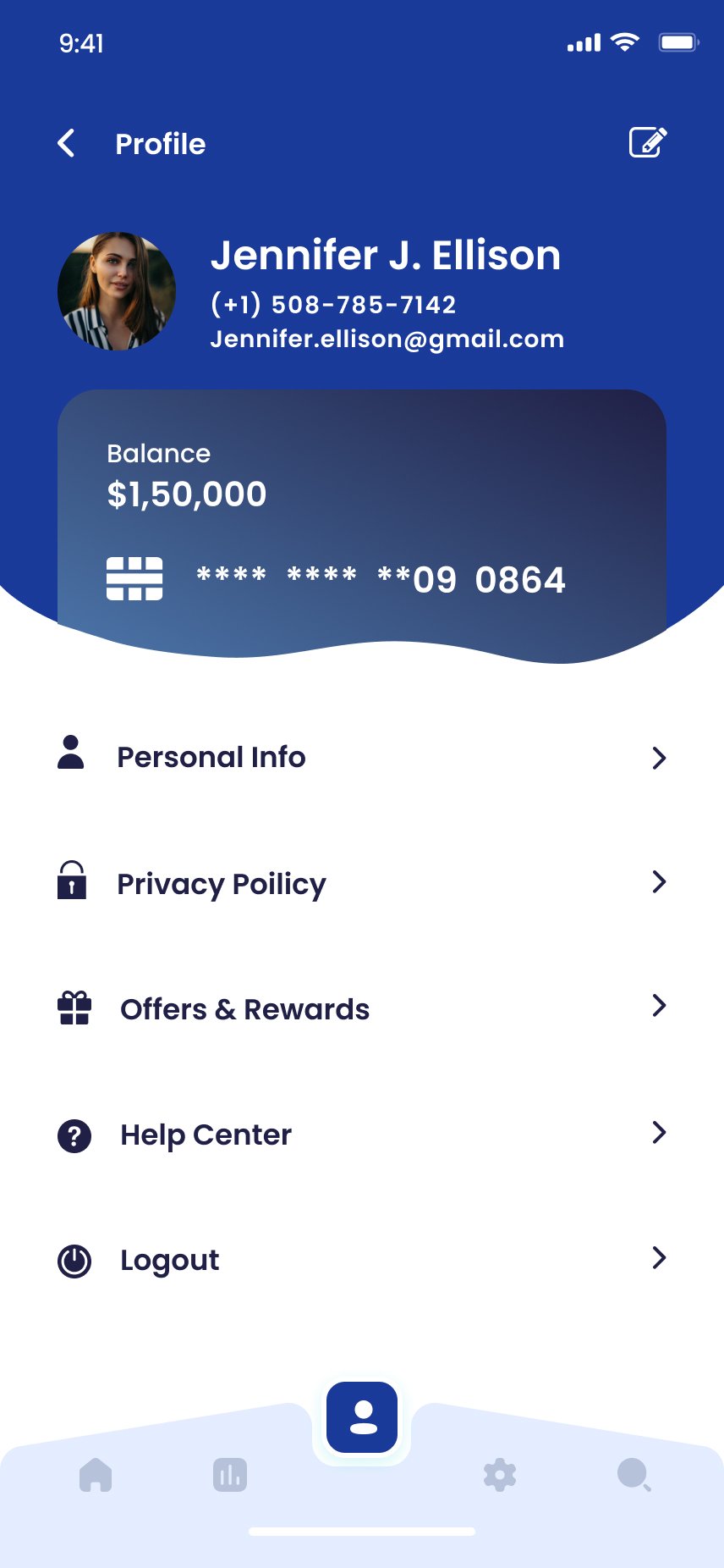
Section 2 · Home Dashboard
The financial control centre — answered in 30 seconds.
Personalised wave header, swipeable savings carousel, hero balance in oversized type, four colour-coded quick action tiles, recent-contact avatars for one-tap repeat transactions, and a transactions list with merchant icons that read like an inbox.
- Hero balance. Total Balance is the first number below the fold — impossible to miss, impossible to misread.
- Four-action quick row. Send, Top Up, Wallet, Services — coloured tiles, no labels needed.
- Contact-first transactions. A recent-contact avatar row sits above the transaction list — one tap to repeat a transfer.
- Branded merchant icons. Users scan transaction lists like an inbox, looking for recognised logos, not reading text.
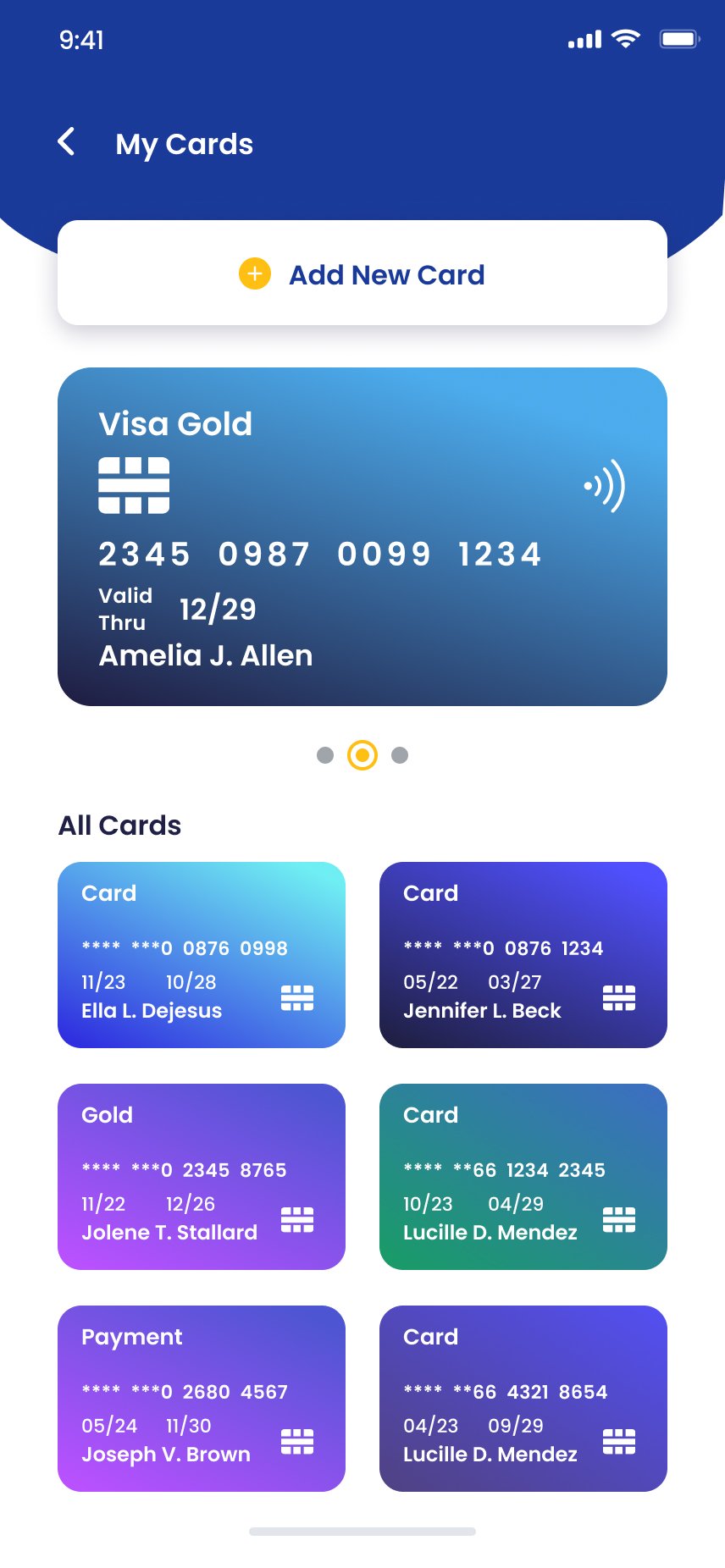
Section 3 · My Cards
Cards rendered like objects, not records.
Full-width gradient card with chip and contactless icons, then a colour-coded grid below. Each card uses its own gradient so users identify cards by colour before reading the masked number. Adding a card offers scan and manual entry as co-equal paths — never a small text fallback.
My Cards
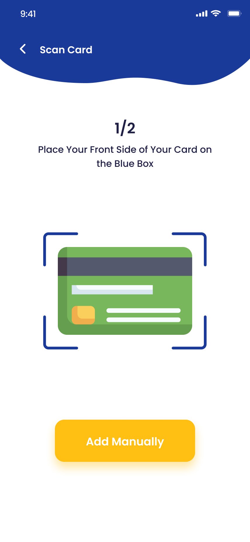
Scan Card · 1/2
Login
Section 4 · Pay Bill
Recurring payments, made effortless.
The screen opens on saved billers — re-adding the same accounts monthly was a top diary-study frustration, so it's been eliminated. The Payment screen pre-fills from history. The Success modal isn't decorative — it's the trust receipt, with a tappable transaction ID and a calm path home.
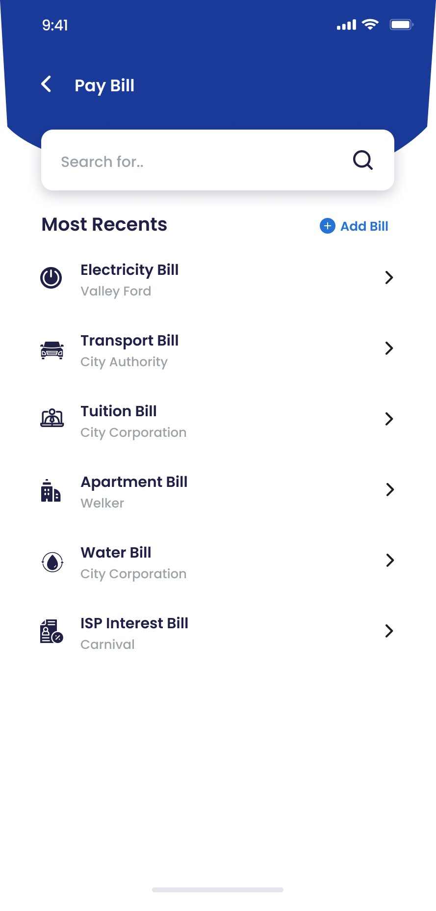
Bill list
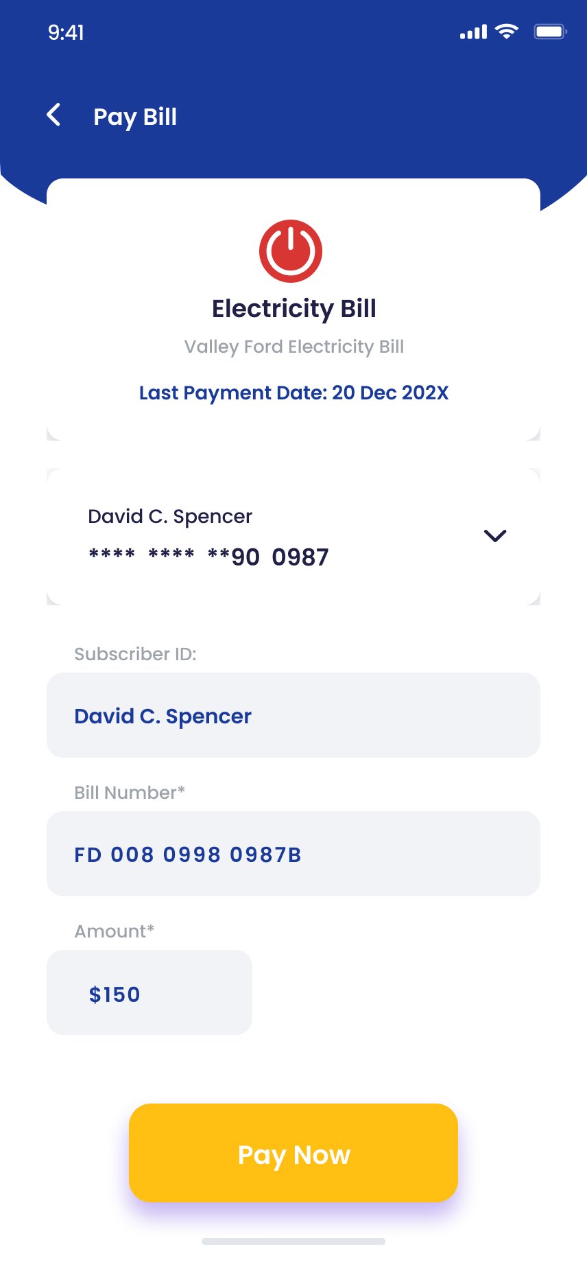
Payment details
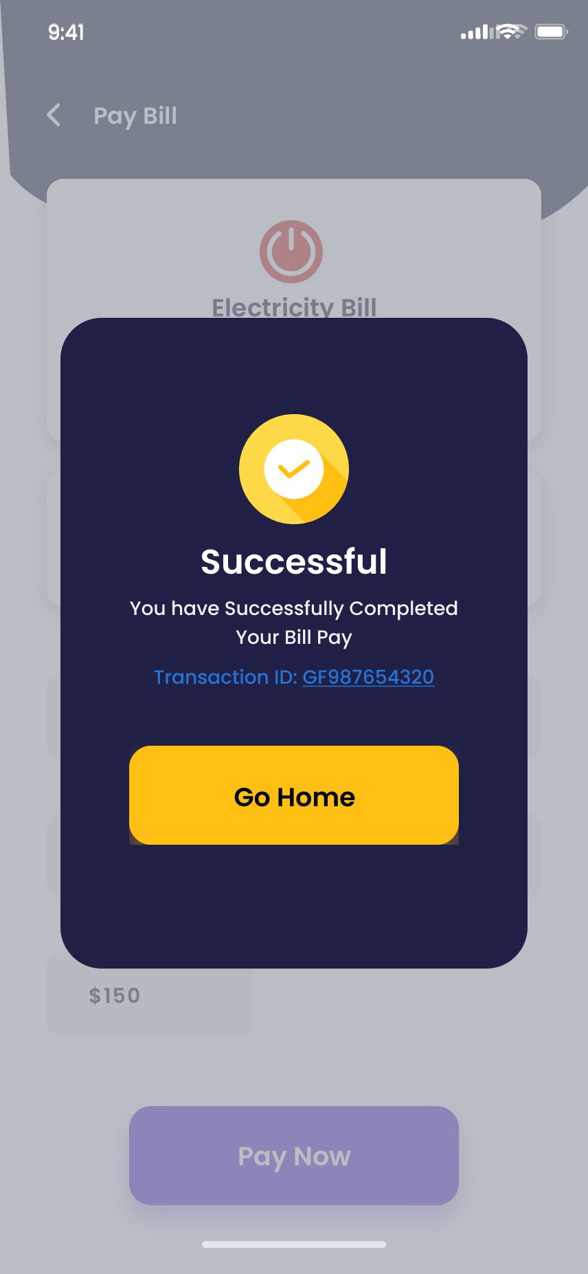
Success · transaction ID
"The transaction ID on every success screen reduced post-payment anxiety in testing more than any other design change. +4.9/5 trust rating."
Section 5 · Money Movement
Send, scan and top up — built around speed and people.
Send Money and Mobile Top Up both lead with recent contacts — money movement between people is the most frequent use case and should require the fewest steps. Scan & Pay is intentionally minimal: when a user is at a point of sale, every pixel either enables the scan or provides a fallback.
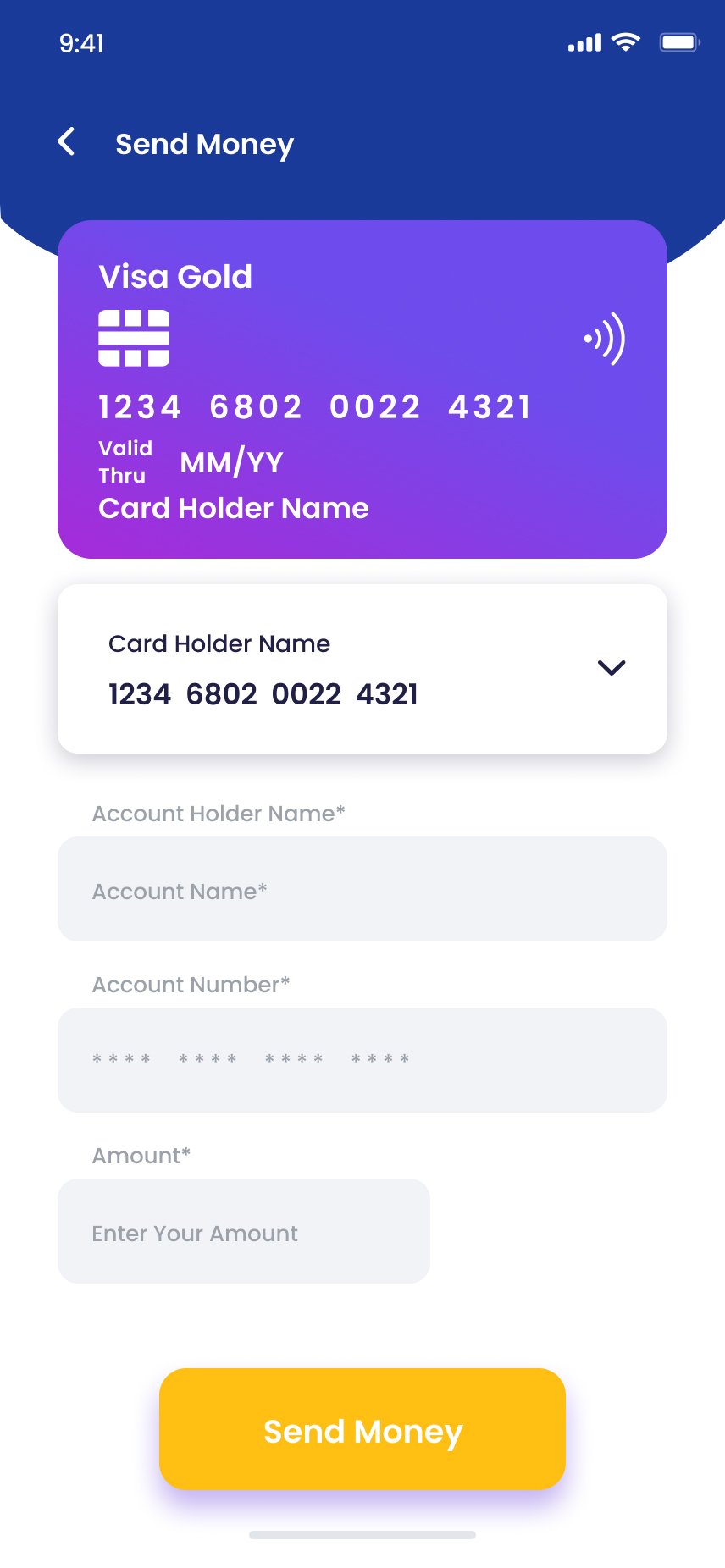
Send Money
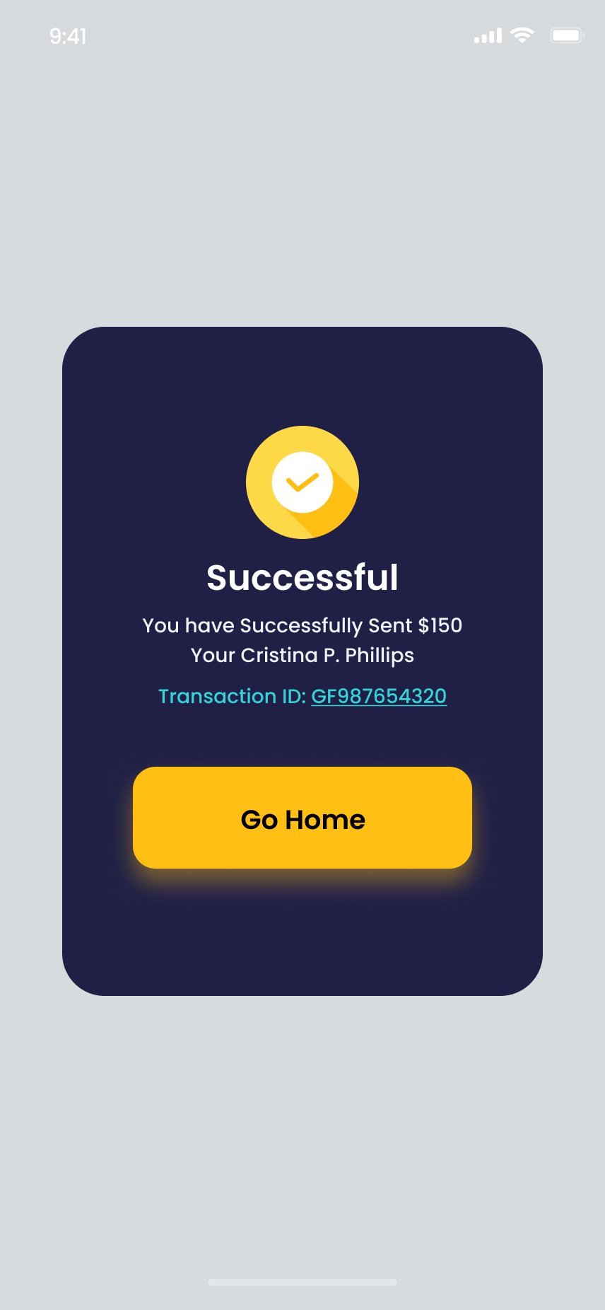
Send Success
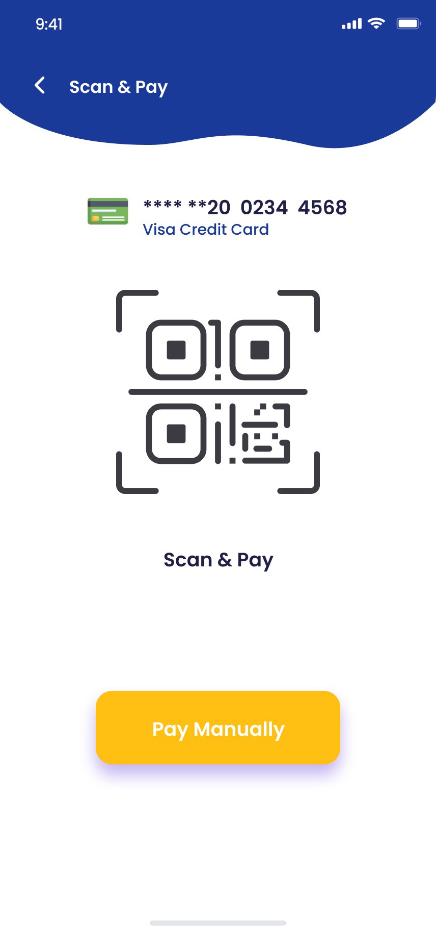
Scan & Pay
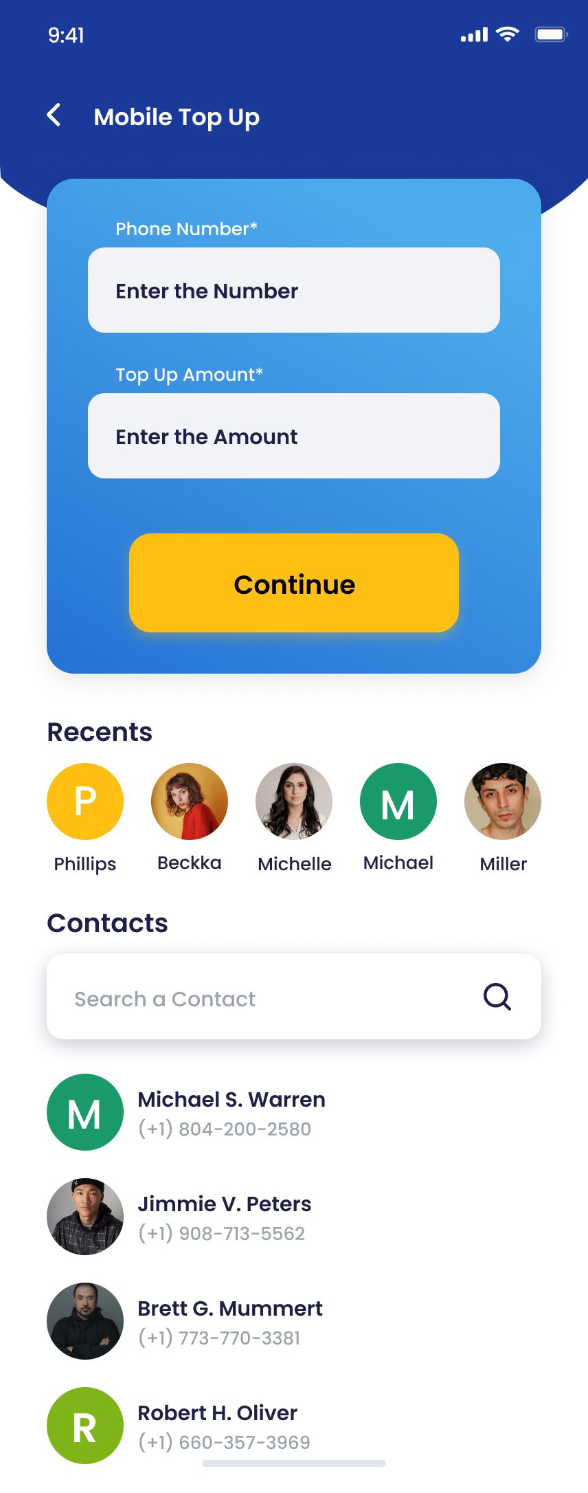
Mobile Top Up
Section 6 · Insight, Loyalty & Cash
Three screens that turn a wallet into a habit.
Statistics gives users a clean monthly picture without a calendar picker. Vouchers — pastel ticket cards with notched sides — give users a daily reason to open FastPay even with no payment to make. The ATM finder keeps users inside the app even for cash transactions.
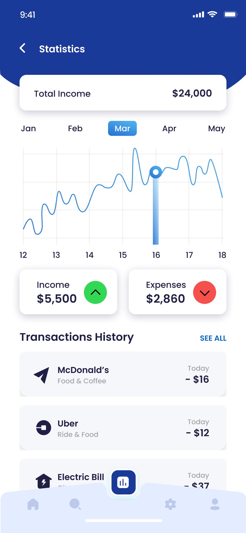
Statistics
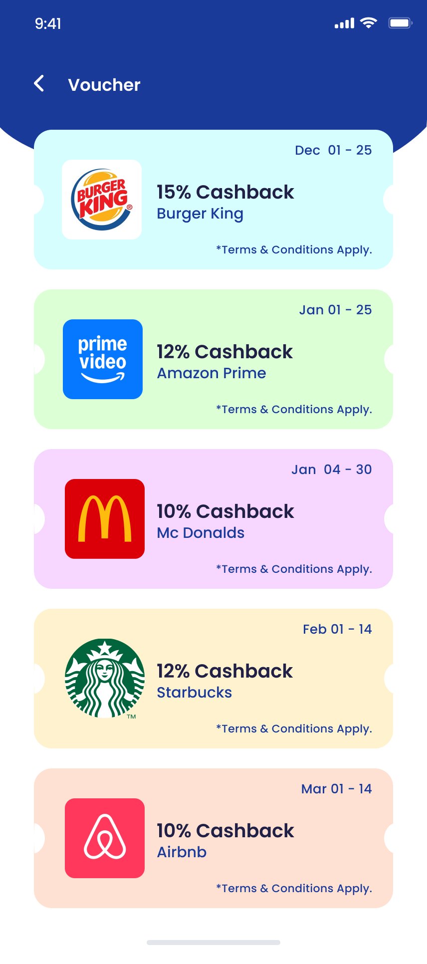
Vouchers
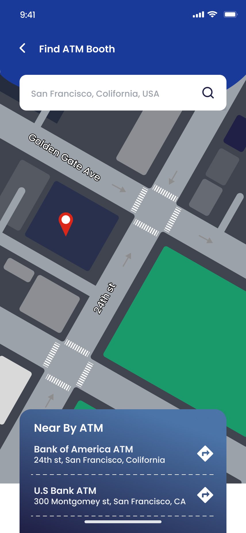
Find ATM Booth
Design System
Navy structure. Gold action. Wave header DNA.
Deep navy anchors structure; amber yellow carries action and confirmation. The dark navy wave header repeats on every screen — a single repeating element that gives every page a sense of brand presence without requiring a logo.
Deep Navy
#1A237E
Amber Yellow
#FFC107
Success Green
#1BB55C
Danger Red
#E53935
Off-White
#F5F5F5
Ink
#0E1234
What I Learned
In fintech, the confirmation is the product.
The design of a payment app is only as good as the moment after the money moves. Every other screen exists to get the user to that success modal — and that modal must repay their trust with transaction ID, clear language, calm treatment and a clear path home.
Consistency is a security signal
Inconsistent form fields read as 'sloppy' in consumer apps and 'dangerous' in financial ones. Strict design-system discipline across 40 screens is a confidence strategy.
Scan-or-manual removes the highest-stakes friction
Card and QR scanning are delightful when they work — and fail hard when they don't. Making manual entry a co-equal yellow CTA keeps real-world transactions completing.
Vouchers are retention, not marketing
Cashback offers drove app opens on days with no payment to make. Building Vouchers as a first-class screen turned a passive benefit into an active engagement driver.
Interested in collaborating on fintech product design? Let's talk.