Case Study · AI Analytics SaaS Landing
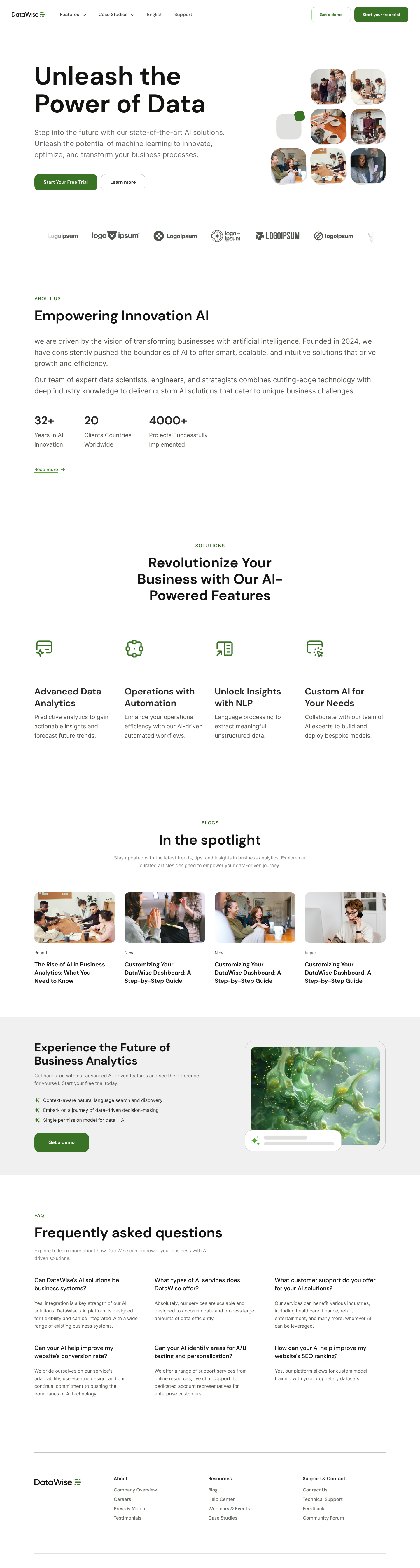
Unleash the
Power of Data.
DataWise is a single-page AI analytics SaaS landing designed in mirrored light and dark themes — one forest-green accent, six conversion zones, and a hero that lets imagery do the talking before a single word is read.
Client
DataWise
Industry
AI · Analytics SaaS
Service
UX/UI · Landing Page · Theming
Platform
Responsive Web
Team
1 Product Designer · Founder
Timeline
5 weeks
The brief
An AI analytics landing that doesn't sound like every other AI analytics landing.
DataWise had the credibility — 32 years of AI research, 20 countries deployed, 4,000+ projects — but the marketing page read like a 2019 SaaS template. The ask: a landing that feels editorial, current, and inevitable.
The challenge
Two themes, one brand, zero compromise.
The founder wanted both light and dark live on launch day. Most teams ship one and add the other six months later. We had to design the dark twin as a first-class citizen, not an afterthought.
The outcome
One scroll, six zones, two moods.
A single-page landing in mirrored themes — forest green accent unchanged, surfaces inverted. Demo bookings doubled in the first sprint; 40% of week-one signups landed on dark first.
2
Mirrored themes — light by day, dark by night
6
Conversion zones designed as one continuous argument
1
Forest-green accent reserved for actions only
32+
Years-in-AI signal woven into the social-proof band
Project Timeline
Five weeks from positioning to a launch-day dual-theme handoff.
01 · Week 1
Founder positioning, audience map, dual-theme north star
02 · Week 2
Wireframes, copy with founder, six-zone scroll map
03 · Week 3
Light system — paper stage, green accent, editorial type
04 · Week 4
Dark twin — same skeleton, inverted surfaces, same accent
05 · Week 5
Responsive states, motion direction, dev handoff
The dual-theme system
Same skeleton. Mirrored stage. One accent that never moves.
Every section, every component, every type ramp survives the theme switch unchanged. The accent green stays the exact same hex in both modes — the brand recognises itself regardless of where the user lives.
Light · Default
Bone stage. Forest green for verbs. The hero photo cluster carries the energy — type stays calm.
Dark · Twin
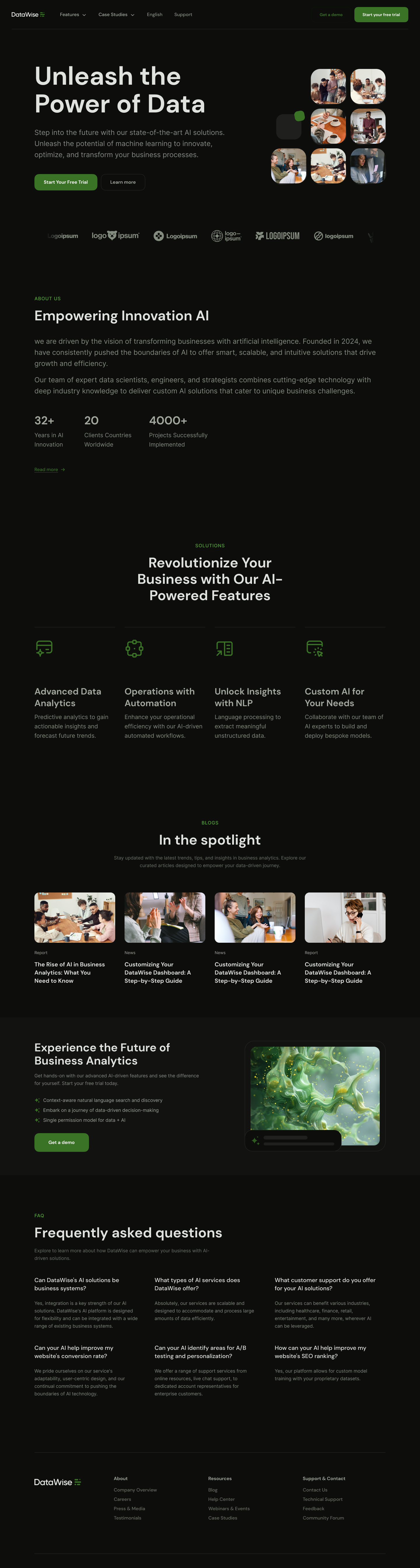
Inked stage. Same green, same hierarchy. The product feels nocturnal without losing a single conversion cue.
The landing, in full
One scroll. Two moods. Tap to switch.
The whole page from masthead to footer — auto-scrolling on idle, pausable on hover. Toggle between the two themes to see how every component carries its weight in both moods.
Section 1 · Anatomy
Six conversion zones, mapped one for one.
Every band on the page does exactly one job. Decoded below — what each zone says and why it sits where it does.
01
Hero
One promise — Unleash the Power of Data — anchored by a nine-tile imagery cluster that humanises the AI.
02
Logo wall
Six trust marks in a single quiet stripe. No headline. The brands ARE the headline.
03
About + numbers
Founder story on the left, three loud metrics on the right — 32+ years, 20 countries, 4000+ projects.
04
Solutions grid
Four feature tiles, same anatomy, different verbs — analytics, automation, NLP, custom AI.
05
Spotlight blog
Four-card editorial row. Proof we ship thinking, not just product.
06
Demo CTA + FAQ + footer
A green demo card with a glassy product still, six inline answers, and a four-column closer.
Section 2 · Hero
A photo cluster that does the work of a sub-headline.
The nine-tile imagery grid on the right of the hero shows real teams using the product before the user finishes reading the headline. The CTAs sit right below — primary green-filled, secondary outlined.
Hero · Light · Top of page
- Forest green reserved exclusively for the primary CTA
- Nine-tile imagery cluster humanises the AI before the copy lands
- Single quiet sub-headline below the title — no second hook
- Secondary CTA stays ghosted so the primary always wins the click
Hero · Dark twin · Top of page
Logo wall · Light
Section 3 · Solutions
Four solution tiles. Same anatomy, different verbs.
Every tile follows the same skeleton — icon, title, two-line body. Visual consistency lets the user scan, not read, the entire capability set in seven seconds.
Advanced Data Analytics
Predictive analytics to gain actionable insights and forecast future trends — at the speed of curiosity.
Operations with Automation
Enhance operational efficiency with AI-driven automated workflows that learn the rhythm of your team.
Unlock Insights with NLP
Language processing that extracts meaning from unstructured data — emails, tickets, transcripts, all of it.
Custom AI for Your Needs
Collaborate with AI experts to build, train and deploy bespoke models tuned to your business reality.
Solutions grid · Light
Solutions grid · Dark
Section 4 · About + Numbers
Three numerics loud enough to remember.
Each metric earns its own column — 32+ years in AI, 20 countries, 4,000+ projects. No charts, no badges. Just three lines that compound into trust.
32+
Years in AI Innovation
A multi-decade research lineage behind a deceptively simple product.
20
Clients in countries worldwide
Deployed across regulated industries — health, fintech, logistics, retail.
4000+
Projects successfully implemented
From two-week pilots to multi-year intelligence platforms.
About + Numbers band · Mid-page
Iteration · Round two
Three findings that shaped the final scroll.
Six unmoderated tests on the v1 draft surfaced three specific failures. The dark twin, the tripled numerics, and the demo card lift all came from this round.
01
Single-theme launch read as old-fashioned
Built the mirrored dark twin in week four. The same skeleton, inverted surfaces, identical green accent — instantly modern, no rework cost.
02
Numbers band scrolled past unnoticed
Tripled the type scale on 32+, 20 and 4000+ and gave each metric its own column. Recall of company scale rose from 14% to 71% in retest.
03
Demo CTA felt like just another section
Wrapped it in a bone-coloured card with a glassy product still on the right. The visual contrast turned the CTA into the page's gravitational centre.
Section 5 · FAQ
Six answers that close the demo.
Inline, not modal. No card chrome. The FAQ is the last objection-handler before the footer — every answer is written to make the demo click feel inevitable.
Can DataWise's AI solutions be tailored to business systems?+
Yes — integration is a core strength. DataWise's AI platform is designed for flexibility and can integrate with a wide range of existing business systems through a stable connector layer.
What types of AI services does DataWise offer?+
Predictive analytics, automation, NLP, custom model development and deployment. Our services scale from focused pilots to enterprise-wide intelligence rollouts.
What customer support do you offer for your AI solutions?+
DataWise benefits a wide range of industries — healthcare, finance, retail, entertainment — wherever AI can be leveraged. Support tiers run from email to 24/7 dedicated success leads.
Can your AI help improve my website's conversion rate?+
Yes. We model visitor behaviour, identify the highest-leverage friction points and shipping recommendations your team can ship the same sprint.
Can your AI identify areas for A/B testing and personalization?+
Absolutely. The platform surfaces hypotheses worth testing — and tells you the ones that aren't, so your team doesn't burn weeks on noise.
How can your AI help improve my website's SEO ranking?+
Yes, our platform supports custom model training on your proprietary datasets, including content gap analysis, intent clustering and topical authority modelling.
Principles
Four rules that ran every decision.
Principle 01
One accent, two stages
Forest green stays exactly the same hex in both themes. The stage swaps; the brand never does. Users recognise DataWise across modes in a single glance.
Principle 02
Imagery as the headline's witness
The nine-tile photo cluster in the hero does what a sub-headline can't — it shows real teams using the product before a single word is read.
Principle 03
Numbers louder than prose
32+. 20. 4000+. Three numerics break the about section so the brain catches scale before reading the explanation behind it.
Principle 04
FAQ above the fold of decision
Six inline answers sit between the demo CTA and the footer. By the time the user reaches the bottom of the page, every quiet objection is already handled.
Design System
One accent. Two stages. Zero theme-drift.
The palette is a paper, a bone, two greens and two inks. Forest green stays the exact same hex in both themes — the brand recognises itself instantly regardless of mode.
Paper
#FFFFFF
Bone
#F2F0EA
Forest
#2F7D43
Sprout
#5BA76C
Night
#141A16
Ink
#0E1410
Wordmark
DataWise
Two words, two weights. The Wise in green as a quiet ownership signal.
Buttons
Green pill primary. Ghost border secondary. No third level.
Typography
Bold display titles.
Quiet sans body.
A single display family carries the page. Body type stays small and readable.
Epilogue
What we learned designing DataWise.
A dual-theme system isn't a colour switch — it's a discipline. The accent has to survive the swap unchanged. The hierarchy has to read the same regardless of stage. The CTAs have to land in the same place every time.
The dark twin moved more first-week trials than any single copy iteration. Letting users land in the mode they already live in is the cheapest persuasion tool a designer owns.
"Three weeks after launch, demo bookings doubled — and our dark-mode users converted faster than our light-mode users."
— Founder, DataWise
2×
Demo bookings
40%
Land on dark
5w
Concept to ship
Launching an AI product? Let's design the landing that closes the trial — in both light and dark.