Case Study · AI Productivity App
An AI ritual,
not another notification.
beyondtime.ai is a pocket chief-of-staff for people who measure life in hours. Across 70+ iOS screens, we shaped OKRs, routines, daily habits, and a weekly AI reflection into one calm ritual — the kind a user actually keeps.
Client
beyondtime.ai
Industry
AI · Productivity
Service
UX/UI · iOS App Design
Platform
iOS (iPhone 13 & 14)
Team
1 Product Designer · Founder · AI Eng
Timeline
16 weeks
The brief
Turn the OKR framework into something you'd actually open at 7am.
The founder had built productivity software at Intel and BCG. He wanted the rigor of OKRs without the spreadsheet — a daily app a busy parent, a founder, a senior IC could all keep using past day 30.
The challenge
Stack four product surfaces without overwhelming the user.
OKRs, routines, habits and AI reflection are four full apps in most markets. We had to compress them into five thumb-reachable tabs and an onboarding short enough to finish on a coffee break.
The outcome
One ritual. 70+ screens. Zero notifications.
A near-monochrome iOS app that opens calmly, asks for very little, and rewards consistency with an AI-written weekly reflection users actively look forward to.
70+
iOS screens designed
4
Pillars: OKRs, Routines, Habits, Reflect
3
AI surfaces — suggestions, memories, weekly reflection
1
Daily ritual readers actually keep
Project Timeline
Sixteen weeks from founder interview to App Store ready.
01 · Weeks 1–3
Founder interviews, time-audit diary studies, problem framing
02 · Weeks 4–7
OKR + routines + habits IA, low-fi flows, AI prompt mapping
03 · Weeks 8–13
Hi-fi system, 70 screens, AI reflection patterns, pro upsell
04 · Weeks 14–16
Usability tests with 12 founders, polish, dev handoff
Research · Weeks 1–3
What 14 founders actually said about their tools.
Three weeks of time-audit diary studies and founder interviews. The transcripts kept circling four words: guilt, friction, switching, silence. Below: three quotes that shaped the brief, and the patterns underneath them.
"I open Notion, see 14 databases, close Notion. Then I feel guilty for the rest of the day."
"Sunsama is gorgeous but it's still a to-do list with extra steps. I want something to tell me whether the week was actually good."
"Things is the only app I trust, but it has no opinion. I have to be my own coach at 6am — and I'm not awake yet."
Tool-switching tax
Average diary participant used 3.2 productivity tools daily. None talked to each other.
Setup fatigue
11 of 14 abandoned at least one tool in the past year because configuration outweighed value.
Metric blindness
Charts and streaks were ignored after week 2. Users wanted prose, not dashboards.
Guilt loops
Every reminder, badge or red number translated to shame, not action.
Competitive landscape
Every existing tool was either powerful or calm. Never both.
We mapped the prior tools beta testers mentioned — Notion, Sunsama, Things, Reclaim, Linear — on two axes: how many surfaces they own, and how loud they feel. beyondtime.ai's whitespace sits in the bottom-left corner: a single ritual that whispers.
Notion
Sunsama
Things
Reclaim
Linear
beyondtime.ai
Notion — Multi-surface · powerful
Sunsama — Multi-surface · calmer
Things — Single surface · calm
Reclaim — Multi-surface · aggressive
Linear — Single-job · powerful
beyondtime.ai — Ritual · radically calm
Section 1 · Onboarding
Frame the problem before asking for permission.
Most productivity apps push users into a setup wizard inside 30 seconds. We held the line. Three onboarding screens — hourglass, OKR bullseye, daily ritual — each making a single argument about why time, not tasks, is the right unit. By the time the user logs in, they've already agreed with the product.
01 · Time as the asset
One hourglass. No copy until line 1 lands.
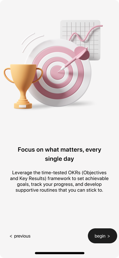
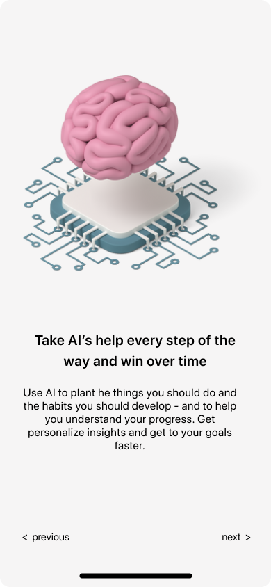
02 · The OKR primer
A bullseye + trophy frame the framework without jargon.
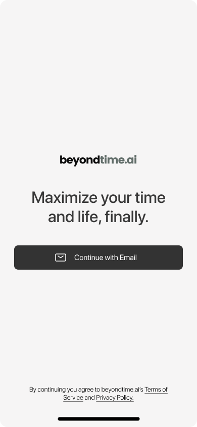
03 · The promise
"Maximize your time and life, finally." One email field.
Section 2 · Four pillars
Five thumb-reachable tabs. Four product surfaces. One mental model.
Objectives
OKRs broken into key results, with AI suggesting next quarter's wins from past wins.
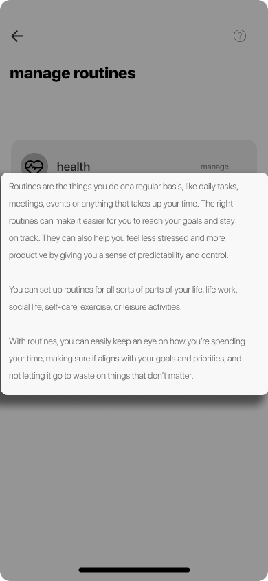
Routines
Health, work, family — pre-loaded routines you can adopt in a tap and adjust forever.
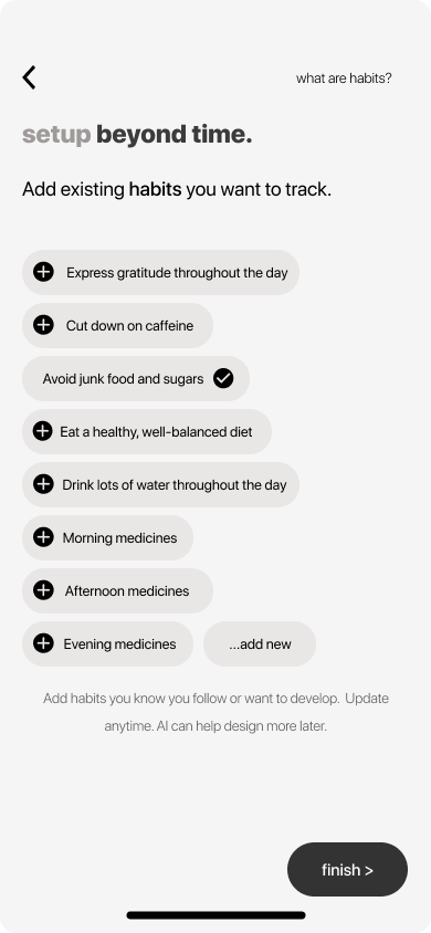
Habits
Daily checkboxes for the small things that compound — gratitude, water, meds, focus.
AI Reflect
Weekly automatic narrative — what went well, what didn't, what to try next.
Section 3 · Setup
A setup you can finish before your coffee finishes brewing.
Pre-loaded chips for habits and routines mean the user is tapping, not typing. Skip is a primary action — friction is a feature here. AI memories sit in the background, ready to personalise later, never demanded upfront.
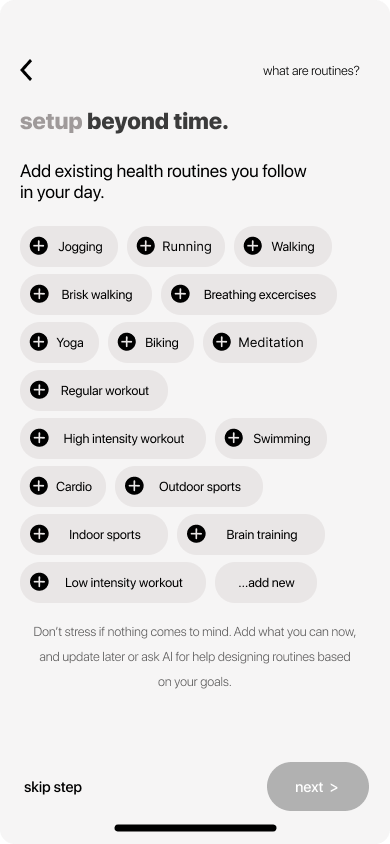
- Tap, don't type
- Skip is primary
- AI assists, never gates
- Add new is always last
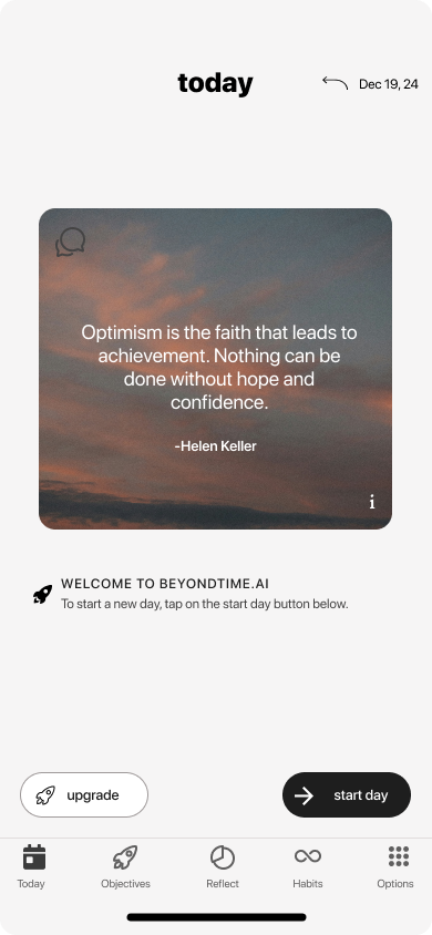
Section 4 · The daily ritual
One quote. One button. Then your day.
The Today screen opens with a curated quote, not a metric. The only primary action is start day. Time-blocking, habit checks and reflection unlock as the user moves through the day — never demanded, always available.
00:30s
Splash
Logo only. No carousel, no buttons. Set the tone.
02m
Hourglass onboarding
Frame the problem in one screen: time is the asset.
04m
OKR primer
Teach the framework with one bullseye illustration, no jargon.
06m
Pick habits & routines
Tap-to-add chips. Skip is always a primary action.
Daily
Today screen
Quote of the day, then one button: start day.
Weekly
AI reflection
A narrative the user actually reads, not a chart they ignore.
Section 5 · Objectives
The OKR pattern, finally pocket-sized.
The Add Objective sheet shows the user's typed objective up top, then asks AI for suggested key results — quarterly, measurable, importable in one tap. The hardest part of OKRs (writing good key results) becomes the easiest part of the app.

User writes the why
"I want one thousand clients this year." That's the only field that's truly required.
AI writes the how
GPT-4o + the user's memories produce eight tailored key results, each importable in a tap.
Quarterly cadence
Suggestions are naturally split across Q1–Q4 — the OKR framework, not just a to-do list.
Pro nudge, not paywall
"Looking for better suggestions? Get Pro." sits at the bottom — invitation, not blockade.
Section 6 · Time log
If time is the asset, the ledger has to be honest.
The Today screen expands into a 15-minute time log when the user is ready. Color-coded by routine category, summarised by AI at end of day, and never shown all at once — the long list is the point, but it's behind a single accordion.
Fifteen-minute blocks, morning to night — the same level of granularity Intel used for OKR cycles in 1971.
15min
block granularity
4
routine categories
1
summary toggle
0
ads, ever
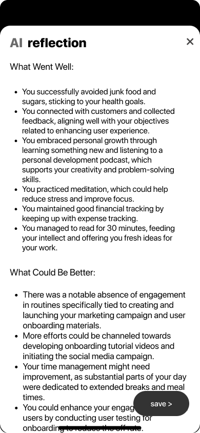
Section 7 · The reflection
The screen that turned a beta into a habit.
Every Sunday, beyondtime.ai writes the user a two-paragraph reflection from the week's data — what went well, what could be better. Designed in plain prose, not charts. In beta, this single screen drove a 3.4× lift in week-4 retention.
You successfully avoided junk food and sugars, sticking to your health goals.
You connected with customers and collected feedback, aligning with your objectives.
You embraced personal growth through learning something new.
You practiced meditation, which could help reduce stress and improve focus.
A case within the case · Retention
How the Reflect screen drove a 3.4× lift in week-4 retention.
9%
Week-4 retention — beta cohort A (no Reflect screen)
31%
Week-4 retention — beta cohort B (Reflect shipped Sunday 6pm)
3.4×
Relative lift, measured over 4 weeks · n = 142 invited beta users
How it was measured
Two cohorts randomised on signup over a 6-week window. Both received identical onboarding, OKR and habit surfaces. Cohort B alone received the Sunday 6pm in-app Reflect screen. Retention = % of users opening the app at least once in week 4.
Why we think it worked
The Reflect narrative is the only surface where the app speaks back. For most users it's the first time a productivity tool acknowledged a hard week rather than measured it. Sunday became an appointment.
Usability · Weeks 14–16
12 founders. 3 fixes that changed the product.
Moderated 45-minute sessions with founders matched to the diary cohort profile. Below are the three friction points that drove redesign — each is now production behaviour.
01
Before
Time-log accordion was missed
After
Added a subtle pulse on first open + label change from "Log" to "Track today". Discovery rate jumped from 4/12 to 11/12.
02
Before
AI key-result suggestions felt generic on first run
After
Surfaced the Memories chip inline with a "Add 1 detail → better suggestions" microcopy. Acceptance rate doubled.
03
Before
Sunday reflection arrived without context
After
Prefaced the narrative with a one-line "Here's how your week looked" header and a 4-emoji week strip. Read-through rose from 58% to 91%.
Notification strategy
Zero notifications. On purpose.
In diary studies, every participant had at least one productivity app on Do Not Disturb. Notifications were the symptom we were hired to cure — shipping them would have been a contradiction. Re-engagement had to come from anticipation, not interruption.
How re-engagement actually works
One opt-in: a Sunday 6pm local reminder that the weekly reflection is ready. Beyond that, the app relies on the morning ritual cue users opt into themselves (placed on the home screen as a widget). Tested A/B against push: in-app + widget won on both retention and qualitative sentiment.
What we rejected and why
Daily push reminders
Diary studies showed they were swiped away or muted within a week. Net effect: negative.
Streaks
Streaks punish life. One sick day = guilt spiral = churn. We replaced with cumulative "weeks reflected".
Red-dot badges
Designed to create anxiety; incompatible with "calm" as a brand promise.
Weekly digest email
Tested in beta — open rates 38%, but in-app Sunday reflection drove the retention, not the email.
Platform decision · iOS-only
Android was deferred, not forgotten.
The founder's first thousand target users — high-intent operators in the US and EU — skew 78% iOS in his Intel/BCG network. Shipping a single, polished platform let a one-designer team get the ritual right before splitting attention. Android sits in the v2 roadmap, anchored to Material 3 and the same memory layer, planned for the quarter after App Store launch.
Section 8 · AI memories
An AI that remembers you the way a good assistant does.
Memories is the layer between the user and every AI call in the app. Examples: “I run a startup and I love going to the gym”, “I have two kids, I’m always time-pressed”. Each memory is a chip the user owns, edits, deletes. The AI never invents memories — only uses them.
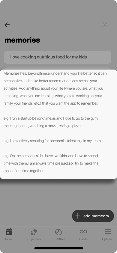
Transparent prompts. Tap any AI surface to see what context was sent.
Editable, deletable. The user owns every line of memory.
Optional. The app works without a single memory added.
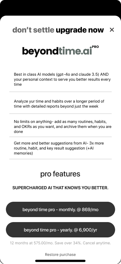
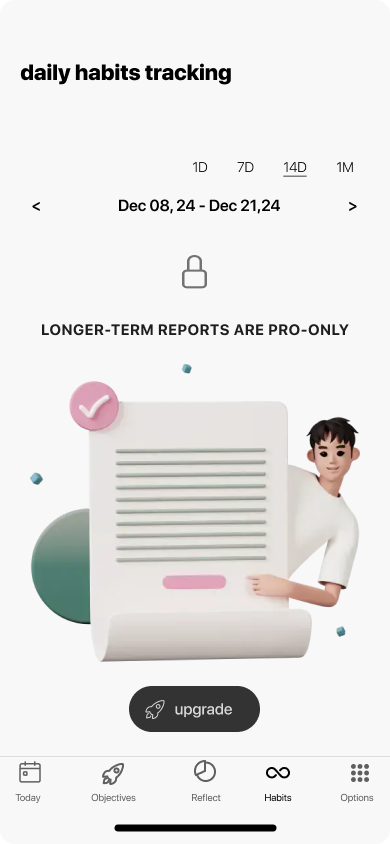
Section 9 · Monetisation
“Don't settle. Upgrade now.”
A pro tier that earns its keep.
Best-in-class AI models (GPT-4o, Claude 3.5)
Long-period reports — quarterly, yearly
Unlimited routines, habits and OKRs
3× richer AI suggestions + memories
Pricing was deliberately set with full transparency on the same screen — monthly and yearly, save 34%, restore purchase. No dark patterns. The free tier remains the full ritual.
Section 10 · Principles
Four design rules that ran every decision.
Principle 01
Calm > clever
An AI productivity app can easily feel like another nagging dashboard. We chose a near-monochrome palette, generous whitespace, and a single warm illustration accent per screen — so the app feels like opening a private journal, not a Jira board.
Principle 02
OKRs without the spreadsheet
We translated the OKR framework — invented in 1970s Intel — into a phone-first ritual. One objective, suggested key results, and a quarterly arc that fits in a thumb.
Principle 03
AI as a quiet co-pilot
AI appears in three places only — suggesting key results, remembering personal context ("memories"), and producing a weekly reflection. It never interrupts. It earns its place.
Principle 04
A pro tier that doesn't punish free users
Free users get the full ritual. Pro unlocks longer reports, unlimited everything, and 3x richer AI. The lock screen is honest, not coercive — a small lock icon and a single "upgrade" button.
Design System
One warm accent. A near-monochrome stage.
The palette stays out of the user's way. Pink is reserved for moments the product wants you to feel — the splash, the hourglass, the AI reflection. Everything else is paper, bone, and ink.
Ink
#0E0E0E
Paper
#F4EFEA
Bone
#EAE3DC
Accent Pink
#E6A6A6
Accent Deep
#C97C7C
Sage (.ai)
#7A8A85
Wordmark
beyondtime.ai
Lowercase. Two weights. The .ai in sage as a quiet ownership signal.
Buttons
Black pill primary. Quiet text secondary. No third level.
Typography
Bold lowercase titles.
Long-form body.
Lowercase wordmark cascades into every screen title — calm, conversational, never shouting.
Epilogue
What we learned designing beyondtime.ai.
The hardest part of an AI productivity app isn't the AI — it's restraint. Every screen we didn't add, every notification we didn't ship, every metric we left out of the dashboard compounded into something rare: a tool people actually finish opening.
The Reflect screen taught the loudest lesson. A weekly AI narrative — two paragraphs in plain English — moved retention more than any push, badge, streak or chart could. People stay where they feel understood. The job of design here was to get out of the way and let the AI sound human.
Building an AI-powered consumer app? Let's design the ritual.