Case Study · Multi-Module Delivery Platform
One platform, three apps, moving as one.
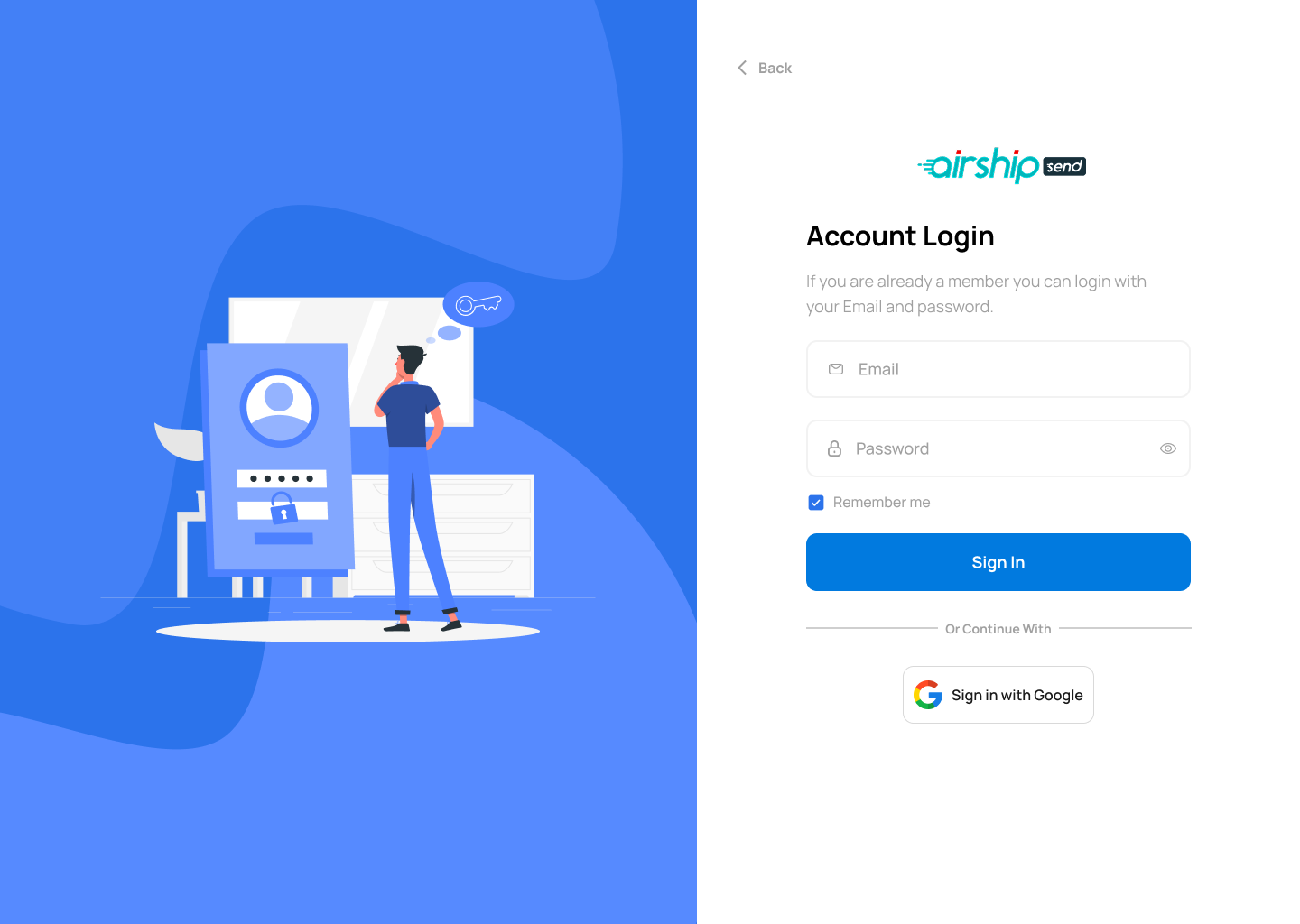
Airship is an on-demand multi-service marketplace — food, shopping, pharmacy, errands, transport and parcel delivery. We designed the full ecosystem end-to-end: a customer app, a powerful web admin console for dispatch and operations, and a focused rider app — bound together by one shared design system.
Client
Airship
Industry
On-Demand Delivery & Errands
Service
UI/UX Design · Design System
Platform
iOS · Android · Web Admin
Modules
Customer App · Admin Console · Rider App
Timeline
18 weeks
Problem
Three audiences with conflicting needs — and one brand caught in between.
Customers want a calm marketplace. Operators want dense data and bulk control. Riders want a thumb-sized interface. A single design language has to serve all three without feeling like three different products.
Goal
Design a shared system, then shape each surface around its job.
Build a token-driven design system once — colors, type, spacing, status states, components — then deploy it across customer browsing, admin dispatch and rider workflows, each with its own information density.
Outcome
150+ screens that all feel like Airship.
Customers move from category browse to tracked order in three steps. Operators dispatch and monitor live routes in one workspace. Riders accept, navigate and verify delivery without leaving the app.
3
Connected modules sharing one design language
150+
Screens designed across mobile and web
6
Service categories: food, shopping, pharmacy, errands, transport, delivery
92%
Task completion in moderated usability testing
Project Timeline
Eighteen weeks from blueprint to handoff.
01 · Weeks 1–3
Stakeholder workshops, journey mapping for 3 distinct user personas
02 · Weeks 4–7
Service blueprints, IA for customer / admin / rider, low-fi flows
03 · Weeks 8–13
Shared design tokens, hi-fi screens, dispatch and routing UI
04 · Weeks 14–18
Cross-module usability tests, edge-case handling, handoff
The Ecosystem
Three modules. One product.
Each module was treated as its own product with its own job-to-be-done — but they share a single source of truth for design tokens, components and status language.
iOS · Android · 60+ screens
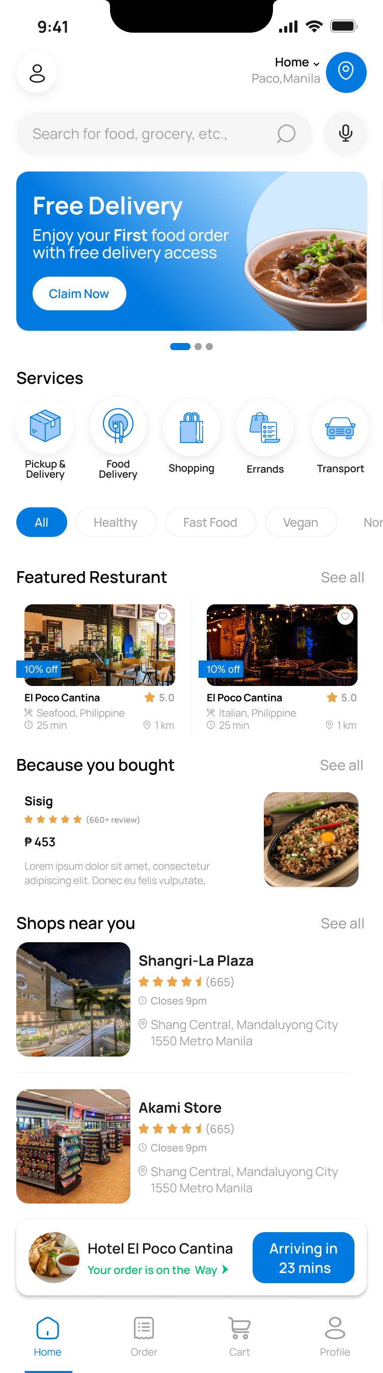
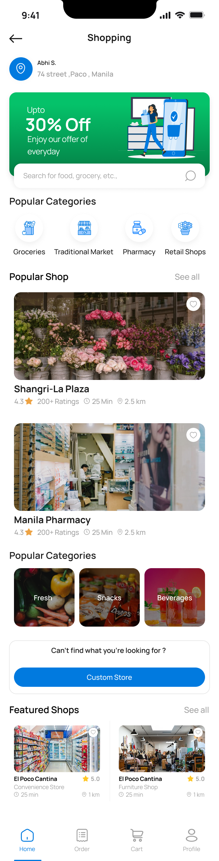
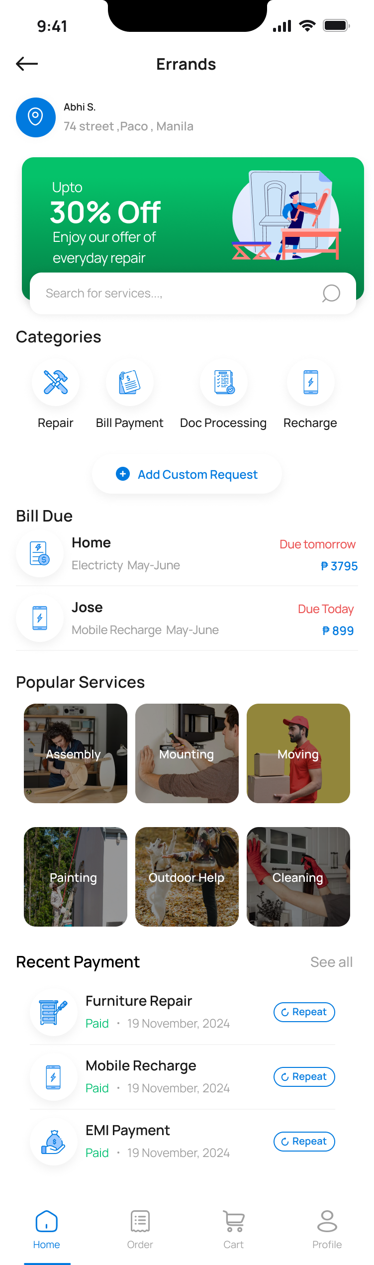
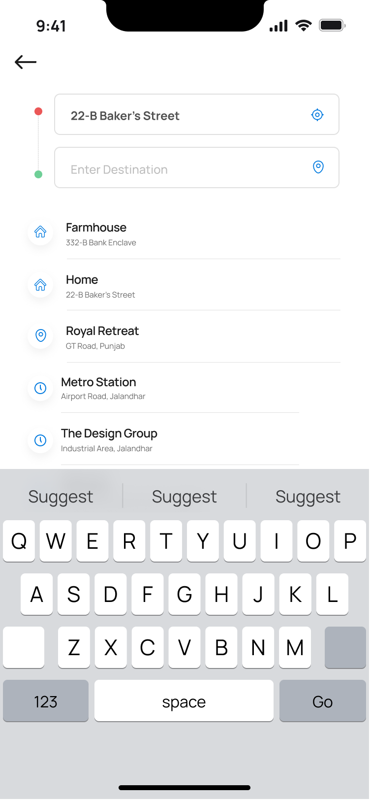
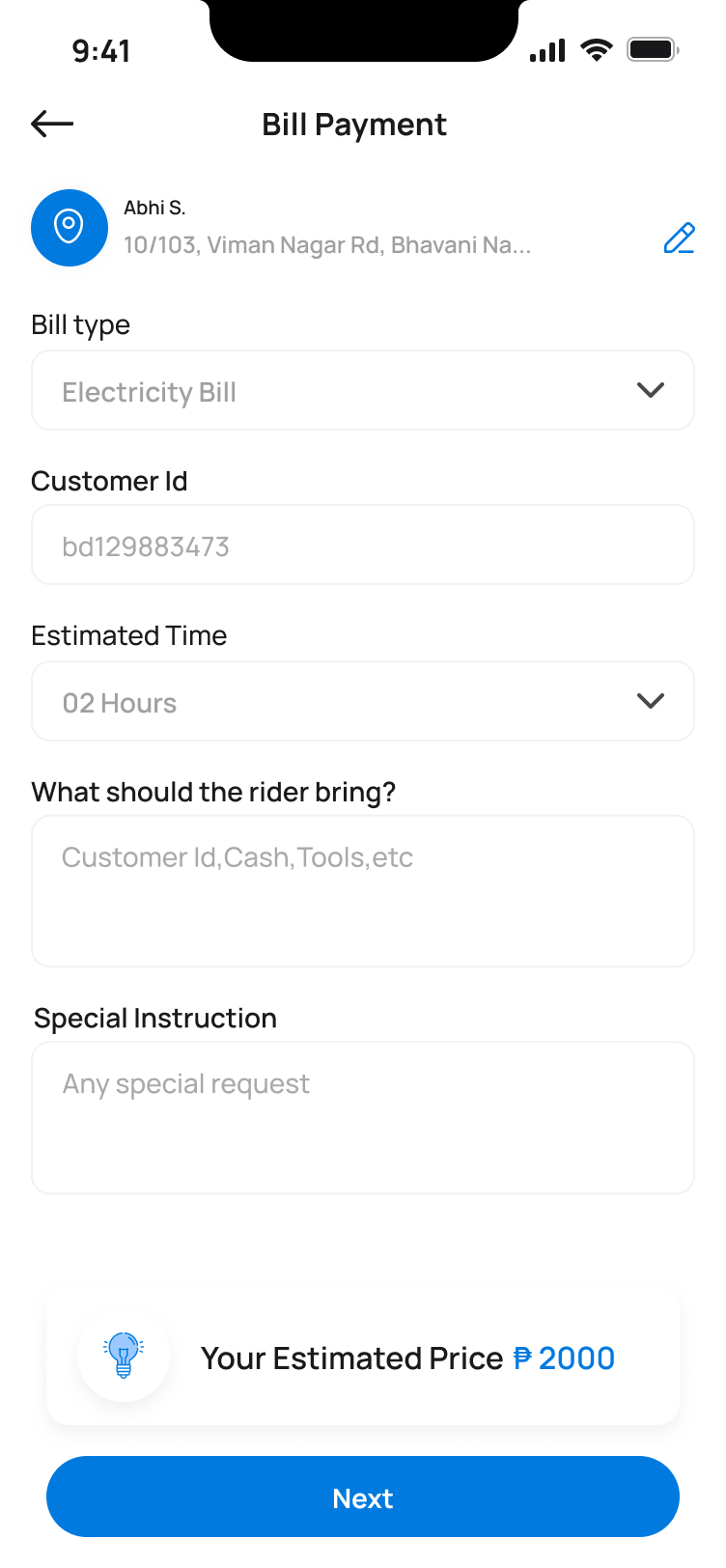
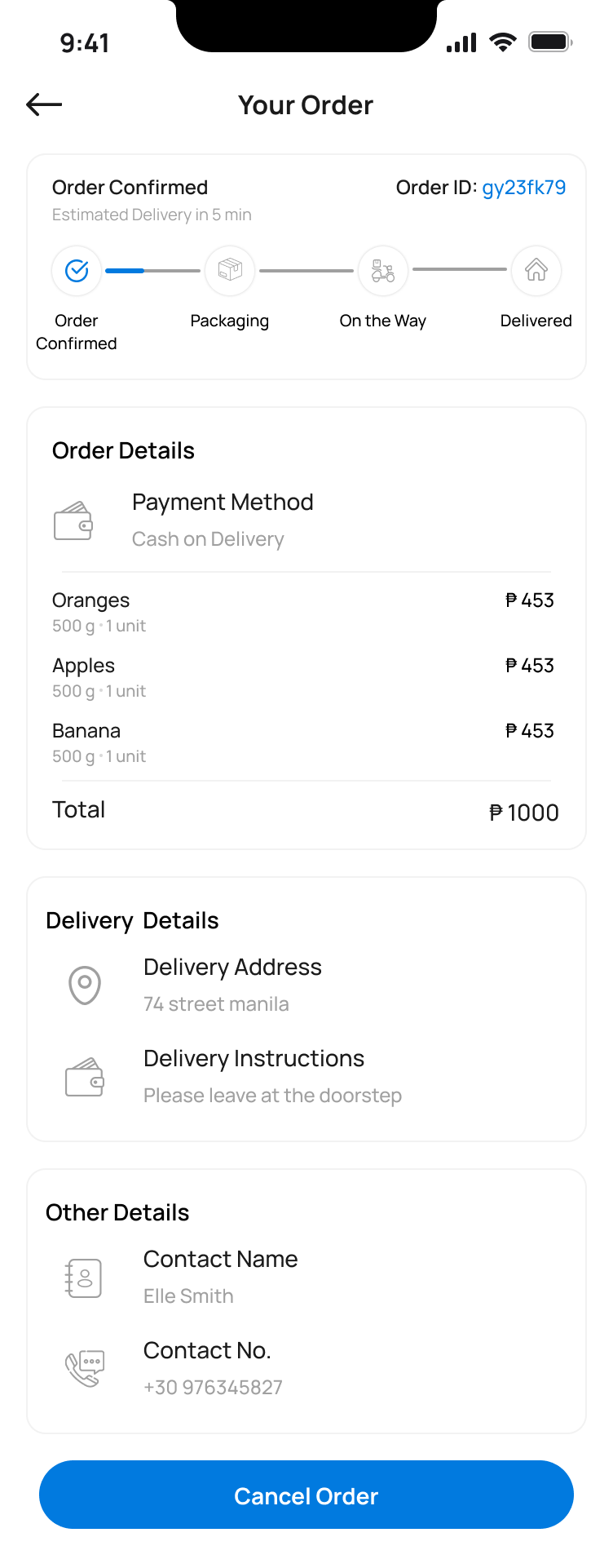
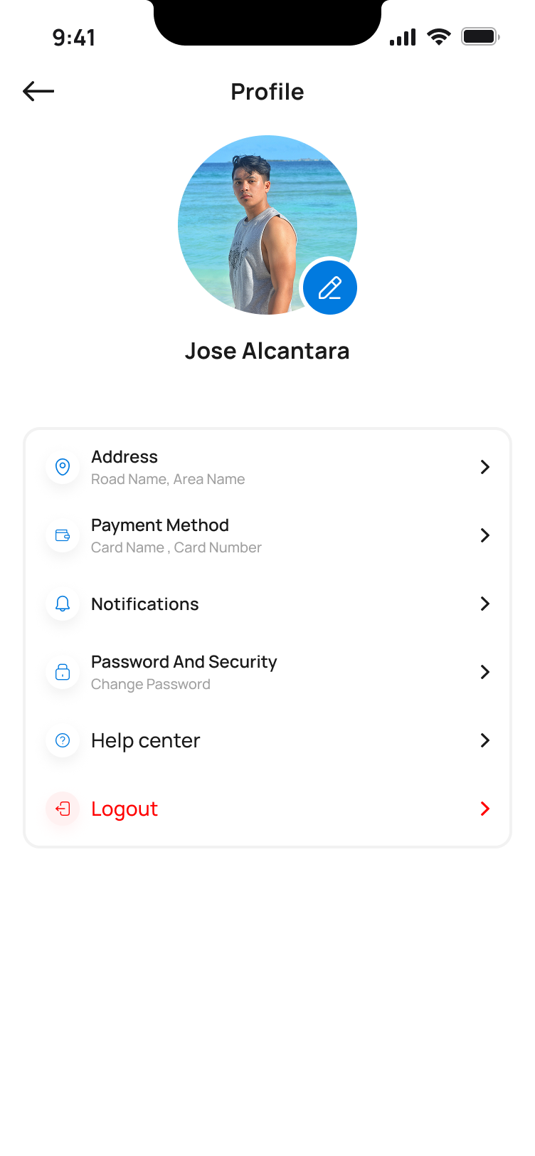
Customer App
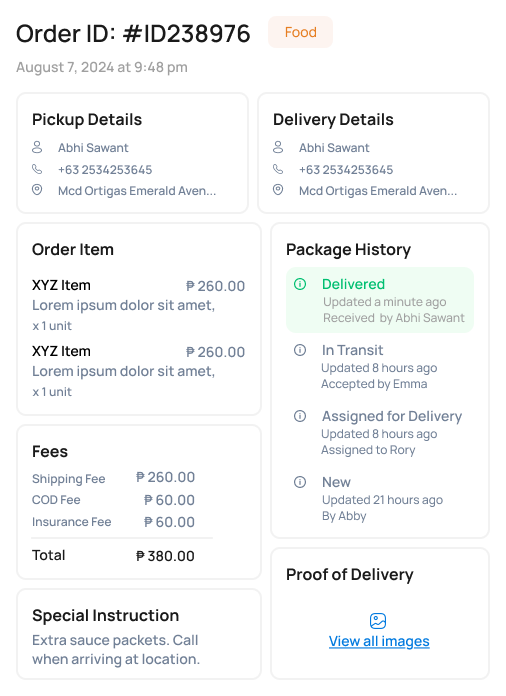
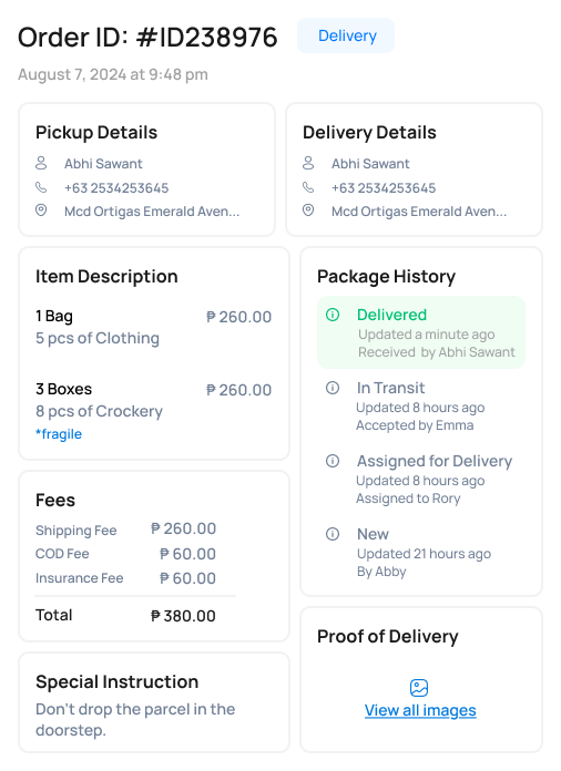
A multi-service marketplace where one user can order food, hire a mover, send an errand, refill a prescription and pay a bill — all in the same app, with a unified cart and tracking experience.
Responsive Web · 70+ screens
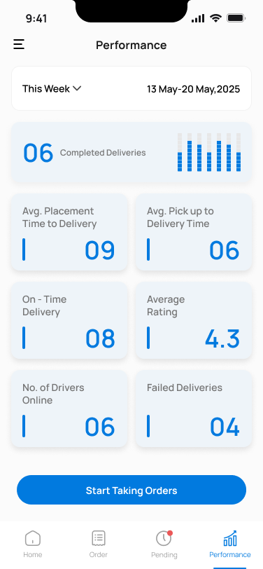
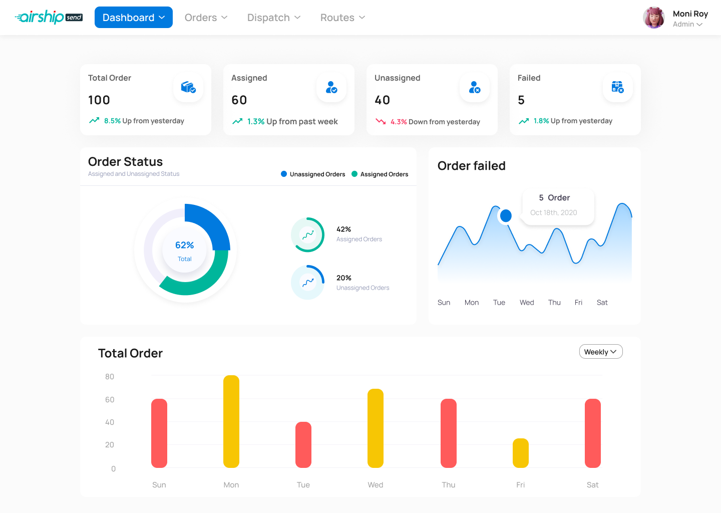
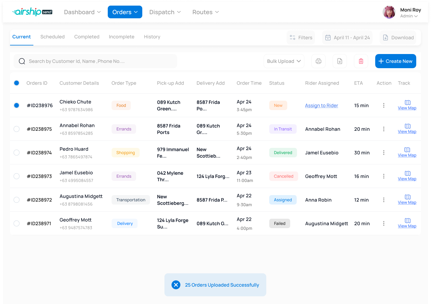
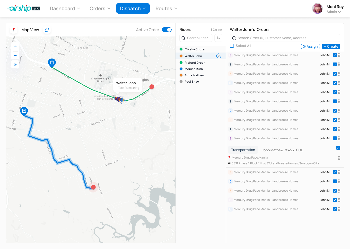
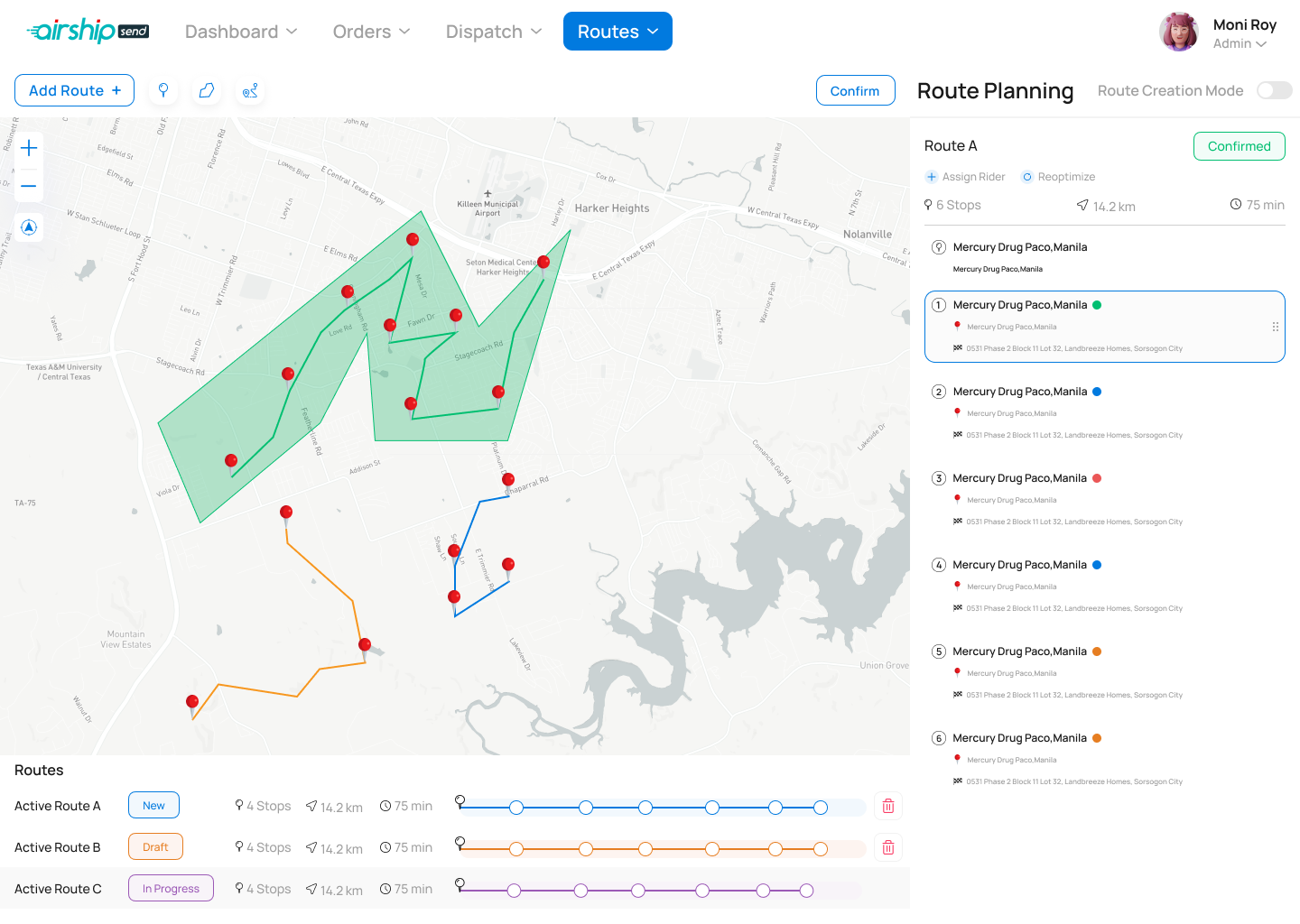
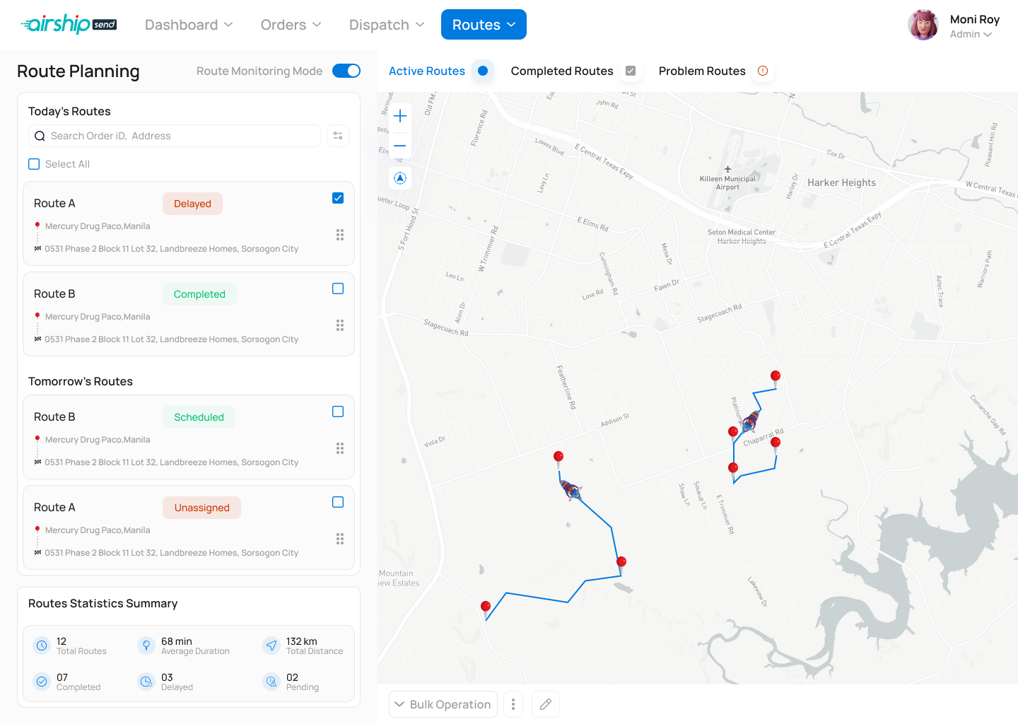
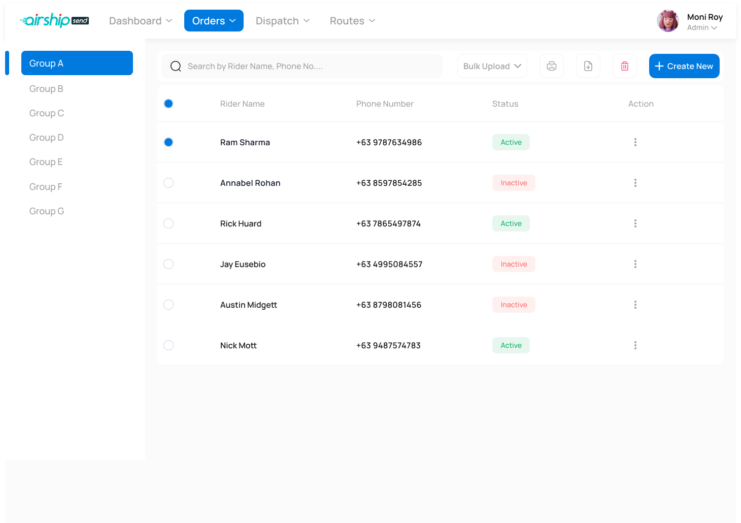
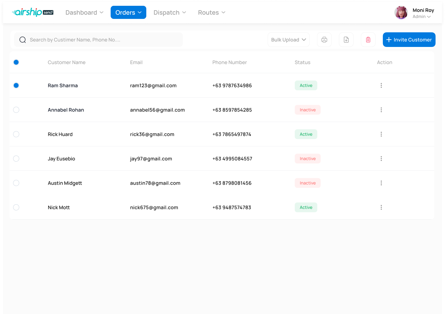
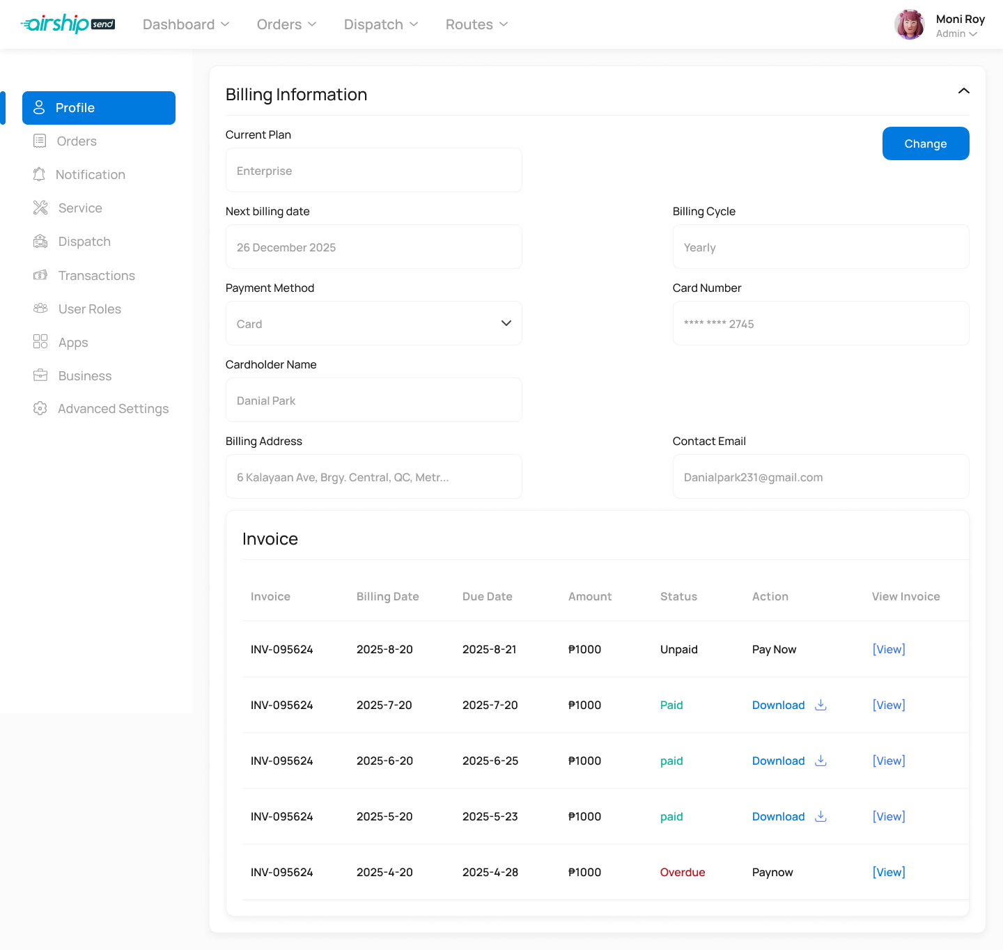
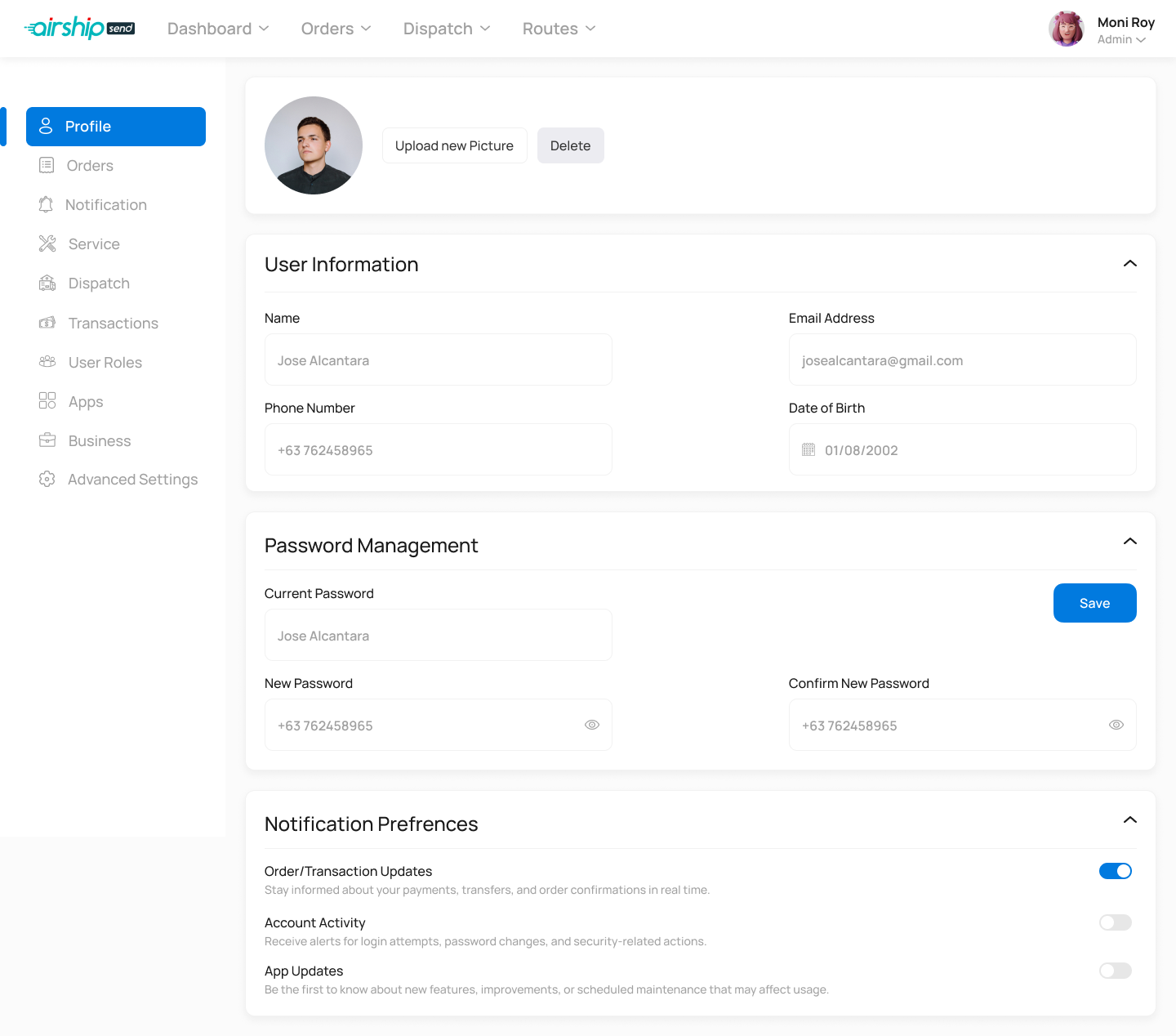
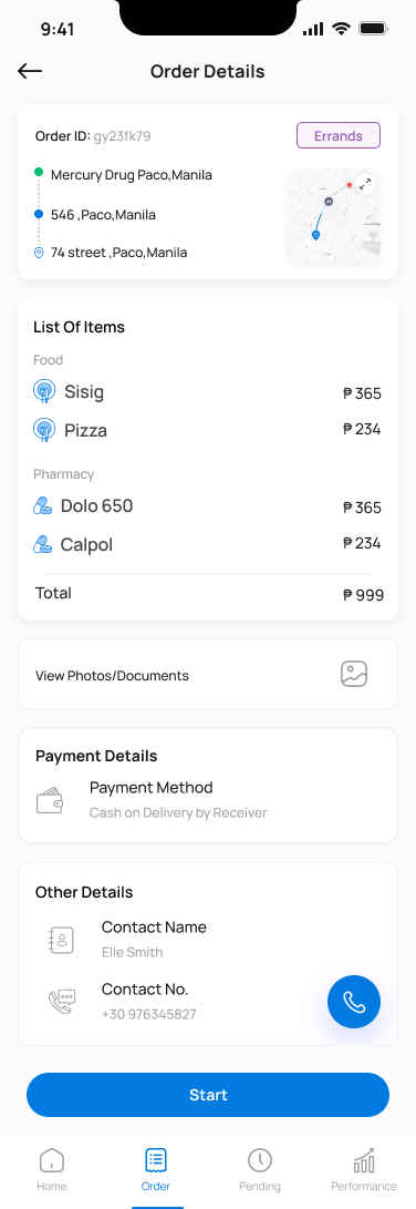
Admin Console
The operational brain — order management, dispatch, rider assignment, route planning and live monitoring, multi-service settings, billing, customer support and full role-based access.
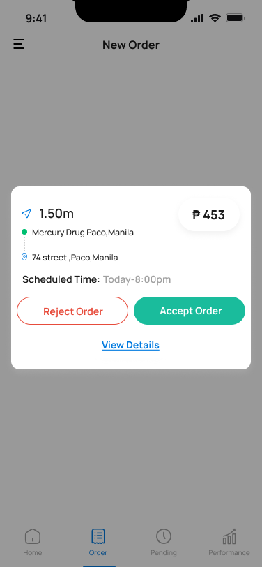
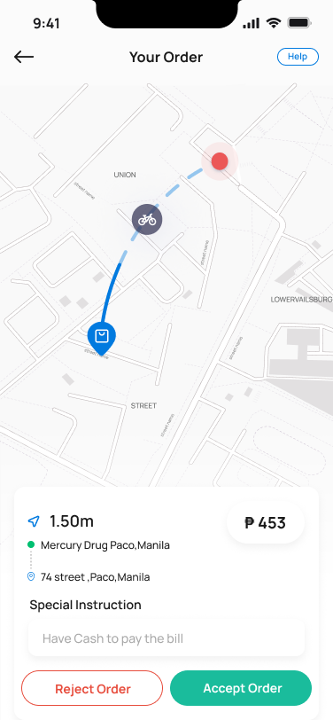
iOS · Android · 20+ screens
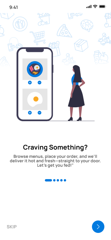
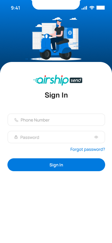
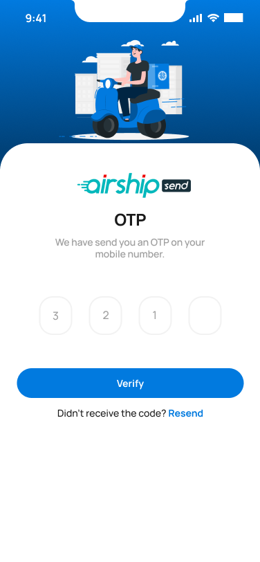
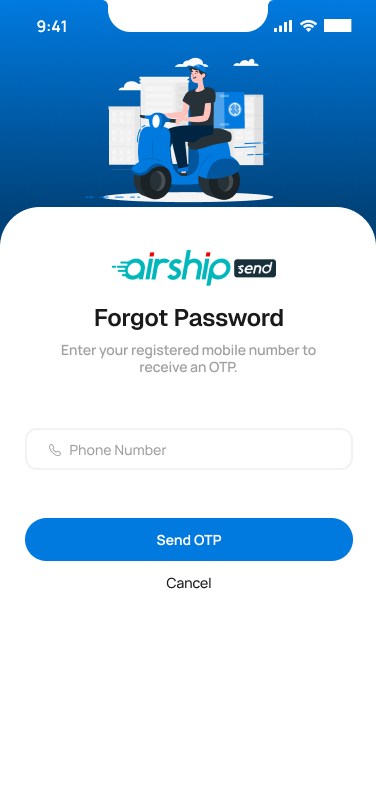
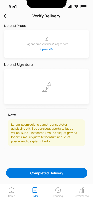
Rider App
A focused, glanceable interface built for riders on the move — accept new orders, navigate, verify delivery with OTP and proof-of-completion, and see earnings without friction.
01 · Customer App
A marketplace that doesn't feel like one.
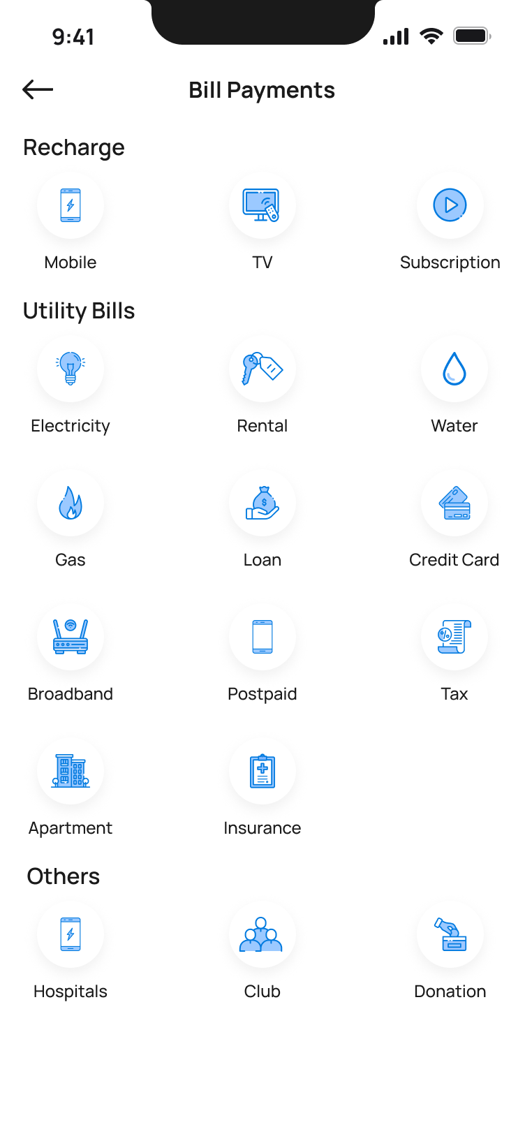
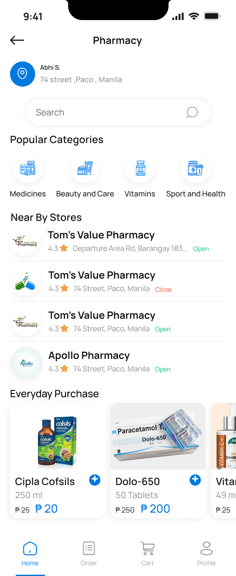
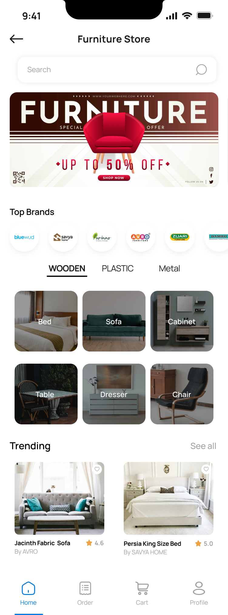
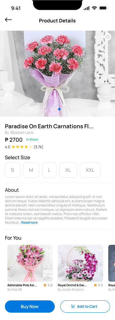
Six service categories live in one app — food, shopping, pharmacy, furniture, errands and transport. The home screen invites browsing without forcing a choice, and every category opens into a focused, vertical-specific flow.
02 · Admin Console
The operational brain.
Built for dispatch managers, the web console handles order intake across six services, assigns riders, plans and monitors live routes, manages customers and merchants, and controls every setting in the platform — from pricing plans to user role permissions.
03 · Rider App
One-handed. Glanceable. Verified.
Riders see one job at a time. Big tap targets, clear states, and a verification step built around an OTP and a proof-of-completion photo — so every handoff is closed cleanly.
Design Principles
Six principles that held the system together.
One System, Three Surfaces
Shared tokens, type ramp and components — every module looks like the same product.
Speed Where It Counts
Customer browsing and rider accept-flows optimized for sub-second decisions.
Dispatch That Shows Its Work
Route creation and live monitoring make assignment decisions transparent.
Status Is Always Visible
Every order surface — customer, admin, rider — uses the same state language.
Verified Handoffs
OTP and photo proof for every delivery — trust built into the workflow.
Operator-First Admin
Dense data tables, smart filters, bulk actions — built for power users.
Visual System
A palette tuned for status, not decoration.
Color in Airship carries meaning. Blue is the brand and call-to-action. Amber marks attention. Green is confirmation. Red is intervention. Every module uses them the same way.
Signal Blue
#1E66F5
Beacon Amber
#FFB020
Confirm Green
#1FB46A
Alert Red
#E5484D
Mist
#F4F6FB
Ink
#0B1220
Reflection
The hardest part wasn't drawing screens. It was keeping three products honest to one promise.
A customer's idea of "fast" is not the same as a dispatcher's, and neither matches a rider's. The design system became the contract between them — when a status changed in one app, it had to read the same way in the other two. That consistency, more than any single screen, is what made Airship feel like a single product.