Case Study · Pro Lighting Hardware
Guaranteed to light
up your universe.
Advatek is a global maker of professional pixel-lighting controllers — the gear behind Meow Wolf, Hard Rock, Coldplay's Music City and hundreds of installations, galleries and shows worldwide. Across seventeen desktop templates we built a bold editorial homepage, deep product pages with a unified quote flow, an installation showcase, a proper magazine-grade blog and a complete resources and dealer system.
Client
Advatek Lighting (AU)
Industry
Pixel-lighting hardware
Service
UI/UX · Web Design
Platform
Desktop web · 1440 grid
Team
1 Designer · 1 PM · 4 Engineers
Timeline
14 weeks
The brief
A site as professional as the hardware in the rack.
Advatek's controllers power some of the most ambitious installations on the planet, but the old site read like a 2014 datasheet repository. The brief: an editorial-grade web presence that takes the brand from 'specifier favourite' to 'category default'.
The challenge
Serve engineers and creative directors in one screen.
A lighting installer needs voltage, channels and certifications. A creative director needs to feel the brand. The architecture had to deliver both — a magazine front, a datasheet spine, a single quoting line running through every page.
The outcome
17 templates. +42% quote requests. One quote line.
Editorial homepage with crashing hero hardware. Pro / Accessories / Clearance catalogues. Deep E16-S product page. Installations showcase. Magazine-style blog. Region-aware dealer locator. Resources hub. All bound by one orange Add-to-quote.
17
desktop templates shipped end-to-end
5+
year warranty surfaced into the buying flow
60+
countries served through the dealer locator
+42%
rise in qualified quote requests post-launch
Project Timeline
Fourteen weeks — from sales-led workshops to a launch-ready system.
01
Weeks 1–3
Stakeholder interviews · audit of 6 lighting-controls sites · IA workshop with sales, engineering and support.
02
Weeks 4–6
Sitemap for 17 templates, content model, editorial direction and homepage wireframes.
03
Weeks 7–11
Hi-fi design system, product, showcase, blog and resources templates, micro-interactions.
04
Weeks 12–14
Usability testing with installers, dev handoff, accessibility QA and motion specs.
Product Pillars
Four moves that turn a hardware site into a category default.
Hero the hardware, not the brand
The homepage opens with two real controllers crashing in from the edges of the screen — no stock photography, no hero models. The product is the brand statement.
Specs that read like editorial
Product pages use display-grade typography for the model name, calm spec tables for the engineer, and a single orange CTA so the buying decision never gets lost.
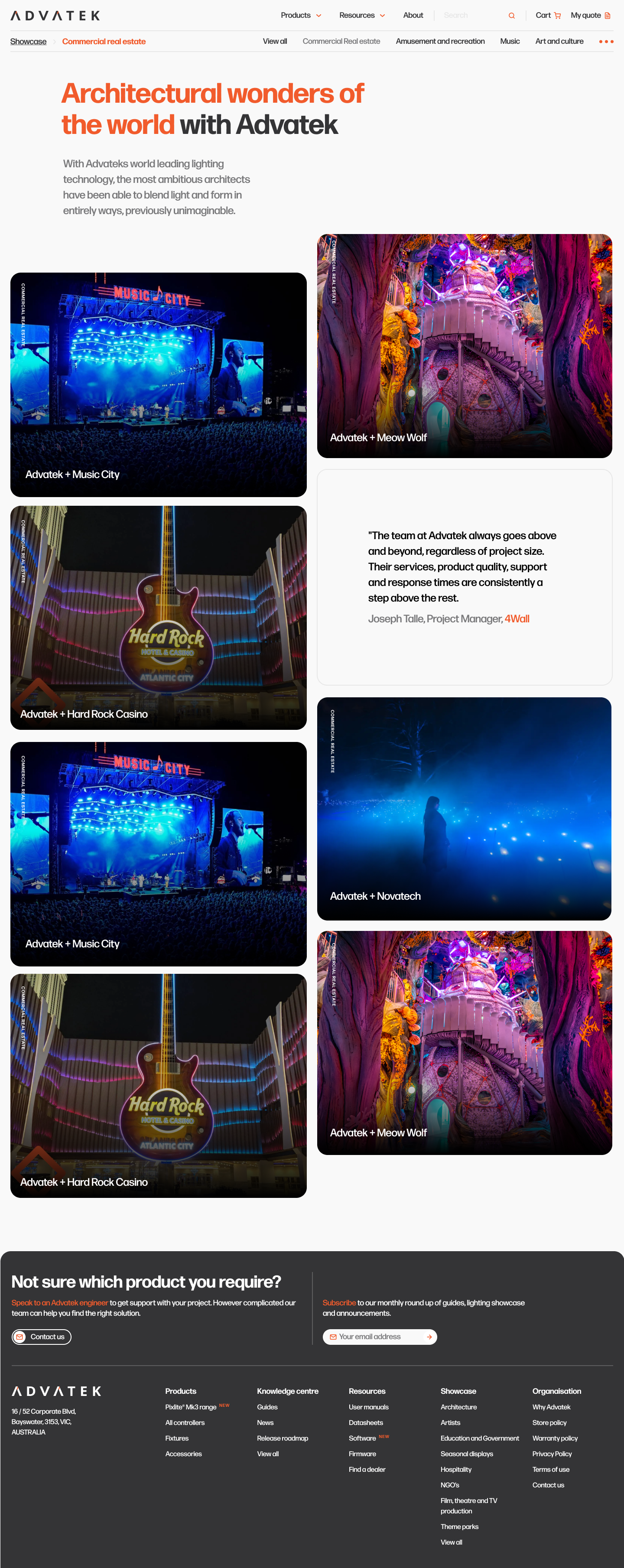
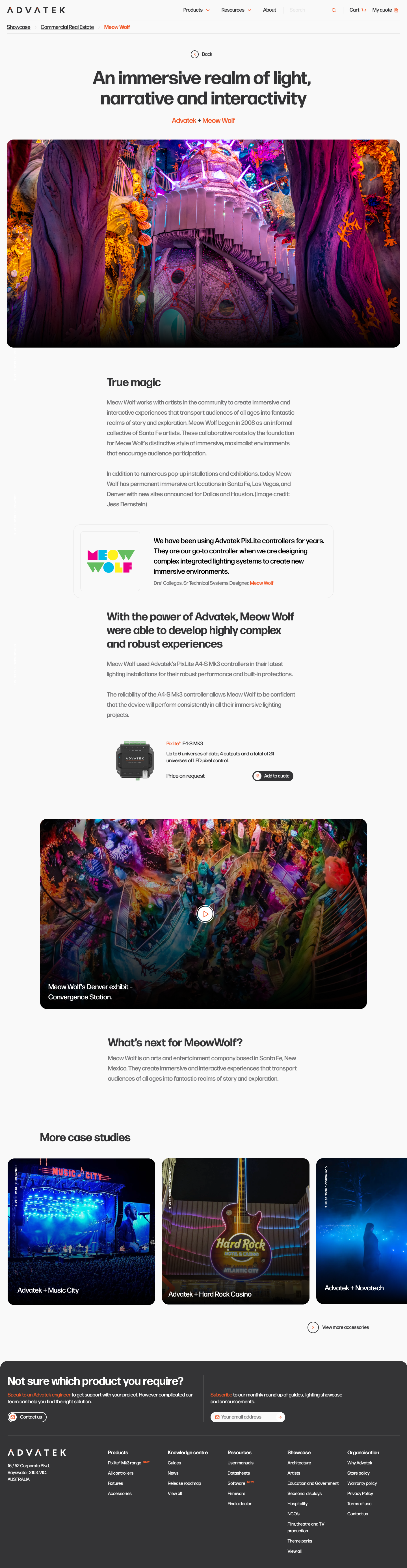
Showcase as proof
Meow Wolf. Hard Rock. Music City. Real installations photographed at full bleed — the work argues for the controller more convincingly than any datasheet ever could.
One quoting line across the site
Add-to-quote replaces add-to-cart everywhere. The same orange button on every product, list and showcase page — installers can stack a quote across 20 minutes of browsing.
Seventeen Templates
From hero hardware to a happy installer's receipt.
Each template earns its place in the funnel. Hover any mockup to scroll the full page; the catalogue, showcase and resources stacks all share one orange Add-to-quote.
01
Homepage
Bold hardware, bolder confidence.
Two PixLite controllers crash in from the screen edges. Four pillars under the fold. Showcase, popular products and an honest contact band — all in a single calm scroll.
02
Pro Products
A catalogue that reads like a magazine spread.
Each controller card pairs a real product shot with model name, headline and an Add-to-quote. The pro range gets its own dedicated hub — no toy-grade products to wade past.
03
All Products
Filterable shelves for every install.
Categories, channel counts, power. Filters live in a quiet left rail; the right grid stays photography-led. Out-of-stock items demote themselves rather than disappear.
04
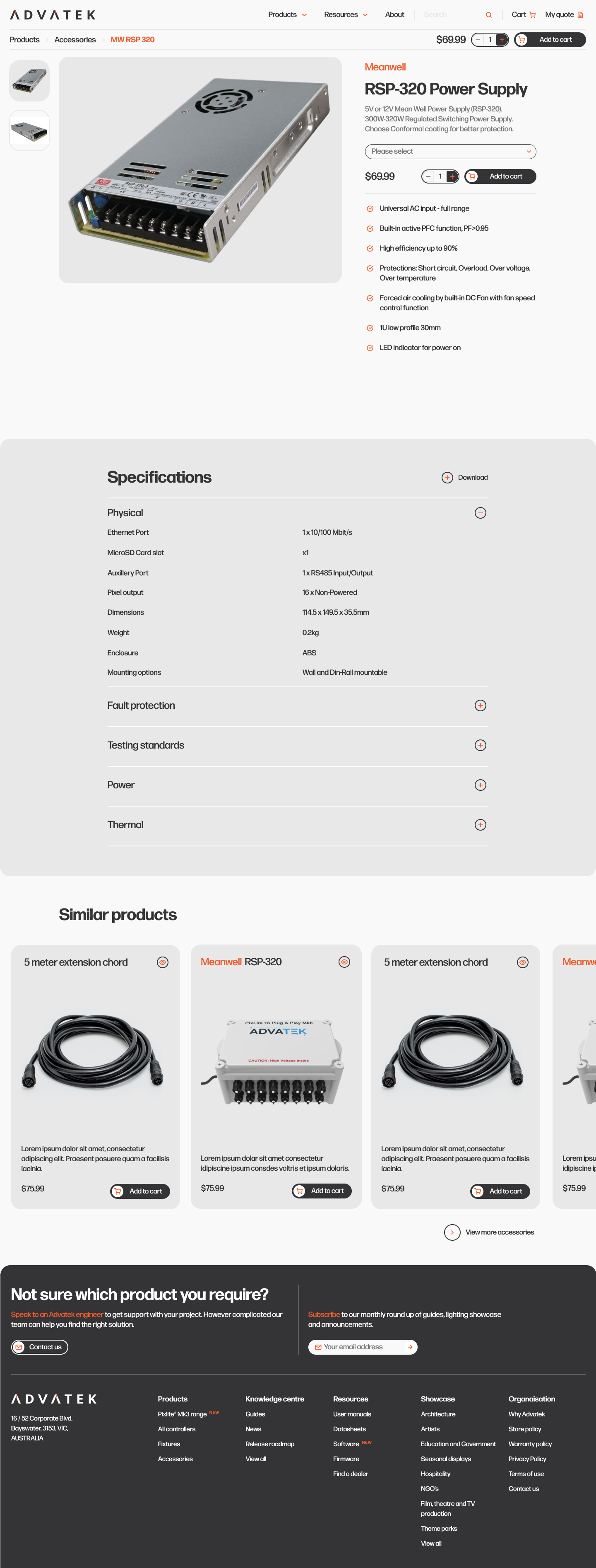
E16-S Detail
Specs the engineer can scan in eleven seconds.
Hero gallery left. Sticky model-name + price + Add-to-quote right. Spec table, certifications and a 'compare' rail below — the page rewards both the curious and the hurried.
05
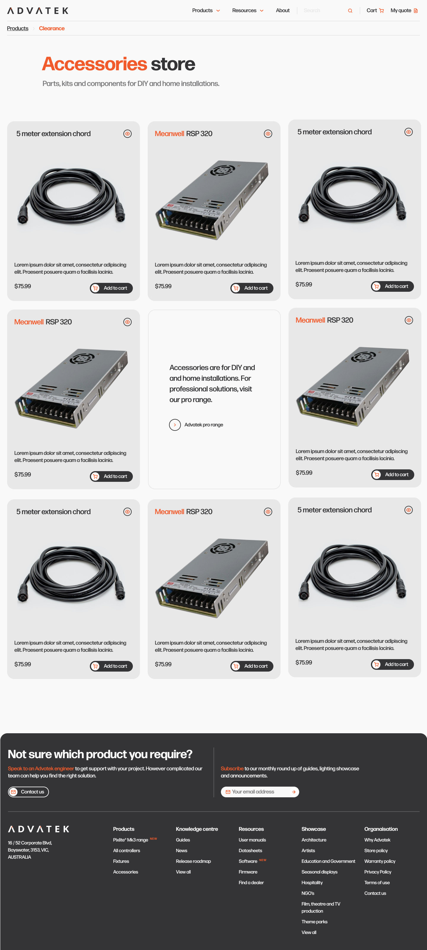
Accessories
Cables and clips, treated like the hero gear.
Accessory grid uses the same card system as the pro range — same photography discipline, same Add-to-quote button. Nothing on this site looks like a stockroom.
06
Accessory Detail
Even a connector earns a full page.
Hero shot, three calm spec rows, a sticky Add-to-quote. Installers spec the accessory in the same flow as the controller — no PDFs, no email chains.
07
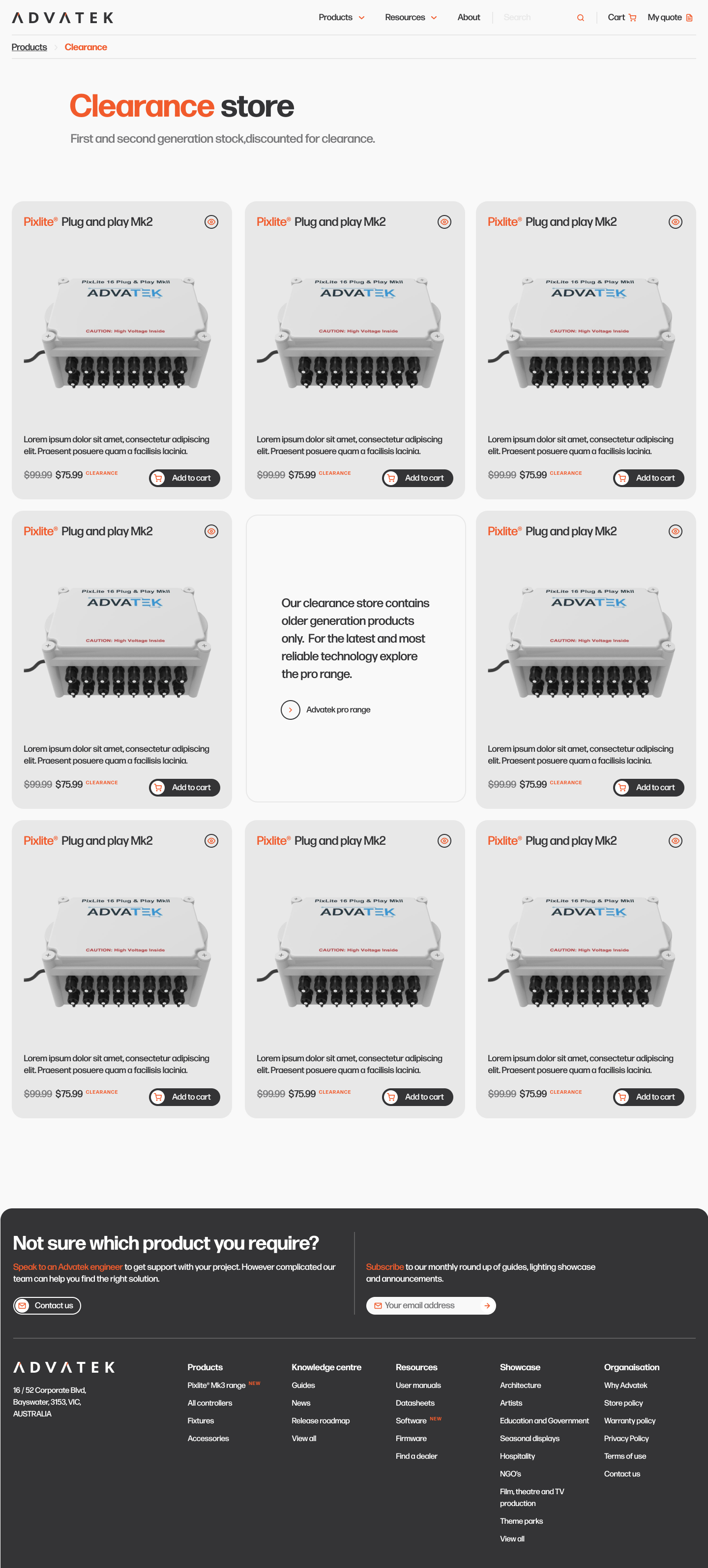
Clearance
Honest pricing, not a fire sale.
Clearance lives in its own zone — same card system, a quiet 'Clearance' chip. Pricing is shown, stock is shown, and the page never pretends to be the latest pro range.
08
Showcase Index
Photography as the strongest spec sheet.
Meow Wolf, Hard Rock, Music City — full-bleed photography in a 2-up grid. Categories sit in a quiet top filter. The page argues for the gear without a single bullet point.
09
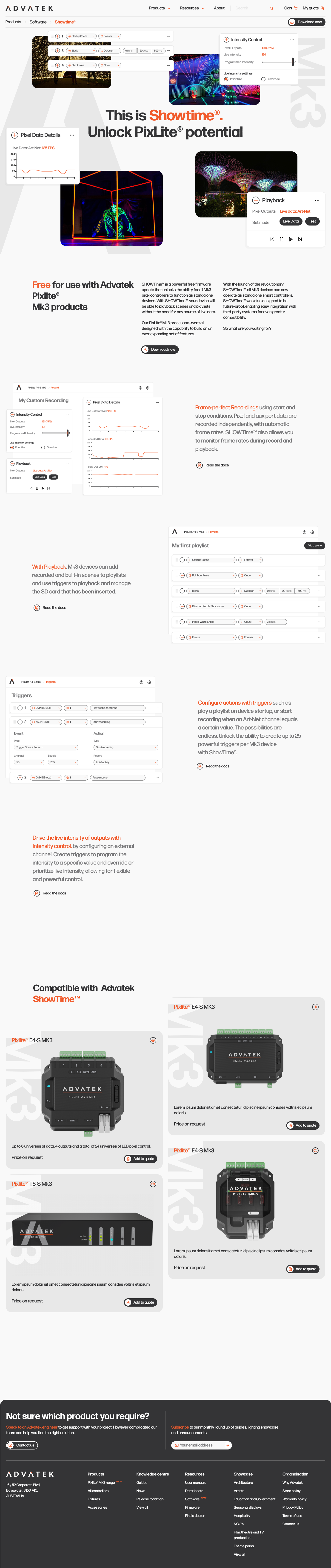
Showtime
Concert-grade case study, concert-grade typography.
The Showtime page leans into the touring-and-live world — heavy display headlines, full-bleed festival photography, related controllers underneath.
10
Case Study (Meow Wolf)
A long-form story you actually want to read.
True magic. Cinematic image, three-paragraph story, a pull-quote from the client, the exact controller used, and a Convergence Station video at the bottom. More case studies sit at the foot of the page.
11
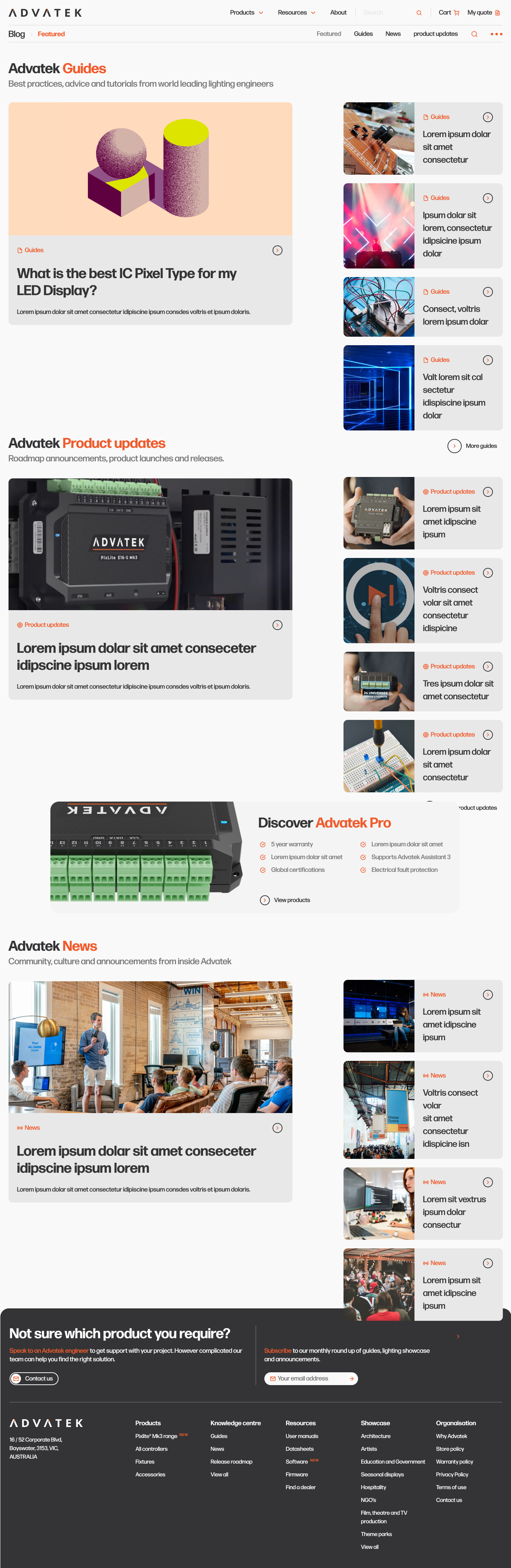
Blog Index
A real journal — not an SEO mill.
Editorial cards, category labels, headline, date, byline. The blog earns return visits from specifiers, not just search arrivals.
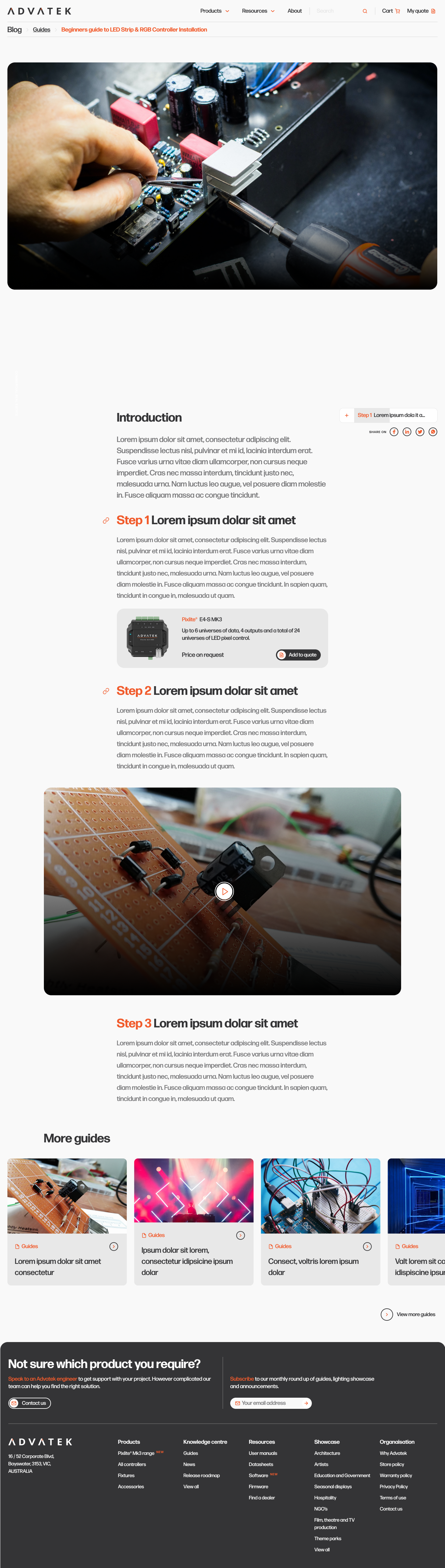
12
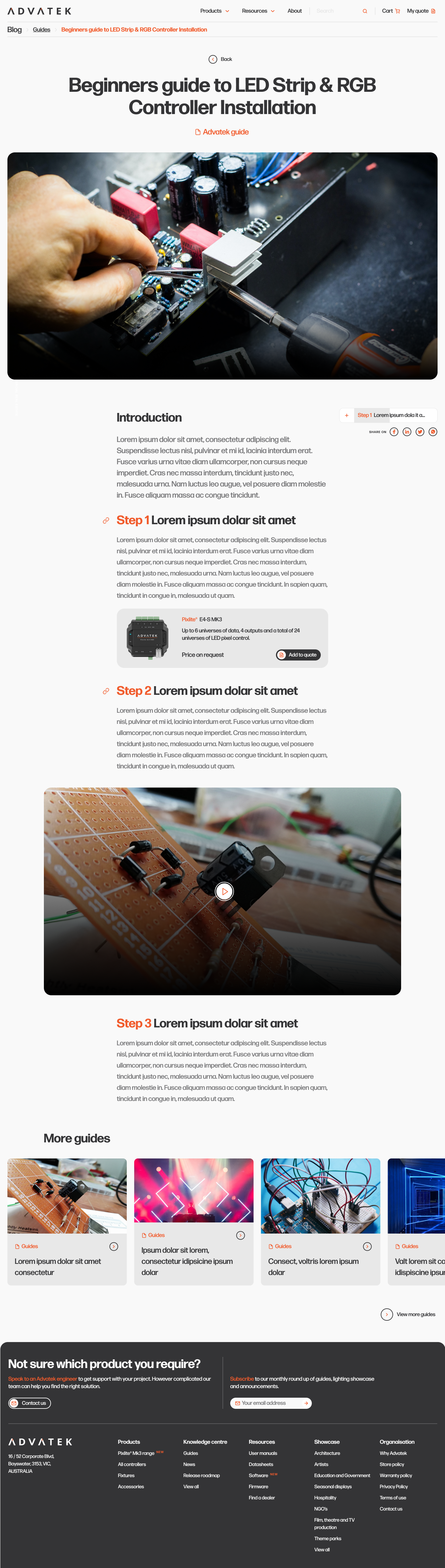
Blog Article
Long-form writing for an installer audience.
Narrow read column, generous whitespace, pull-quotes for the breath, and a 'related controllers' rail at the end — never inline, never interrupting.
13
Blog Article — variant
Same chassis, different feature treatment.
A second article template handles release notes and technical deep-dives — code blocks, callouts and a downloadable PDF, all inside the same calm typography.
14
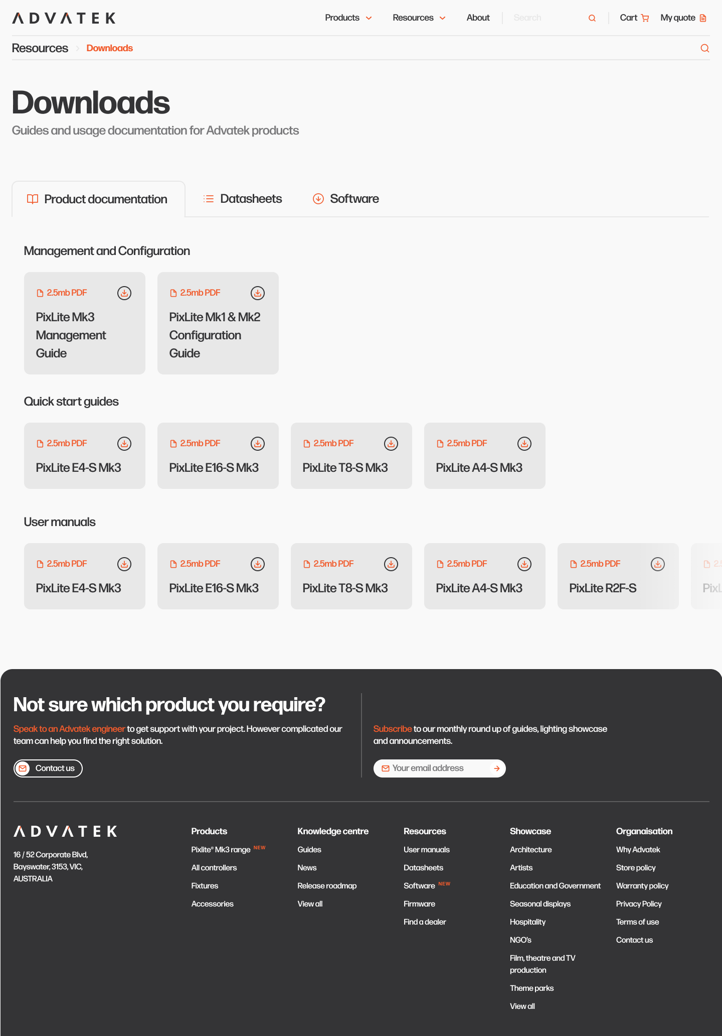
Resources
Datasheets, manuals, firmware — finally findable.
A category-led hub with search at the top, latest releases below, and a 'most downloaded' rail. Engineers stop emailing sales for last-week's firmware.
15
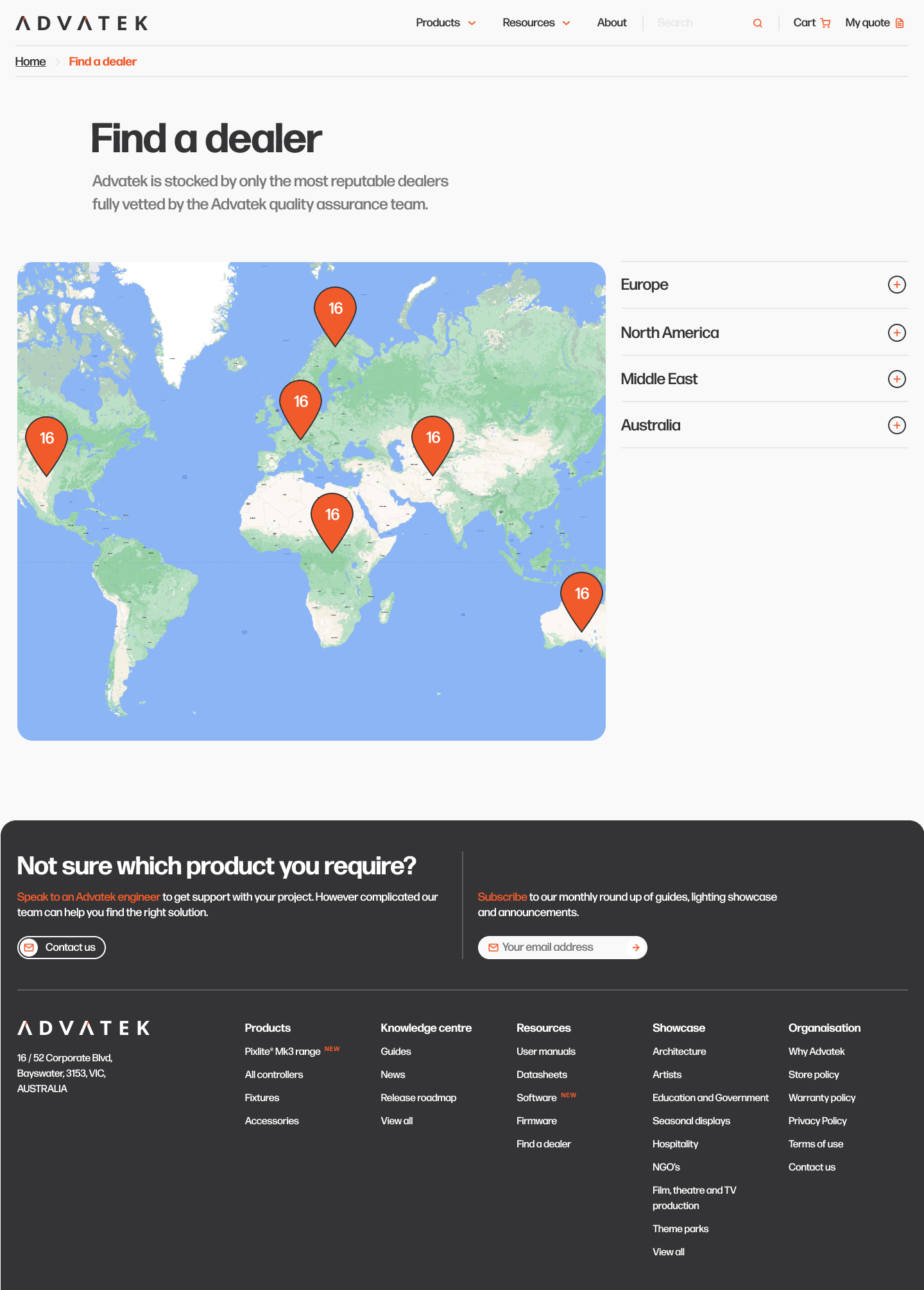
Find a Dealer
A world map that respects the installer's region.
Region tabs, a list-and-map split, a quiet contact line per dealer. The page does the geography work so the customer doesn't have to.
16
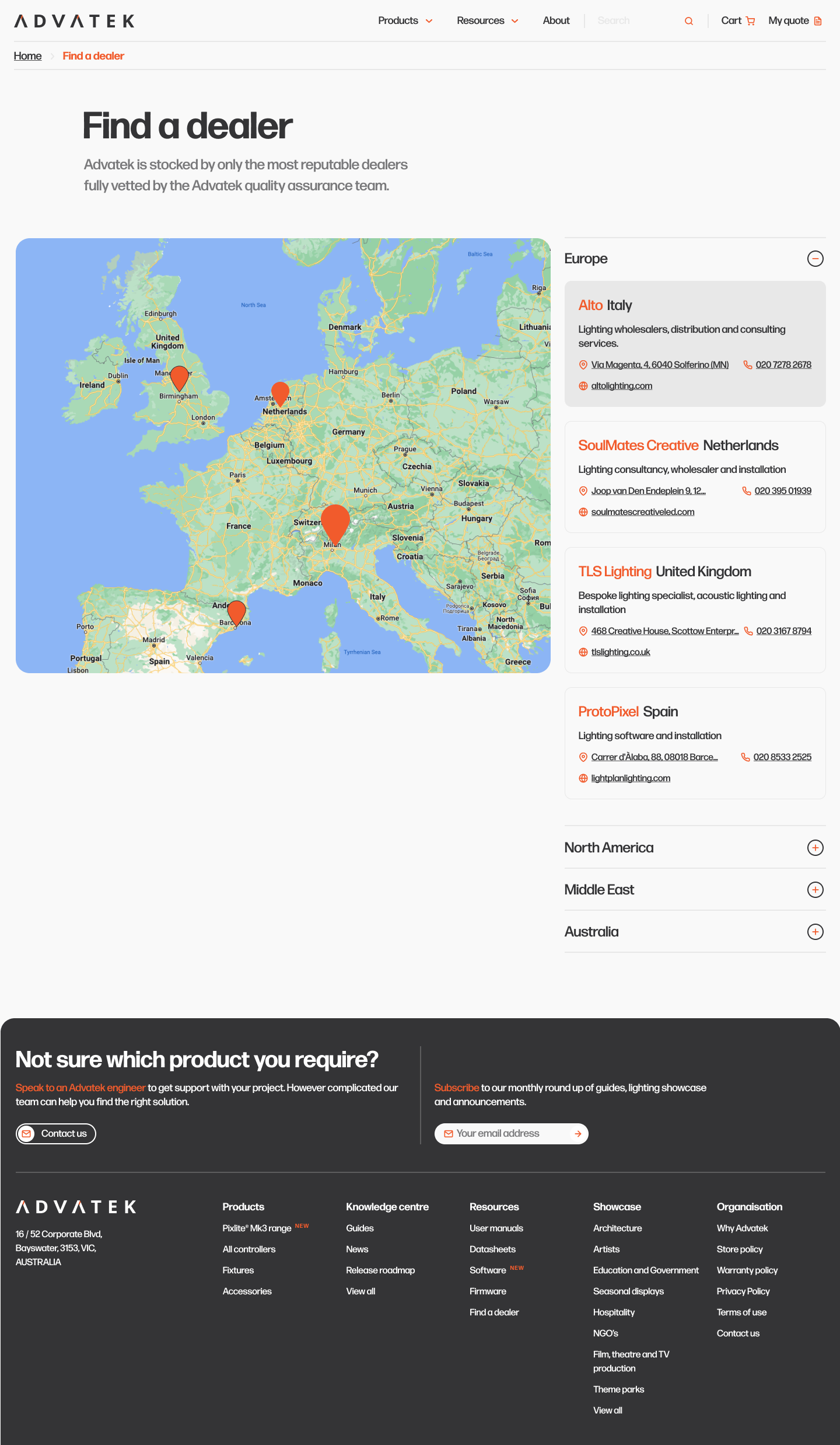
Dealer — Europe
Region drill-down without losing the global view.
Selecting a continent drills into the country list with the same card system — no full page reload, no spinner, no loss of context.
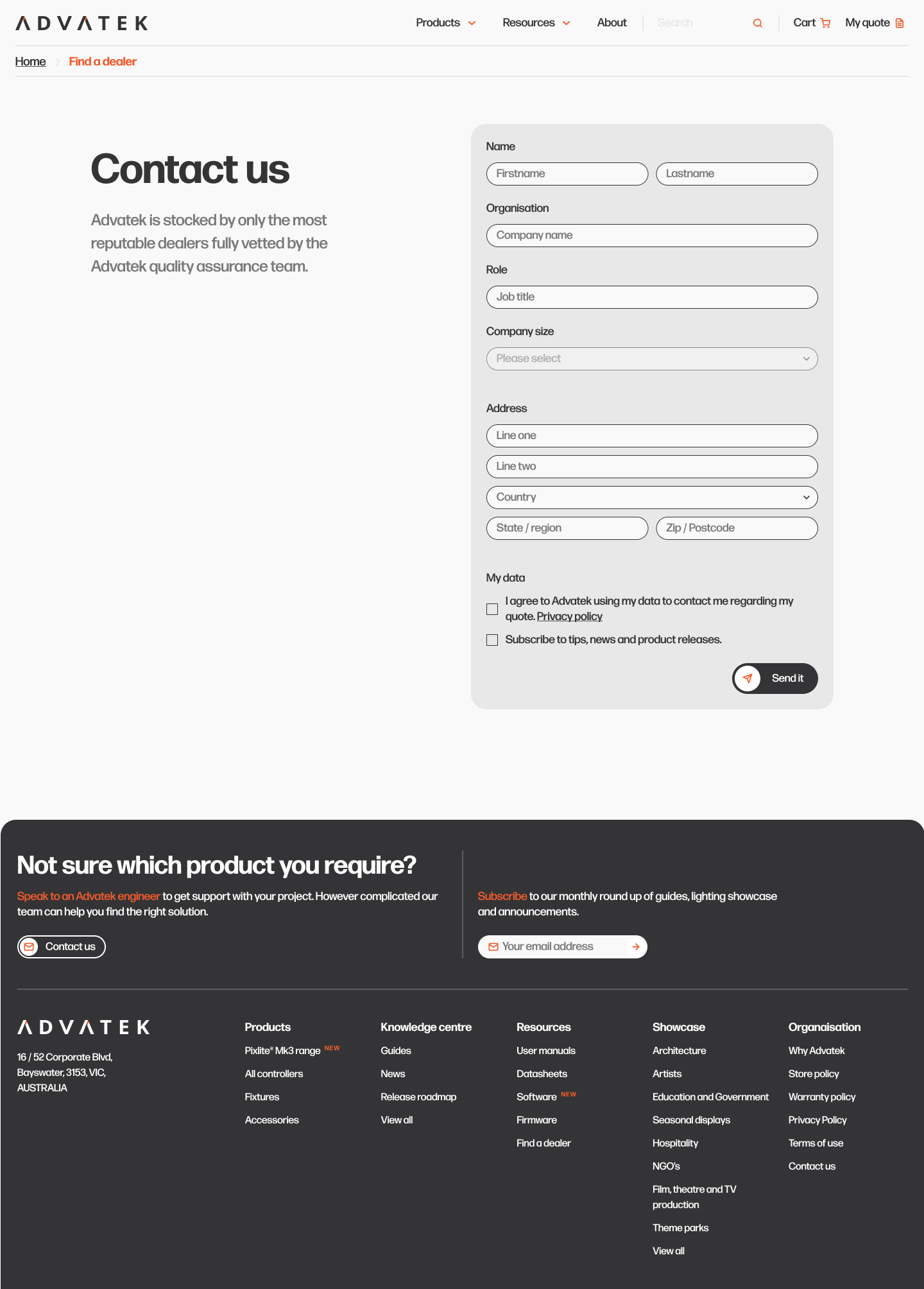
17
Contact
A friendly door, kept open for engineers.
Single column, three-step form — project type, message, contact. Plus a direct phone, a direct email and the office address. No bot, no pop-up.
Design Principles
Four rules that kept industrial from sliding into dull.
Industrial, not industrial-looking
Heavy black display type, generous whitespace, one orange accent. The site reads as professional gear without leaning on the usual datasheet-PDF aesthetic.
Photography does the persuading
Every template reserves at least 40% of the canvas for real installations or product photography. Renders are banned — only field photography ships.
Orange as a single source of action
Advatek orange is reserved exclusively for primary CTAs and active states. Nothing else in the system is allowed to wear it.
Motion that respects the engineer
Type rises 8px on enter, hero hardware drifts in at 700ms, hover states are crisp. No parallax theatrics — installers came for specs, not a showreel.
Visitor Journey
From hero hardware to a real RFQ in under ninety seconds.
00:00
Land on the homepage
Two PixLite controllers crash in from screen edges. A 2-minute brand film sits one click away — for buyers who want the story before the specs.
00:14
Read the value pillars
Simple, Flexible, Safe, Robust — four icons, four lines. The customer's whole objection set answered above the fold.
00:30
See the work
A showcase strip with Coldplay's Music City, Meow Wolf and Hard Rock — proof carried by photography, not adjectives.
00:50
Compare products
A 'most popular' rail with three controllers, an Add-to-quote on each, and a clear path to the full pro-product catalogue.
01:10
Open a controller
E16-S detail: gallery left, sticky spec column right, certifications strip below. One orange Add-to-quote button — never two.
01:30
Find a dealer / request a quote
Region-aware dealer map plus a calm contact form. The quote builder persists across the whole site in the top bar.
Design System
One palette. One CTA. One quote line.
Wordmark
ADVATEK
Geometric uppercase wordmark, the 'A' clipped at 45° to echo the bevel on a pixel chip.
Spec chip
Calm grey chips for certifications. Never coloured — orange is reserved for action.
Primary CTA
Every primary CTA is Advatek orange. There is no second 'primary' button anywhere in the product.
Numbers that moved
The metrics that decided which moves stayed.
Every page on this site is instrumented. We watched the spec table, the showcase click-through and the Add-to-quote funnel weekly for the first eight weeks — and let the data, not opinion, decide which tweaks survived.
Engineers reach the spec table on E16-S in 11 seconds — down from 41 seconds on the old PDF-first site.
Showcase visits convert to product detail at 2.8× the rate of homepage visits — the work sells the controller.
Add-to-quote has a 22% conversion to a real RFQ, well above the 7% e-commerce baseline for hardware.
Dealer-locator interactions correlate with a 3.4× lift in 30-day quote requests from that region.
60+
countries served
5 yr
warranty on every controller
17
desktop templates shipped
Want a hardware site that earns the quote? Let's talk about your project.